💪 XGBoost Time Series Prediction


In the world of time series prediction, often LSTM models, as well as the newer trend toward transformers, are primarily what are thought of as leading edge. But I personally have a great admiration for XGBoost models and the raw power they offer, and there are times when XGBoost can very skillfully outperform the competition.
XGBoost stands for "extreme gradient boosting". It is a fantastic decision tree machine learning library and is one of the leading machine learning libraries for regression and classification. XGBoost enhances gradient boosting, supervised machine learning, and decision trees, as well as ensemble learning.
In this project, I will be using an XGBoost Regression model to very accurately predict energy usage in the UK, and I will provide statistical evidence for the effectiveness of the model. I will walk you through step by step, working with the data in a variety of ways and showing how we can increase accuracy significantly by skillfully utilizing XGBoost, along with Scikit-Learn and some effective feature engineering.

Sections: ● Top ● The Data ● Feature Engineering ● Investigating Correlation ● Lag Features ● Splitting ● The Model ● Results with Traditional Split ● Using Cross-Validation ● Making Future Predictions
1. The Data
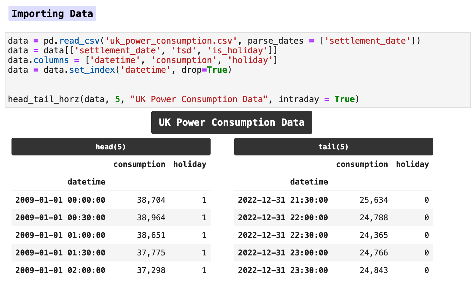
The data for this project is a large excerpt from a Kaggle maintained and regularly updated dataset collection. The dataset provides the energy consumption records as reported by the National Grid ESO, Great Britain's electricity system operator. In this data, consumption in megawatts is recorded twice an hour, every hour of every day. Overall, at these intervals, the data ranges from January 1, 2009 to December 31, 2022.
Of the original data, I chose to keep only the main column containing the overall energy usage and the column signifying whether a day is a holiday or not. These along with some features we will engineer shortly will provide plenty of data for our machine learning model to make very accurate predictions.
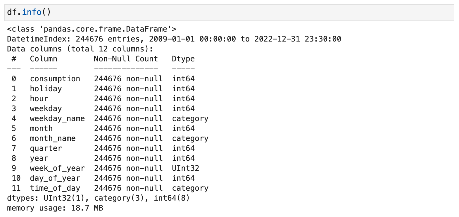
When I first import data, I prefer to have an overview of the original raw data in one place. I also like for it to be more visually appealing than the typical Pandas info() output. So I threw together this handy function that takes time series data and produces an overview of all the important information.
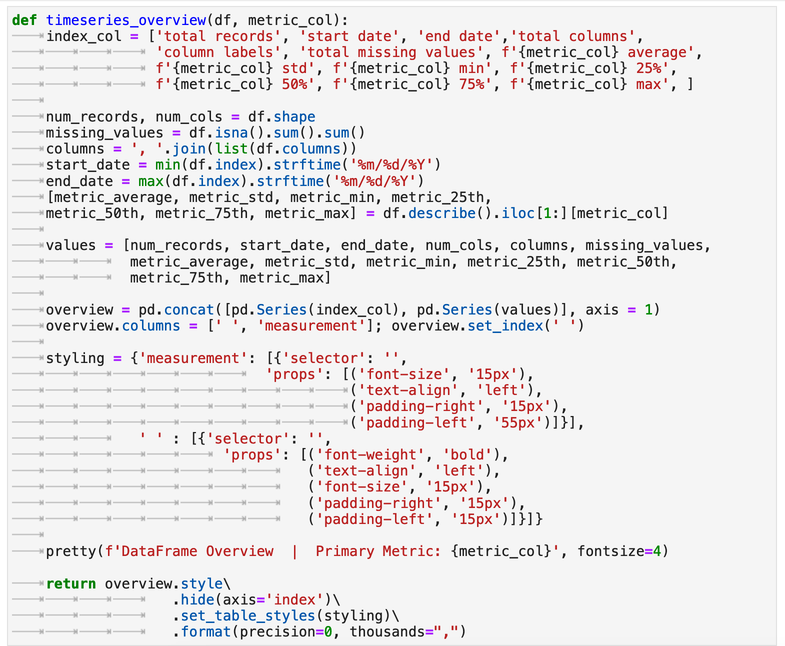
Here we can get a quick mental picture of the overall data beast we are intent on taming. This is an invaluable first glimpse that will be useful as a reference and backdrop when we are reviewing plots later and considering different contexts for the data. This function essentially combines many of the first steps any skillful data practitioner takes when first working with new data. We get the equivalent of df.describe(), df.shape, df.isna().sum().sum() (the total missing values from records in all columns summed up), df.index.min() and df.index.max() (the beginning and ending of the datetime range) all returned in one place. And I find this to be incredibly useful.
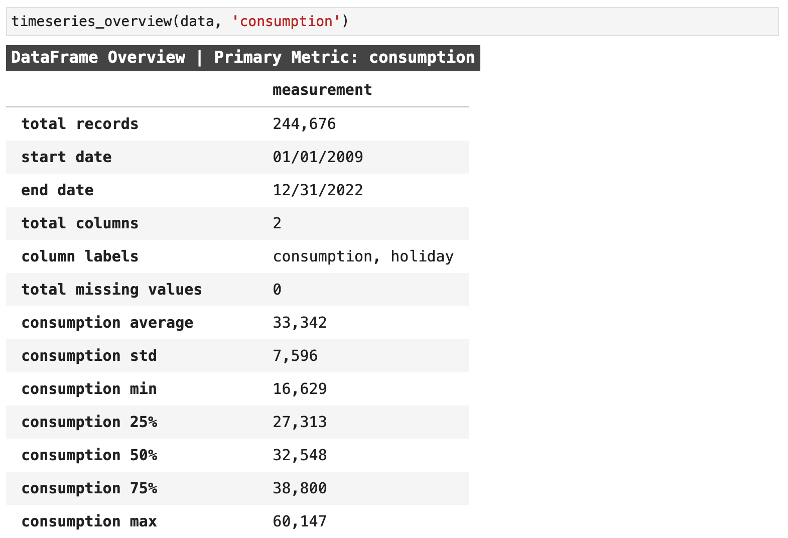
When beginning a time series project, I also find it is always useful to get an initial plot of the main metric of the data to check for any outliers or aspects that need to be further investigated. The data looks very clean, and so there will not need to be any outlier removal. I was struck, however, by the decline in energy usage in the UK from the beginning of our data's date range, January 1, 2009, to the end of 2022. There was nearly a 25% decrease in the maximum values, which is substantial.
We can also clearly see from this initial visualization the cycles of energy use in the UK, which we will later see rise in the winter and dip during the spring, summer, and autumn.
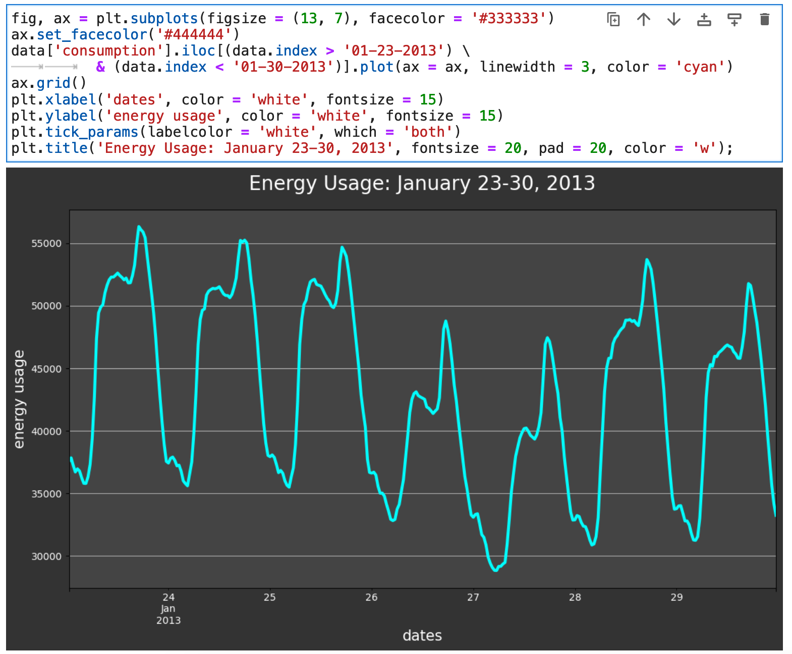
And if we zoom in closer and look at one week worth of visualized data, we can see micro trends in the usage of energy, with multiple mini-peaks each day. We will look at different times of day shortly and see these peaks in more detail.
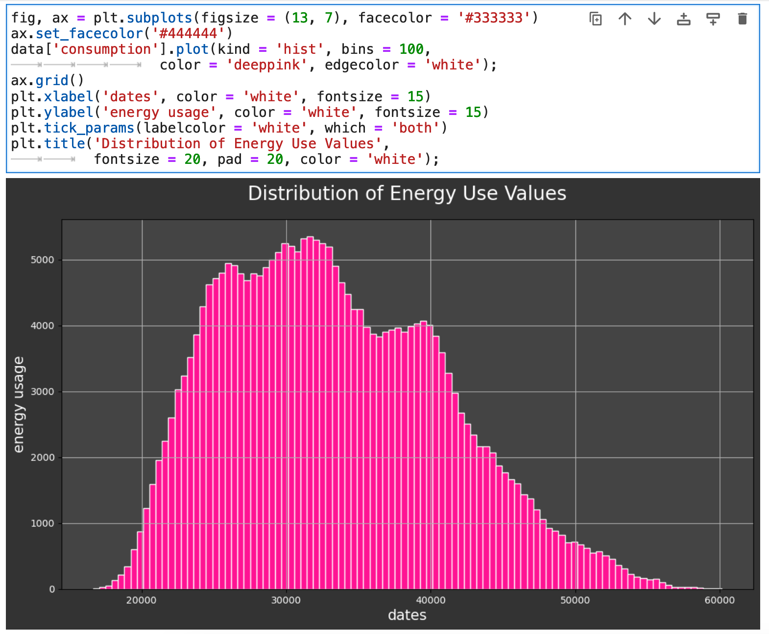
Another beneficial view of our data is the overall distribution of the main metric we are considering, which here is energy consumption measured in megawatts.
Sections: ● Top ● The Data ● Feature Engineering ● Investigating Correlation ● Lag Features ● Splitting ● The Model ● Results with Traditional Split ● Using Cross-Validation ● Making Future Predictions
2. Feature Engineering
When working with data that is essentially one metric and a datetime index, it is important to get creative with that little bit of data you start out with and try to organize it and move it around and squish it and stretch it in whatever way necessary to help the model find as much meaningful and actionable results as possible in the data. One easy way to get many new features and perspectives from which to view the data is to break down the datetime index into its many parts. There is so much more there than one might think.
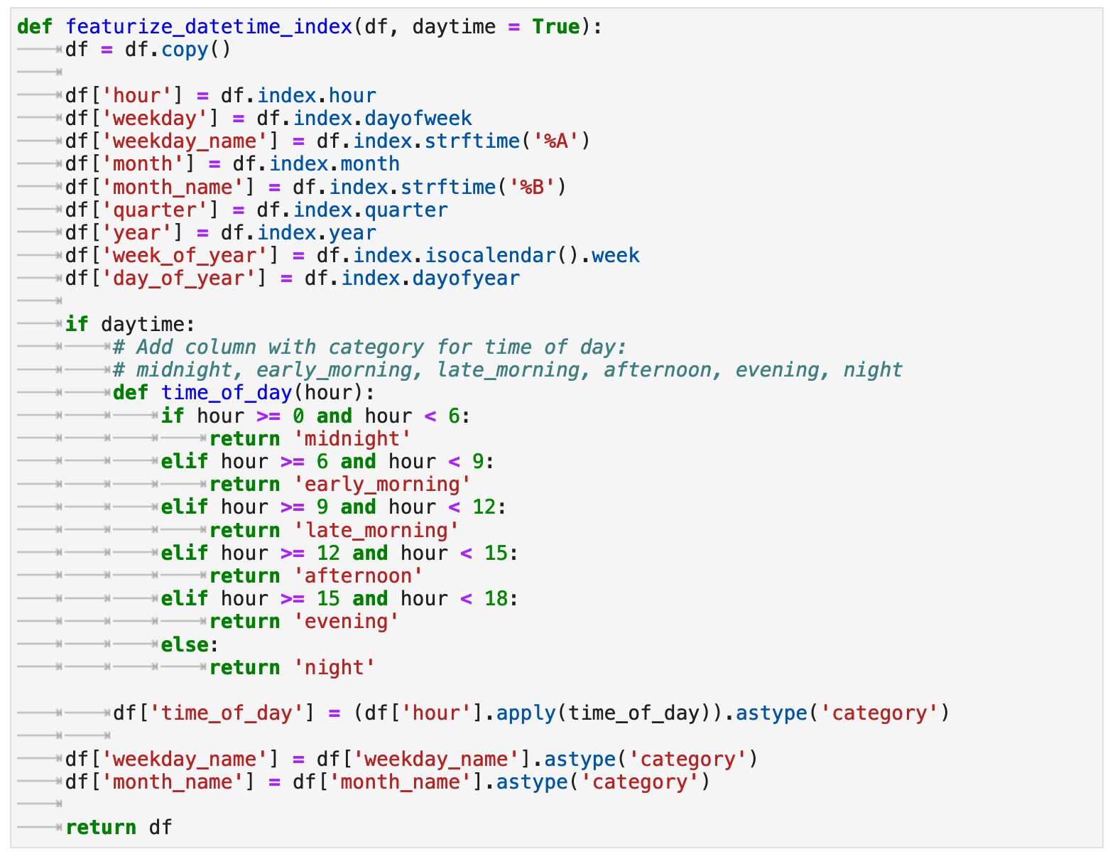
With the following function, featurize_datetime_index(), I am adding essentially 8 new features, 10 new columns, in all: hour of the day, day of the week (as a number), weekday name (for correlation visualization purposes later), month, month name (also for later correlation investigation), quarter of the year, the year itself, the week of the year, the day within the year, and the categorical time of day. That is a lot that we get out of that one datetime index!
Now we can get a look at the vast array of new features we just extracted from one series of dates. And this will help our model find more patterns within our data and lead to better accuracy for our predictions.
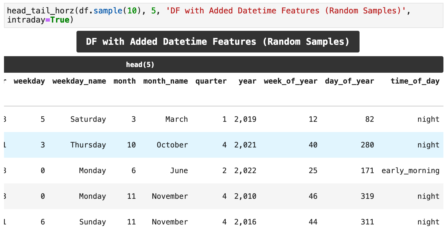
Here is the grand totality of our new features: 12 where there once were only 2!
Sections: ● Top ● The Data ● Feature Engineering ● Investigating Correlation ● Lag Features ● Splitting ● The Model ● Results with Traditional Split ● Using Cross-Validation ● Making Future Predictions
3. Investigating Correlation
Now that our data has all these fancy new features, we can investigate the correlations between the features and the energy consumption in megawatts for the entire UK. This will give us an even deeper understanding of the data and its structure. The following function takes the dataframe, two features, one of which for our purposes will always be the consumption column, our main metric. We will also pass the ordering along the x axis whenever the feature we are comparing to consumption is non-numeric, so that we can get the proper ordering, rather than the months of the year or the days of the week being ordered alphabetically, for example. Let's check out some correlations with boxplot_correlation()!
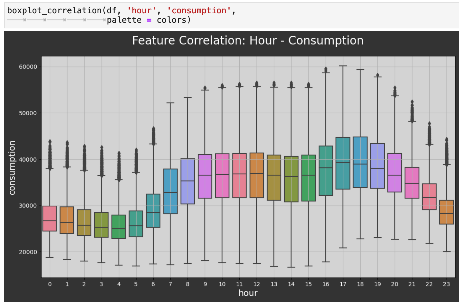
First, we will get the relationship between the hour of the day and energy consumption. Here we can see in more detail the peaks and dips we saw in the week-span plot above. The highest energy usage is in the evenings when many people get home from work and are most active in the home. And as expected, the lowest energy consumption is when most people are fast asleep.
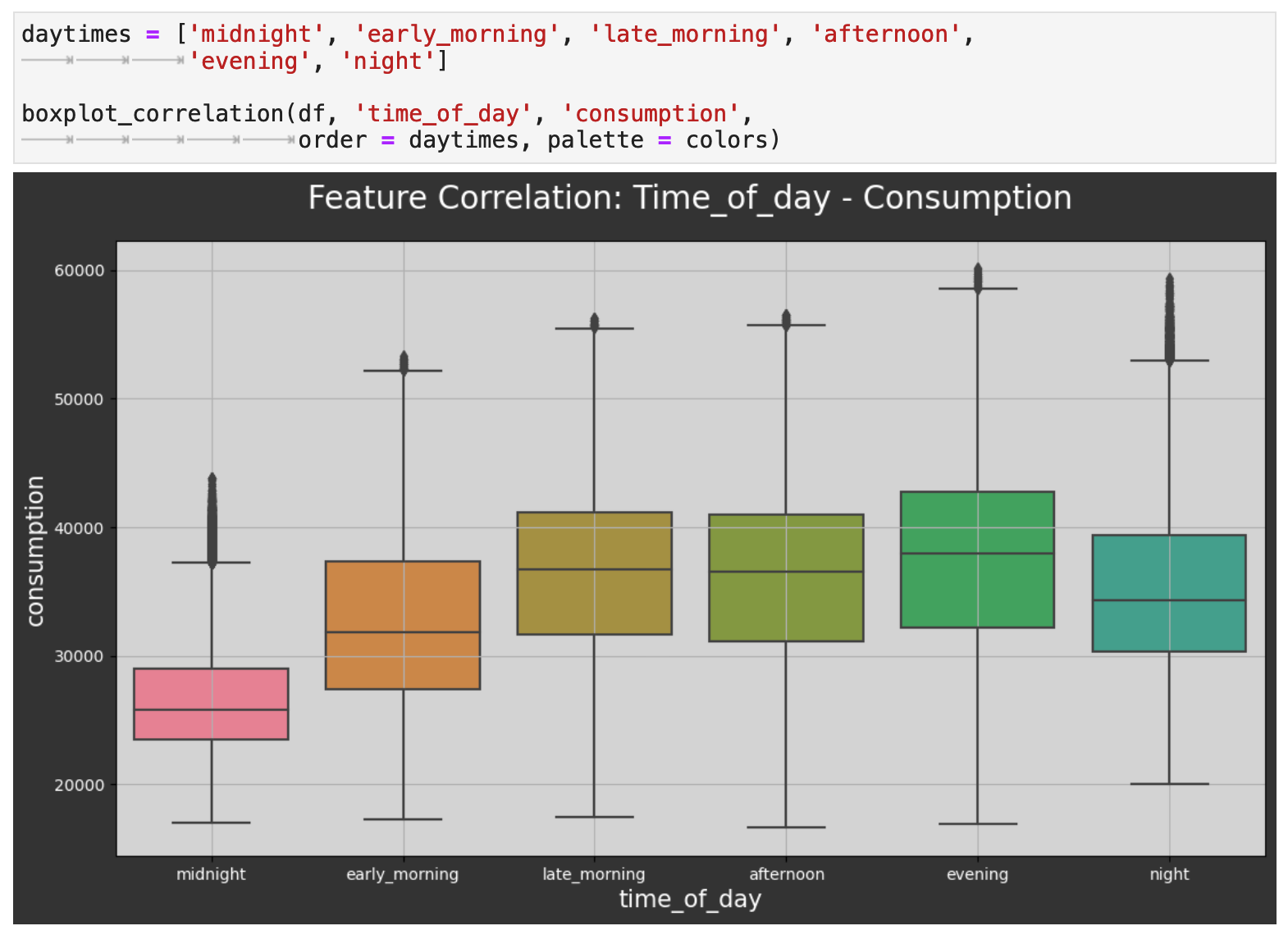
Next, we investigate the relationship between the categorical time of day and energy consumption. This follows the same trend as the hourly plot above. As we can see again, the evening is when consumption reaches its peak, and the middle of the night is when it is at its lowest.
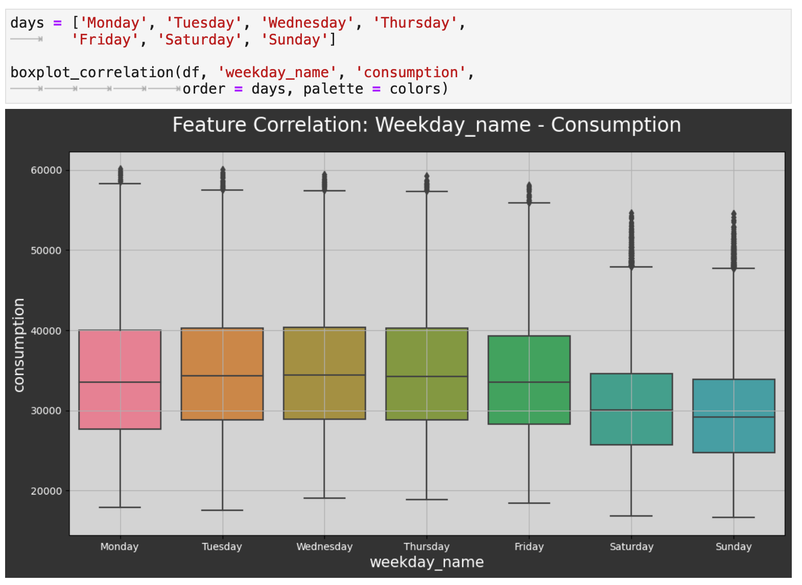
The next level out is day of the week, and we can also see a trend here. The weekends tend to be the lowest consumption days of the week. This would be interesting to investigate further and possibly compare to other countries. At first glance, one might assume, for example, that in the UK, people spend more time outdoors doing activities that require less energy consumption than their work and other weekday activities.
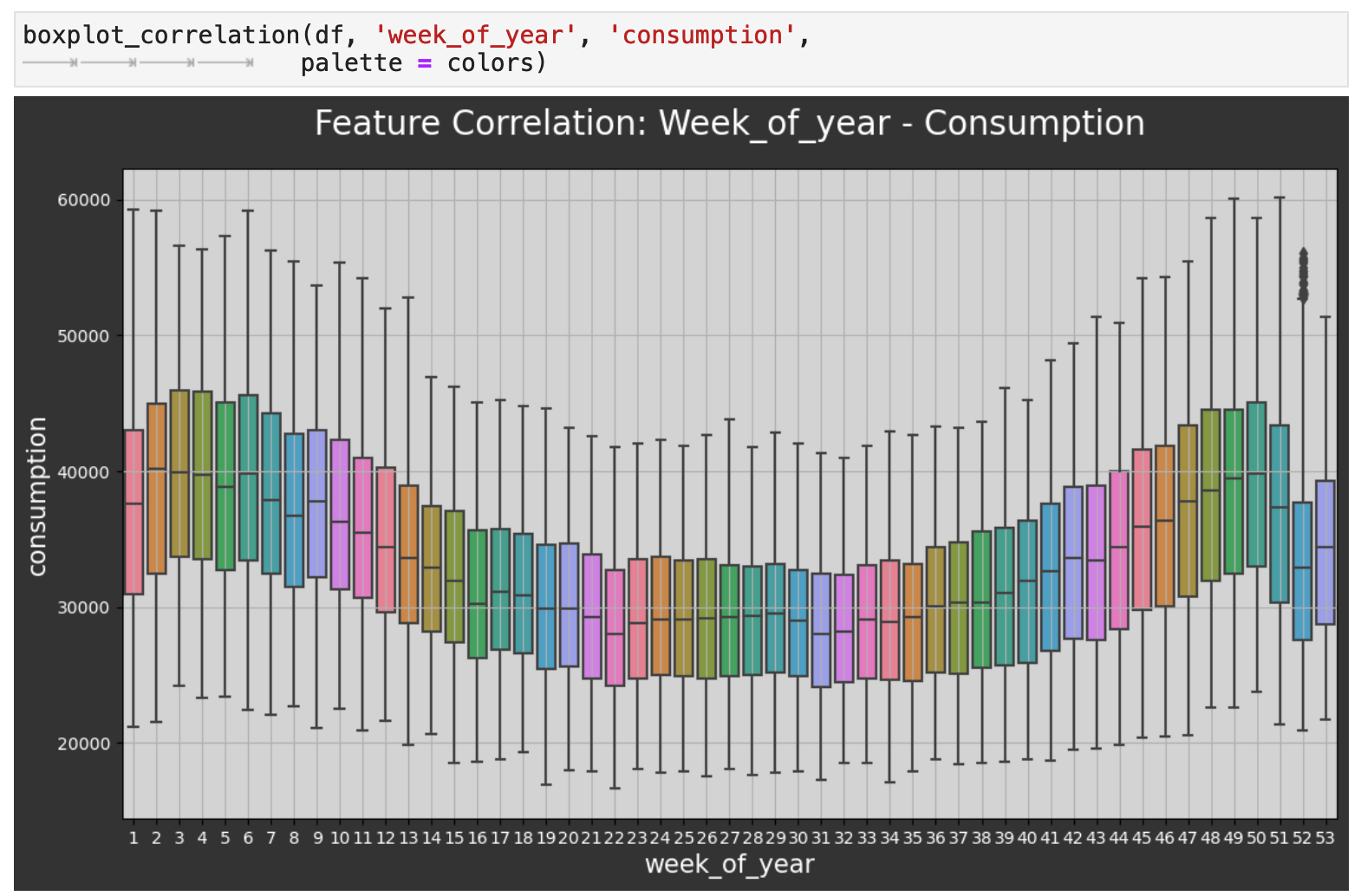
Zooming out even farther now, we can look at the comparison across the weeks of the year. Here we witness the same highs and lows we saw in the initial visualization of the overall data, only now we have finer detail. One curious observation is how even though winter weeks are when the UK sees their highest energy consumption, the weeks just around Christmas and New Year's experience a large dip in energy use. Perhaps this is due to international travel out of the UK during the holidays.
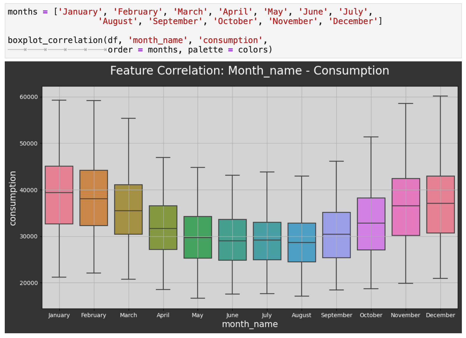
Now we will zoom out to the level of months, and as expected, we can see that energy consumption dips significantly during the warmest months of the year and is at its highest during the coldest months. One would then surmise that the difference is the use in energy for heating mainly.
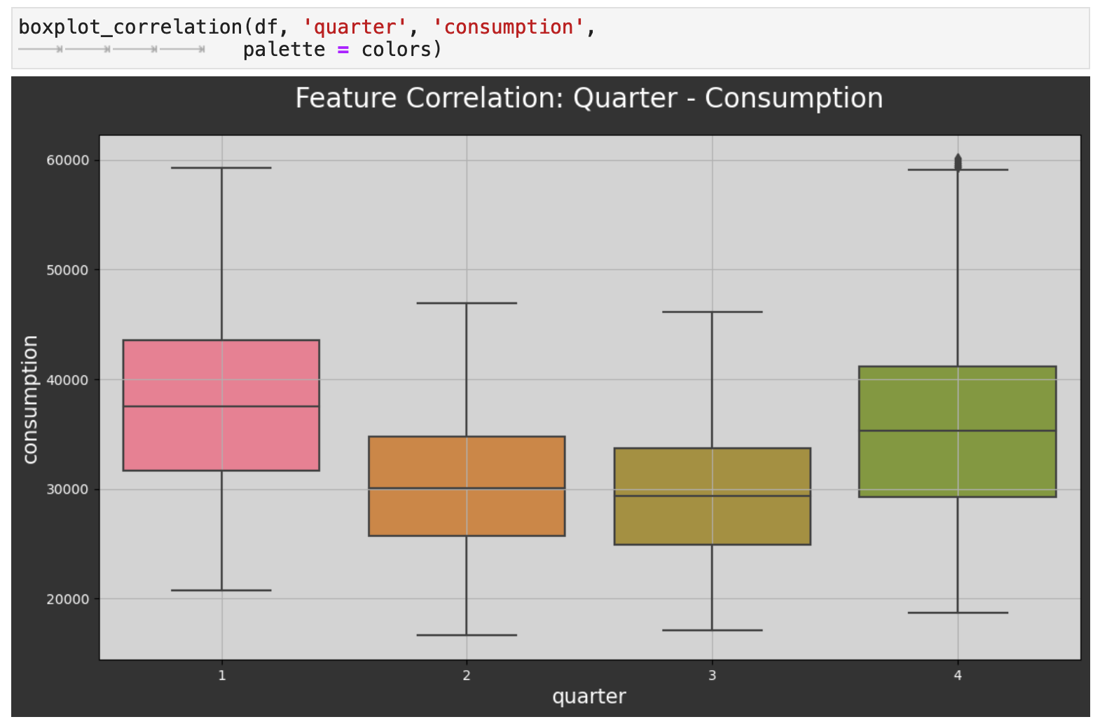
Looking at the data by the quarters of the year reflects the same energy consumption patterns.
Sections: ● Top ● The Data ● Feature Engineering ● Investigating Correlation ● Lag Features ● Splitting ● The Model ● Results with Traditional Split ● Using Cross-Validation ● Making Future Predictions
4. Adding Lag Features
In addition to the features we added as extractions from the datetime index, we will also experiment with lag features. Essentially, these features tell the model to look back into the past, and use the target value for the given number of days back as a new feature. The goal is to give the model more opportunity to find patterns in our data for more accurate predictions. In this case, the lag features will be values from the energy consumption column, our main metric. The following function, year_lags() will take care of these operations for us.
To utilize year_lags(), we create a lag_label_list, which contains tuples of numbers of days for lags and the desired resulting column labels for each. First, the function will save the consumption column as a dict called target_map. Using the various increments in the lag_label_list, we will create a new column for each lag amount in the list. For the purposes of this project, we are using counts of days that are perfectly divisible by 7 and will line up with days of the week. We then use map() to map the values and create the feature columns.
For my examples, I will be creating lag feature columns for 1 year, 2 years, and 3 years of lags. I pass these to the function as the total number of days in each.
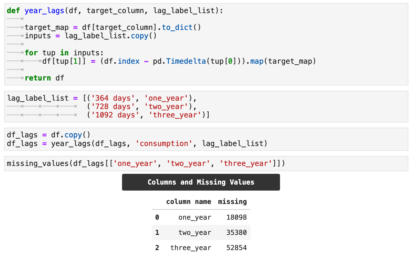
One aspect of lag feature addition to keep in mind is that it will naturally create null values in the lag feature columns, which correspond to the length of the lag.
Sections: ● Top ● The Data ● Feature Engineering ● Investigating Correlation ● Lag Features ● Splitting ● The Model ● Results with Traditional Split ● Using Cross-Validation ● Making Future Predictions
5. Splitting Time Series Data
For this project, we will be looking at multiple ways of wrangling the data and training the model. We will investigate the using lag features versus no lags as well as traditional train-test splitting versus cross-validation splitting and training.
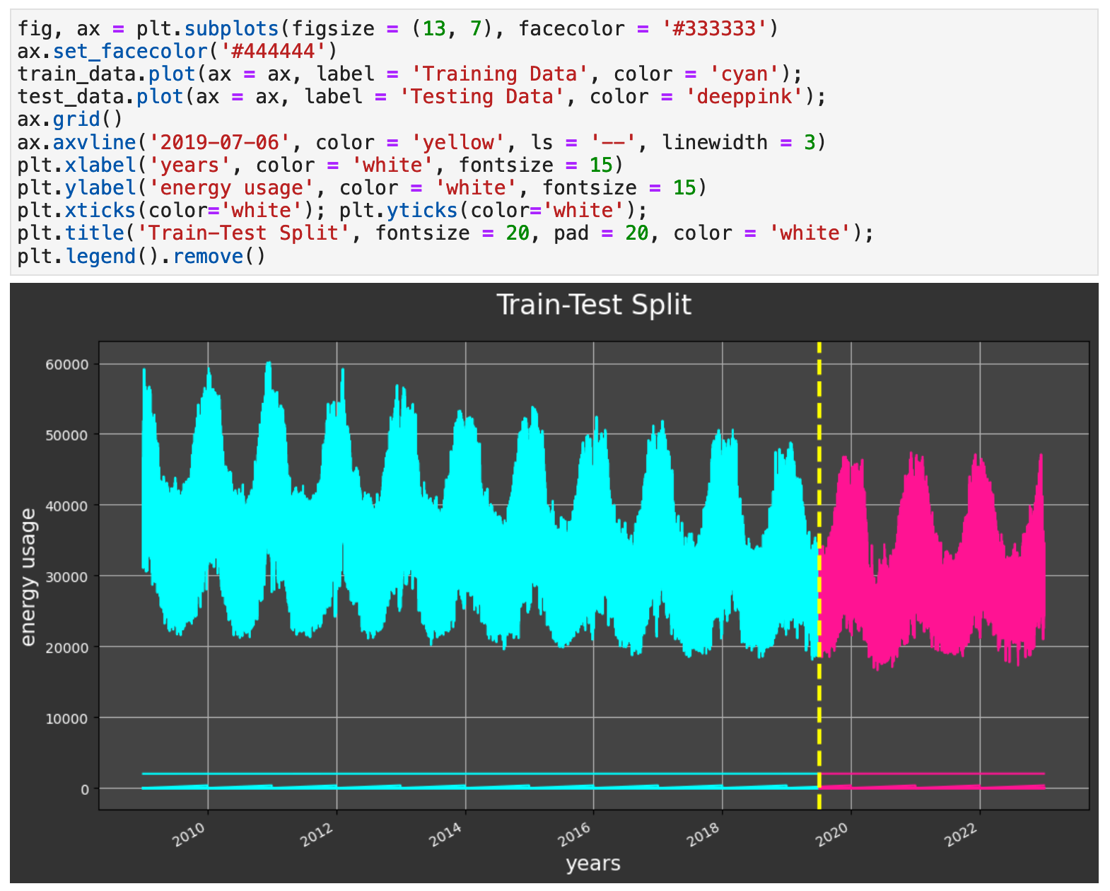
For our traditional split, we will use the first 75% of the data as our training data and the last 25% for testing / validation. The code below shows my process of creating this split and making sure there is no overlap or spillage of testing data into the training.
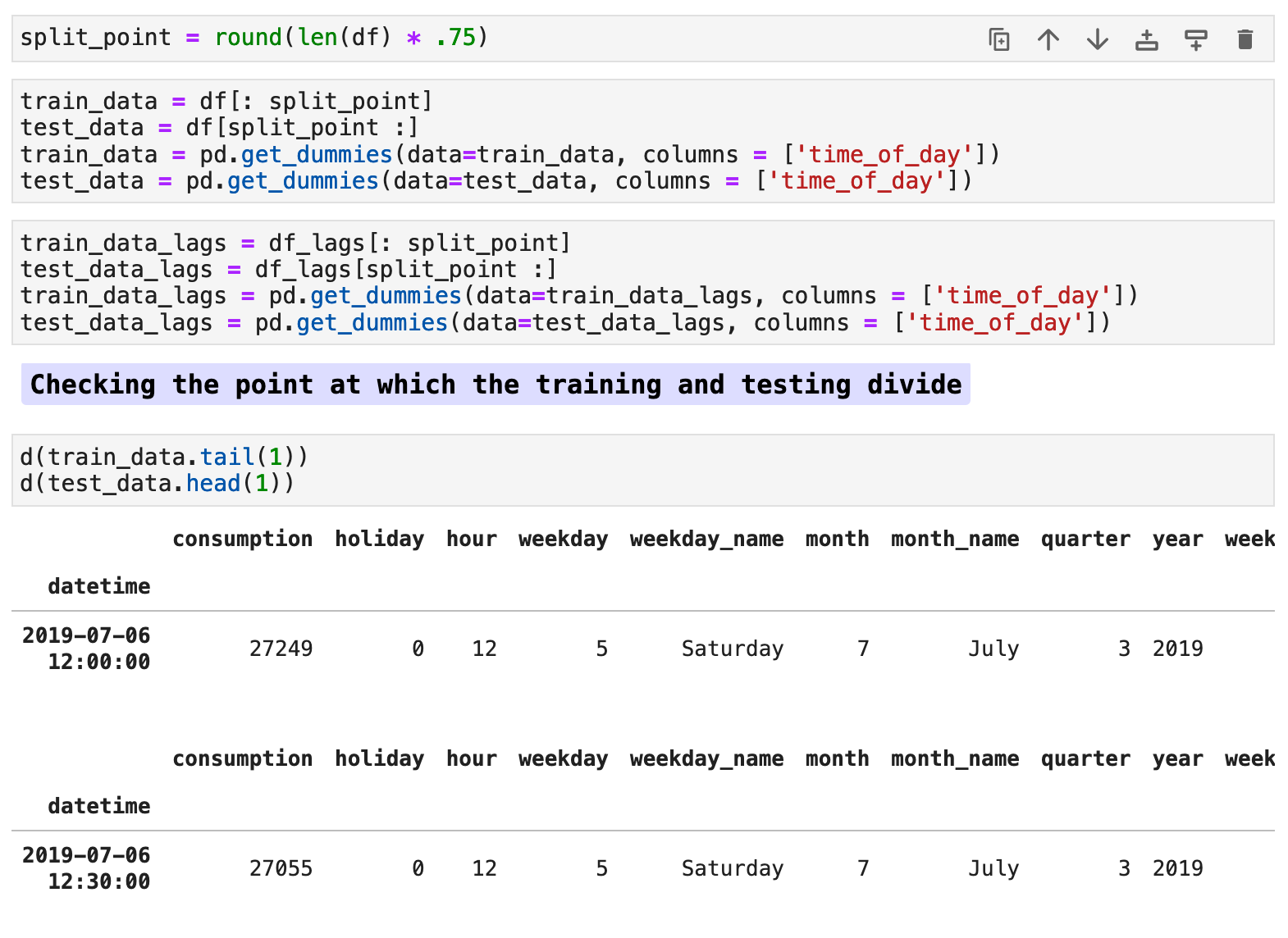
The following visualization shows the split of the data. The cyan colored data is our training portion. And the pink is our testing data.
Sections: ● Top ● The Data ● Feature Engineering ● Investigating Correlation ● Lag Features ● Splitting ● The Model ● Results with Traditional Split ● Using Cross-Validation ● Making Future Predictions
6. The XGBoost Regressor Model
Our XGBoost model is a robust and fascinating creature in and of itself, so be sure to read up on it here: XGBoost Regressor. And for an entertaining explanation of this model, please check out this article, XGBoost Regression: Explain it to me like I'm 10.
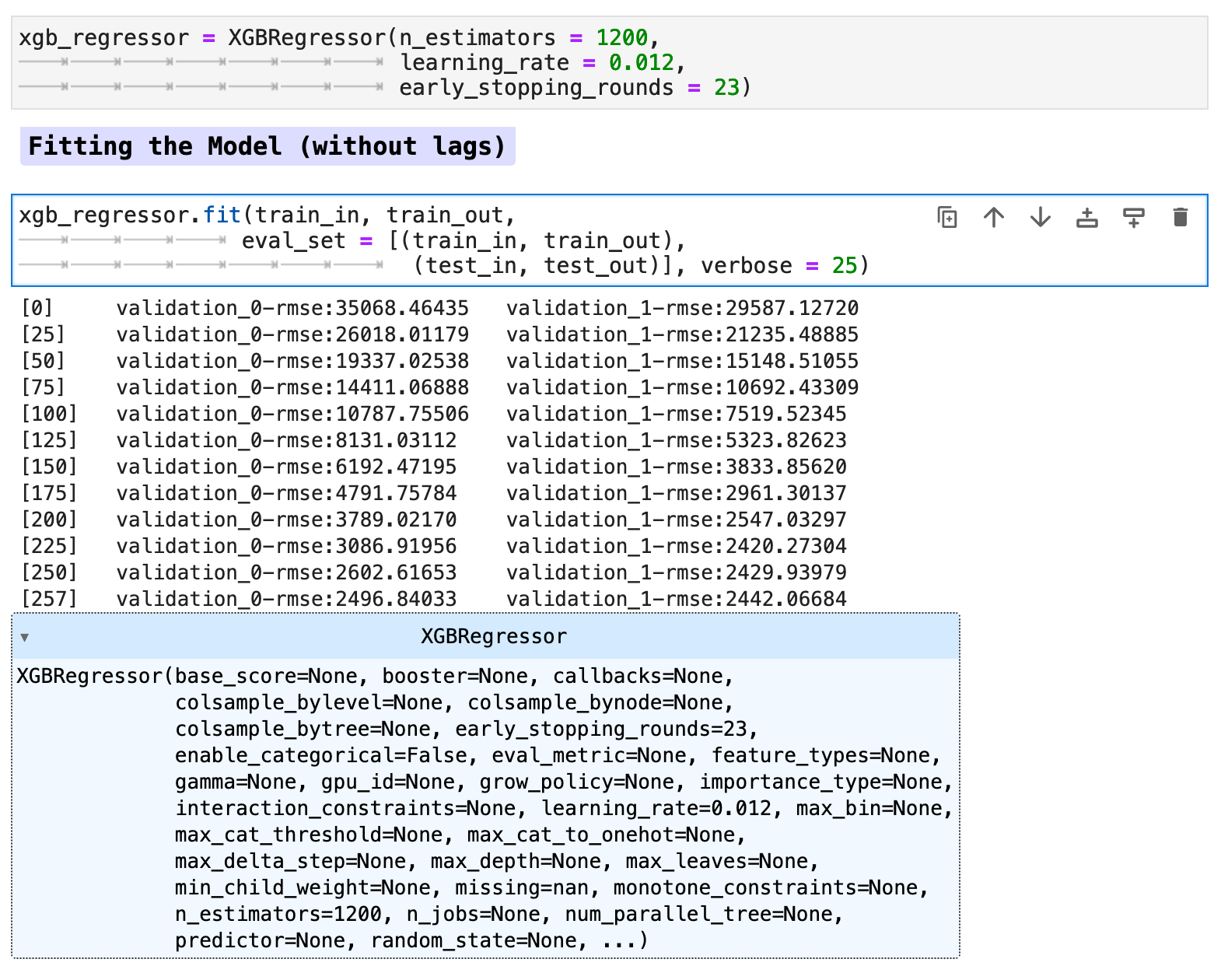
Now our data is ready for our model. Here I will be using both the data with lag features added as well as without for comparison purposes. First we will train the model on our data without the lag features.
And training the model with the lag features:
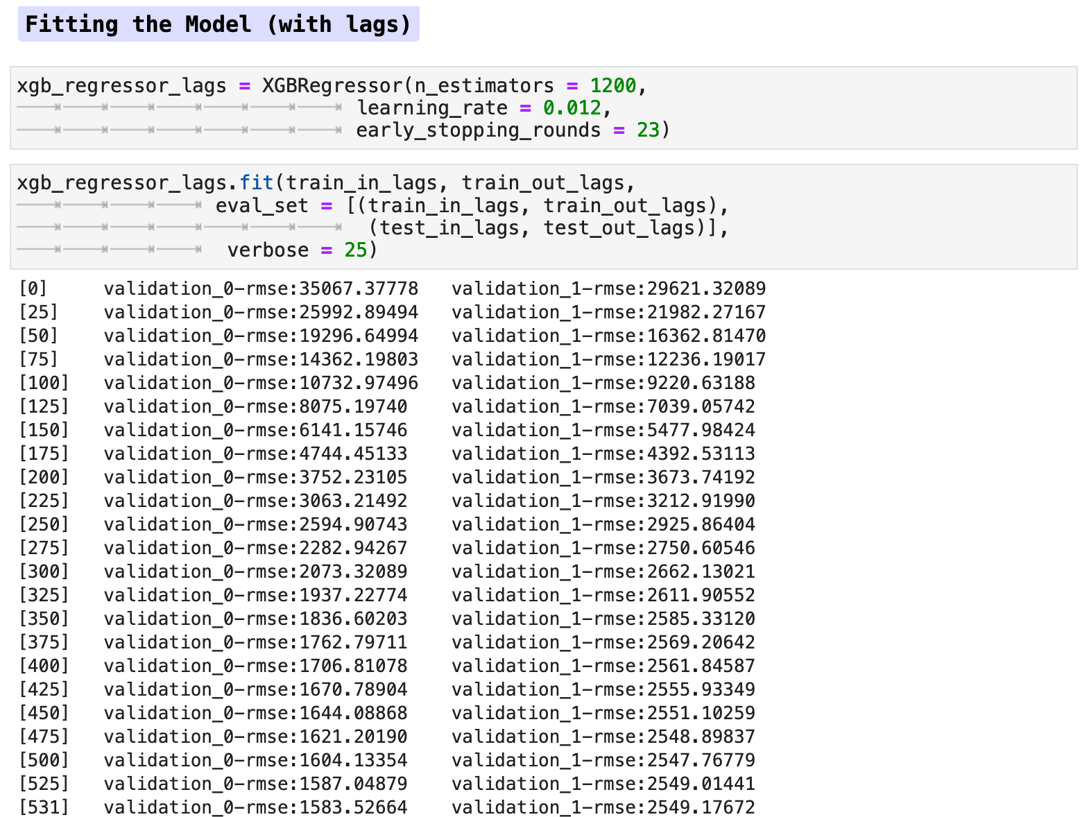
When we look at the feature importance, the lag features seem to make no difference, at least not when using the traditional train-test split method.
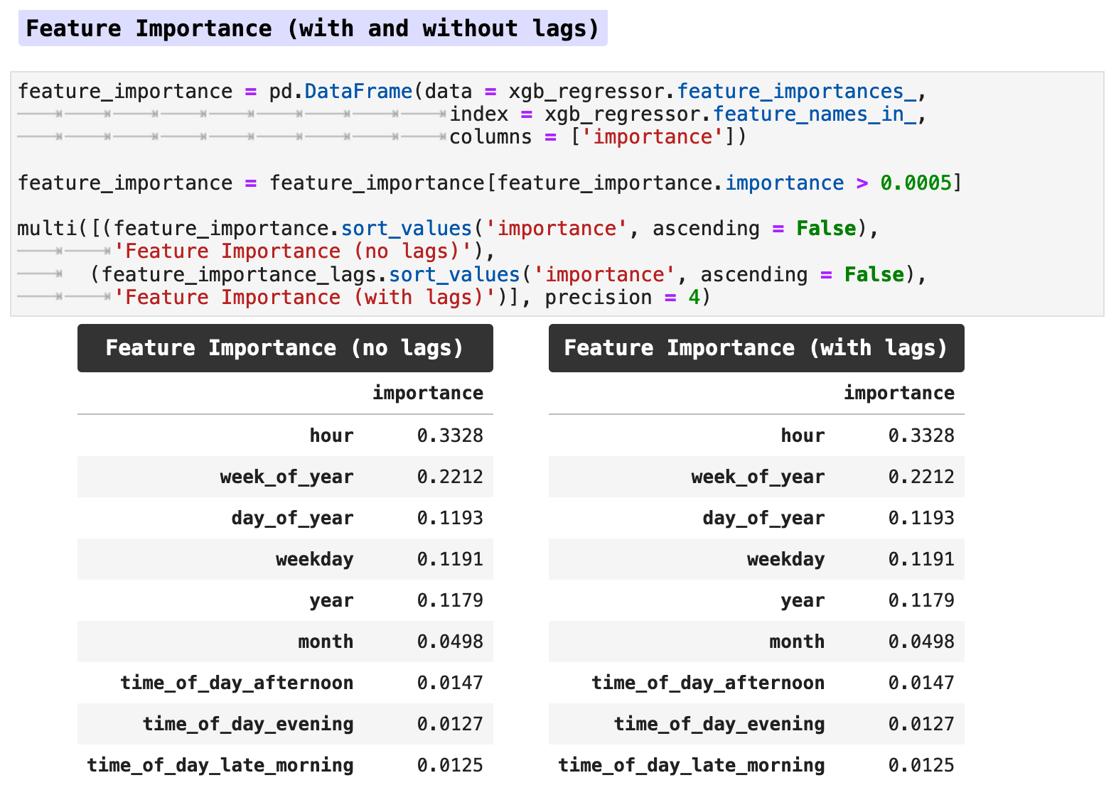
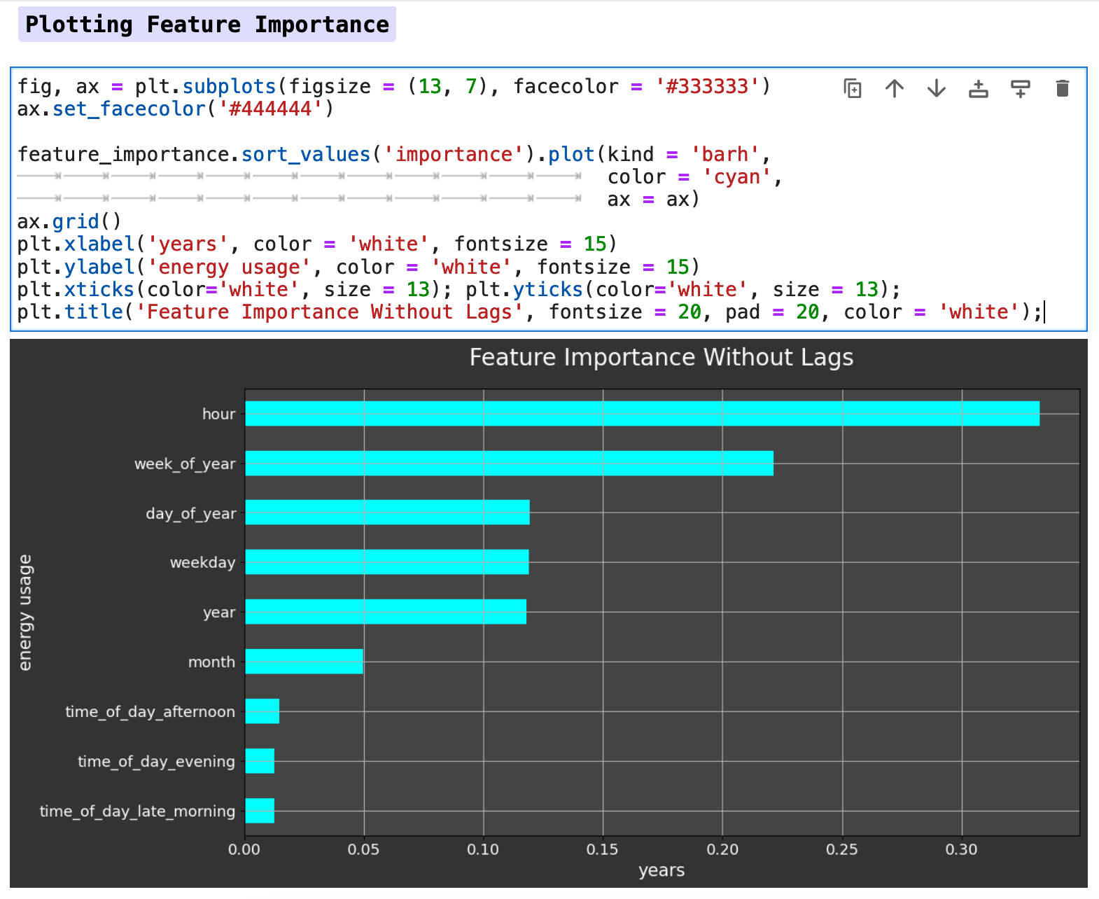
Below is a horizontal bar graph of the feature importance. We can see that the hour of the day has the most effect on our metric of energy consumption, followed by the week of the year, day of the year, and so forth. So the model is clearly finding the patterns we saw earlier in our visualizations.
Due to the lack of difference between the data with lag features versus the data without, I chose to work only with the data without lag features in this section for predictions. I did run both with and without lag features, and the prediction accuracy was almost identical, however without lag features actually scored slightly better across the board than did the model trained with lag features. Note: this was true specifically for the data when utilizing the traditional train-test split method.
Sections: ● Top ● The Data ● Feature Engineering ● Investigating Correlation ● Lag Features ● Splitting ● The Model ● Results with Traditional Split ● Using Cross-Validation ● Making Future Predictions
7. Results with Traditional Splitting
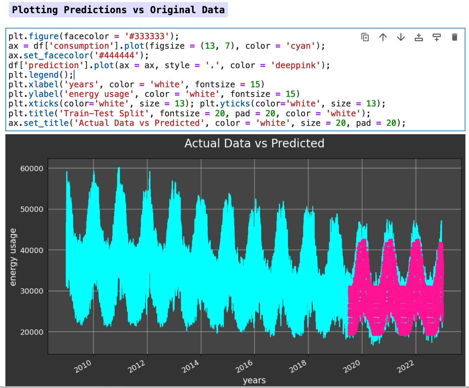
The following visualization shows the plot of target data versus the predictions. Our predictions are fairly solid and accurate, as you can see below.
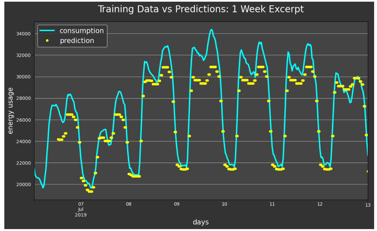
This one-week excerpt gives us even more detail by zooming in to see the accuracy more closely. The model predictions closely track the fluctuations of the energy consumption with just a bit of accuracy lost on the peaks.
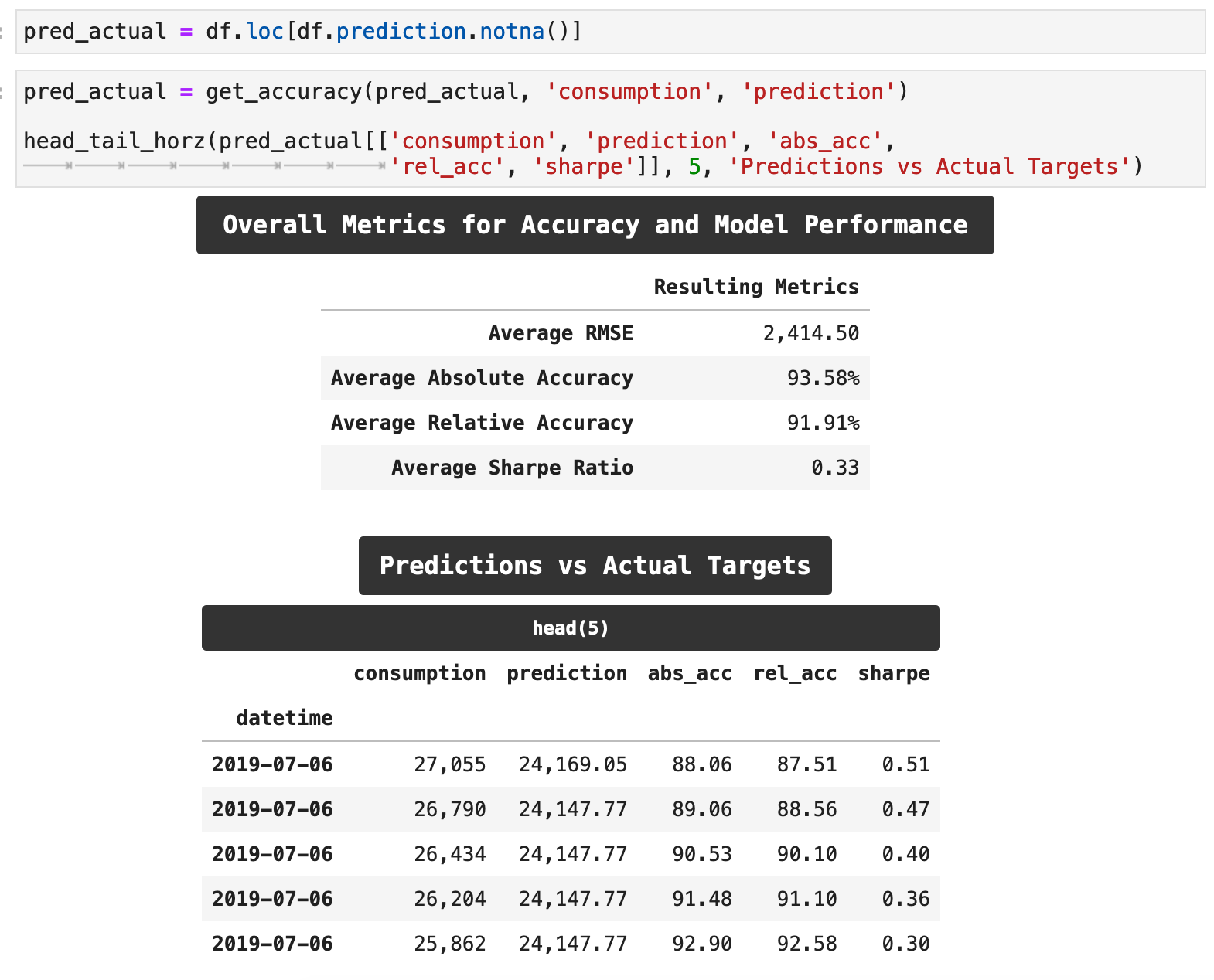
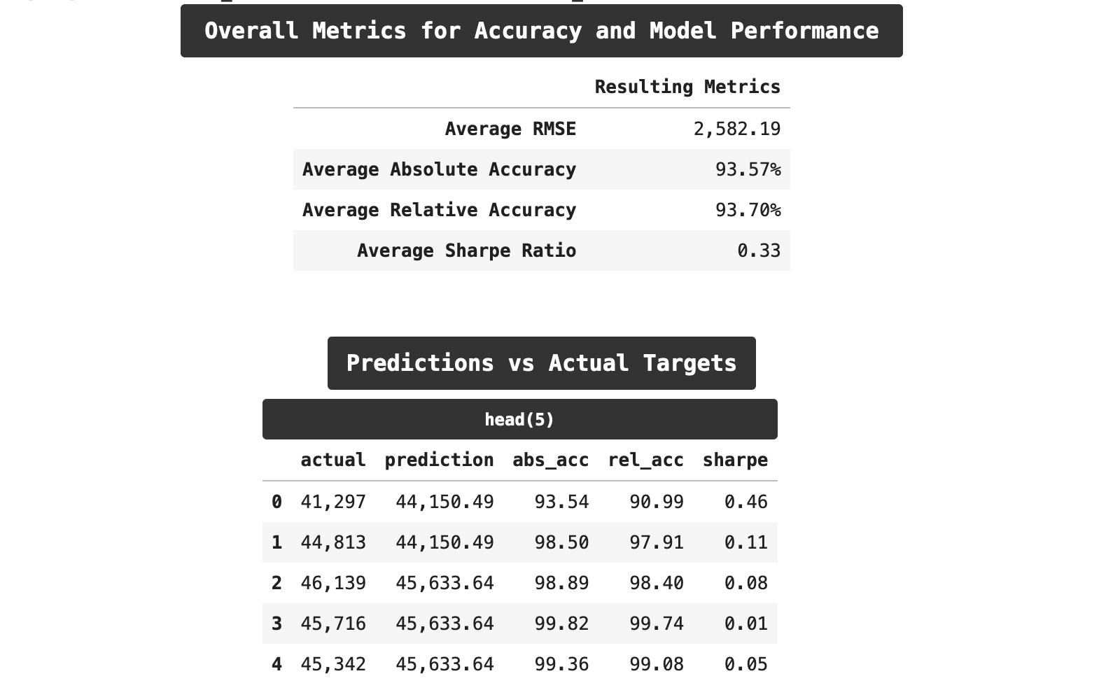
The following function , get_accuracy() will calculate the accuracy of this model and return a number of different metrics for evaluating the accuracy: the absolute accuracy, the relative accuracy, the sharpe ratio for accuracy, and of course, the RMSE score for our overall training and predictions.
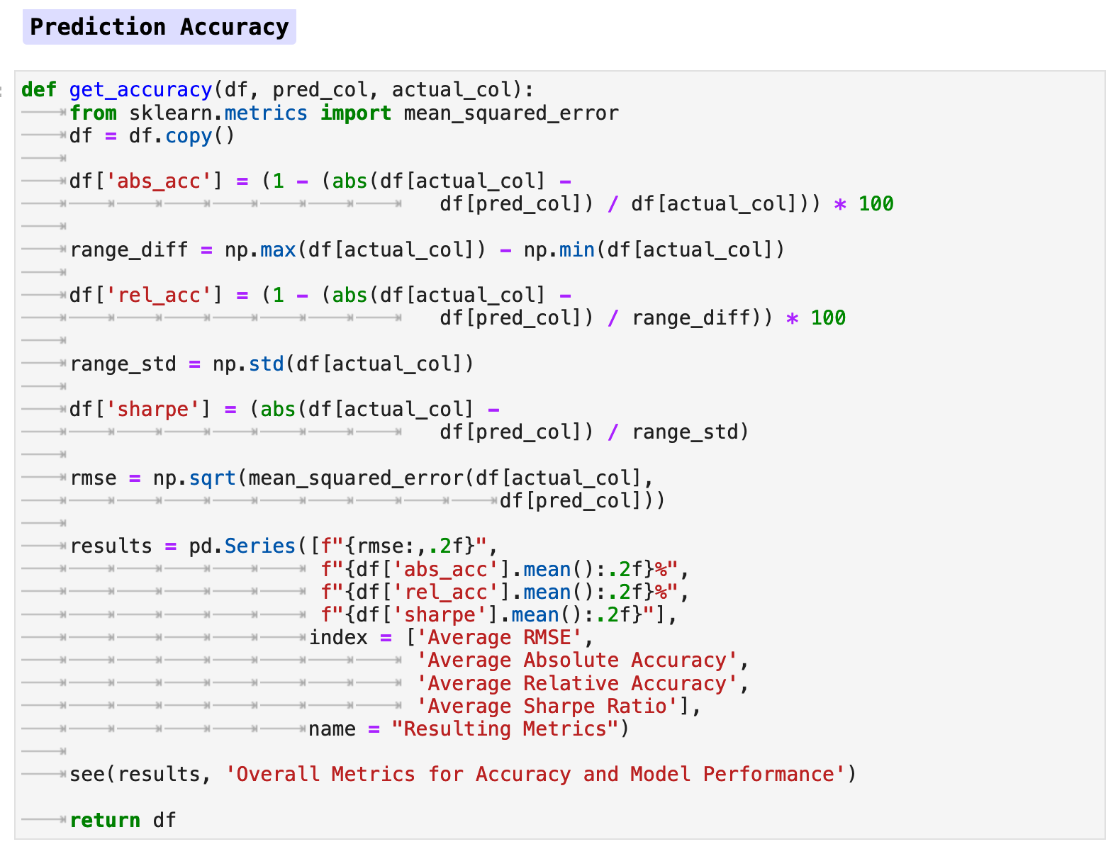
When we run this function with our data, extract our predictions, and compare them to our actual target data, we are able to achieve some very good results. Our overall RMSE score averaged out to just around 2,400, which is a considerably low error rate, considering that at the beginning of training, our error was above 29,000. Our absolute accuracy, which takes the accuracy rating of each prediction as compared to its respective target and then averages those across the board, is pushing 94%. And the relative accuracy, which is slightly more meaningful, also accounting for the overall range of values of our main metric, consumption, reached almost 92%. Not too shabby!
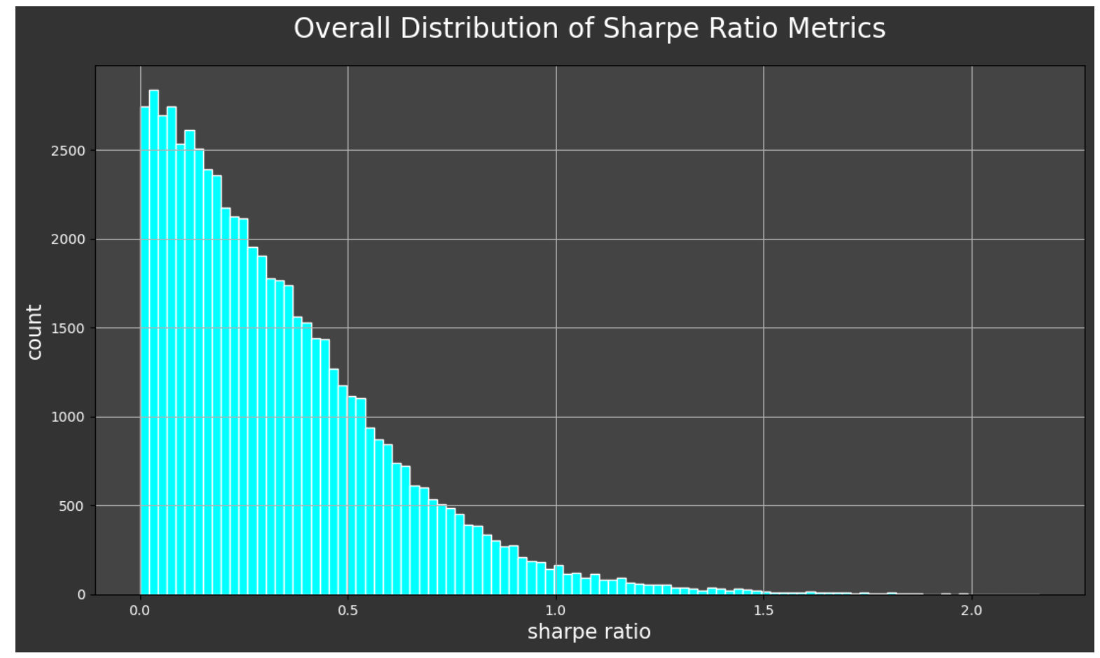
The sharpe ratio is a metric typically connected with investment statistics. However, it is also very telling in this context. The sharpe ratio is a simple risk / return ratio. In investment, it essentially tells us the advantage we receive in returns by holding on to riskier investments and weathering their volatility. For a detailed and entertaining explanation of this metric, check out this article.
Suffice it to say, if we can get below the 0.5-ish range on the sharpe ratio, then we are getting meaningful and actionable results. And the lower we get beyond that, the better. Here, we arrived at a 0.33. Compare this to when I trained the model before well-tuning the hyperparameters and got a o.54.
And if we look at the distribution of our sharpe ratio metrics over the entirety of predictions, we see that the vast majority of our predictions achieved a very good score in this regard.
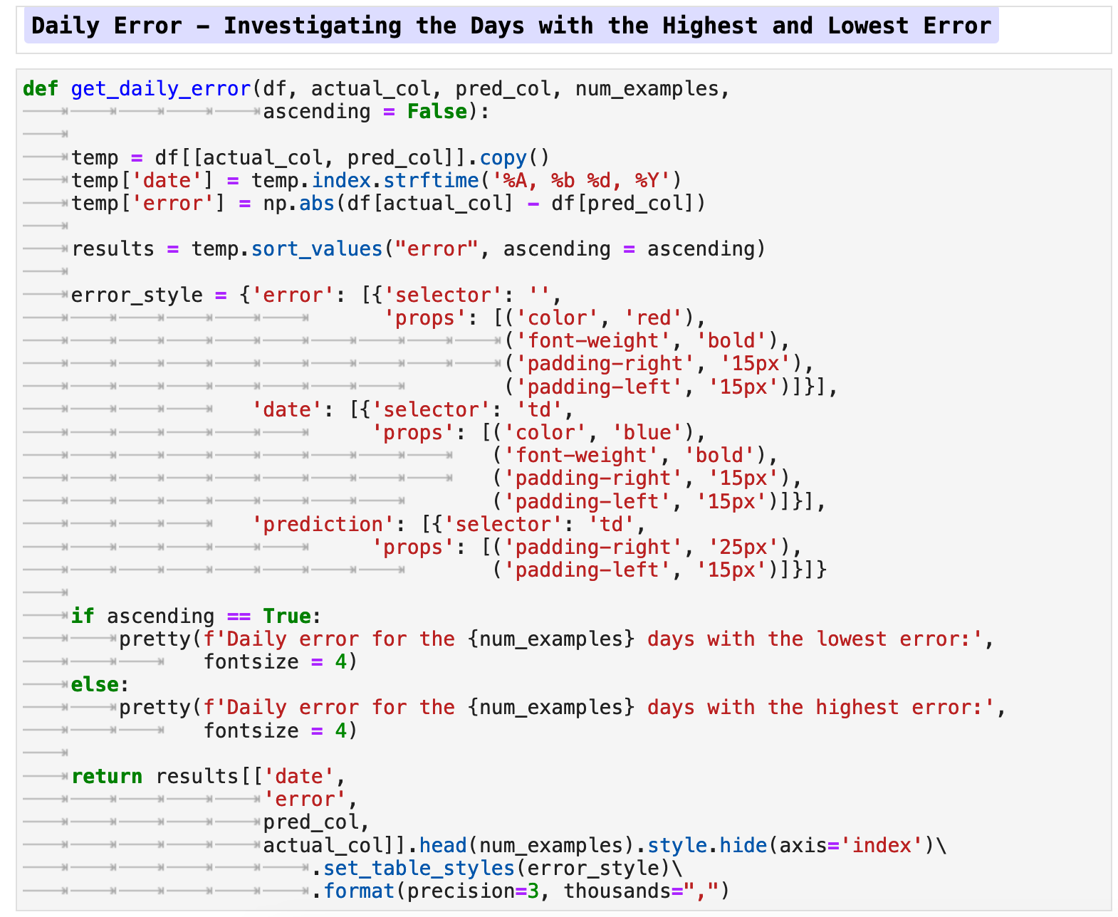
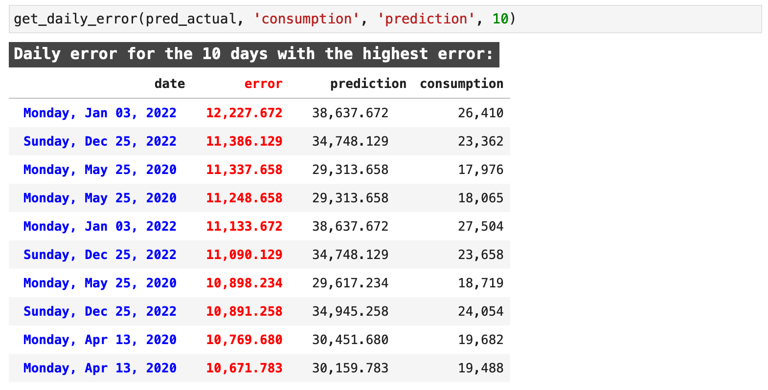
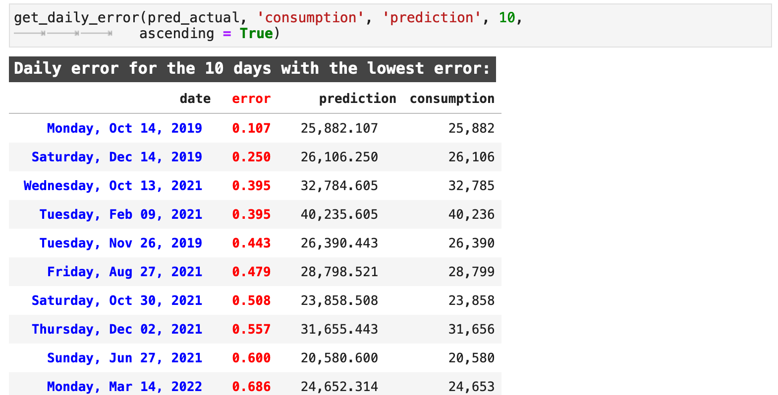
It would be interesting to look at the days when we were the most accurate versus the days when our model predicted the least accurately. The following function, get_daily_error() does just that. It takes the dataframe, the column name for the actual target values, the prediction column name, how many examples we would like returned and whether we want the output to to be ascending, i.e. the lowest error and best prediction results, or descending, which returns the worst predictions with the highest errors first.
The returned data highlights the error in red and the dates, in a very nice, human-readable format for quick comprehension, in blue. Here we can see a few key days where our predictions were particularly bad. For example, May 25, 2020, Christmas Day of 2020, and April 13, 2020 show up a number of times each just in the first 10 records with the worst predictions.
Likewise, we can look at the dates when we got the best results. These do not seem to be grouped in any particular fashion. And that is understandable with a model that has predicted so accurately. The accurate predictions are spread over a much larger span of timestamps.
Sections: ● Top ● The Data ● Feature Engineering ● Investigating Correlation ● Lag Features ● Splitting ● The Model ● Results with Traditional Split ● Using Cross-Validation ● Making Future Predictions
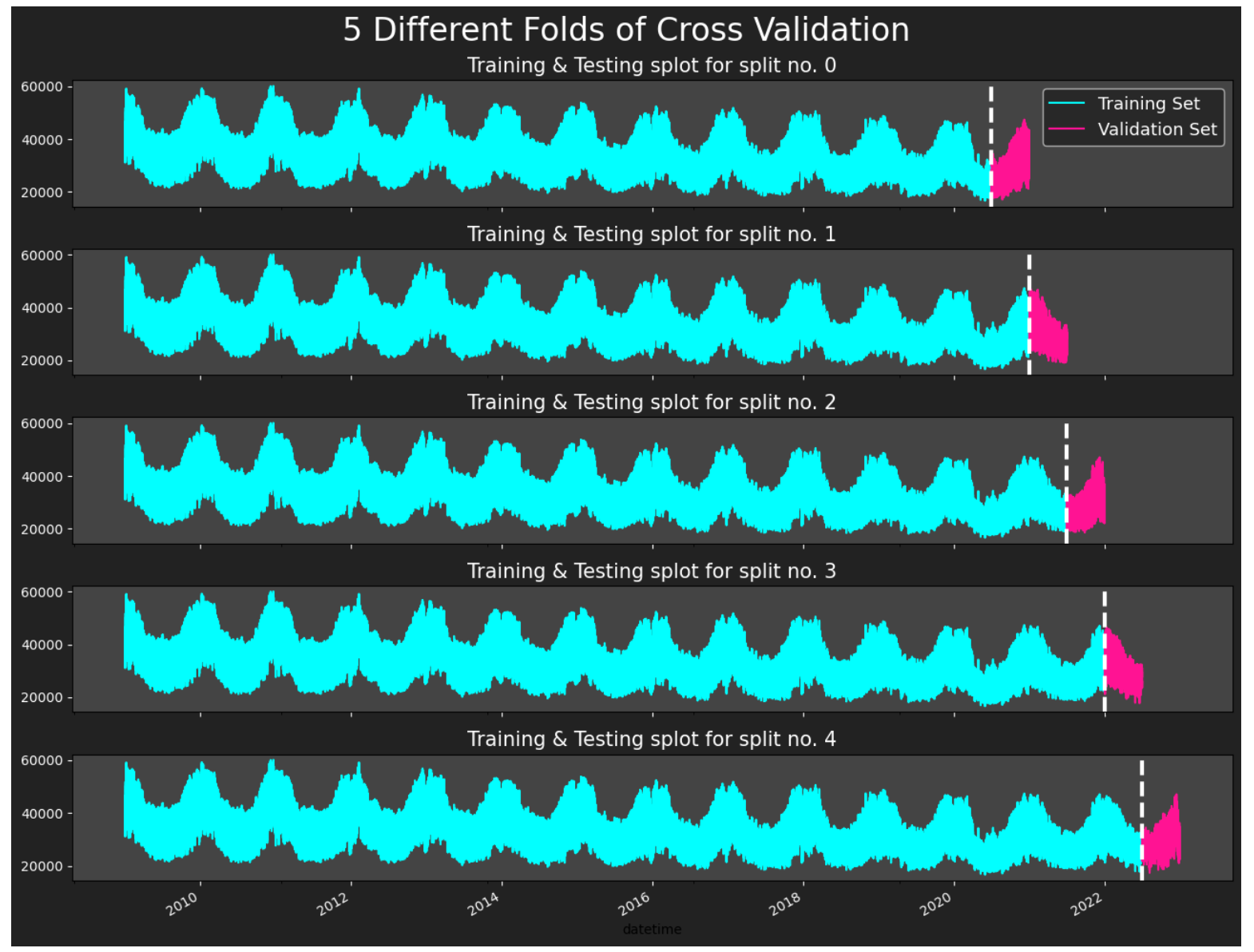
8. Using Cross Validation
Now we will train our model using a cross-validation method and the scikit-learn TimeSeriesSplit() module. Here, we will be testing 1 year increments at a time with a gap of 24 hours between each training and testing sample to enhance generalization and reduce overfitting. Note: we double check that the data is properly sorted by datetime index timestamp, or else this method will not function properly.
I give further explanation of this method in the markdown cells below, but for a more in depth view of the process and explanation of scikit-learn's TimeSeriesSplit(), please see the documentation here. And for a more thorough explanation, here is an article with a quick overview.
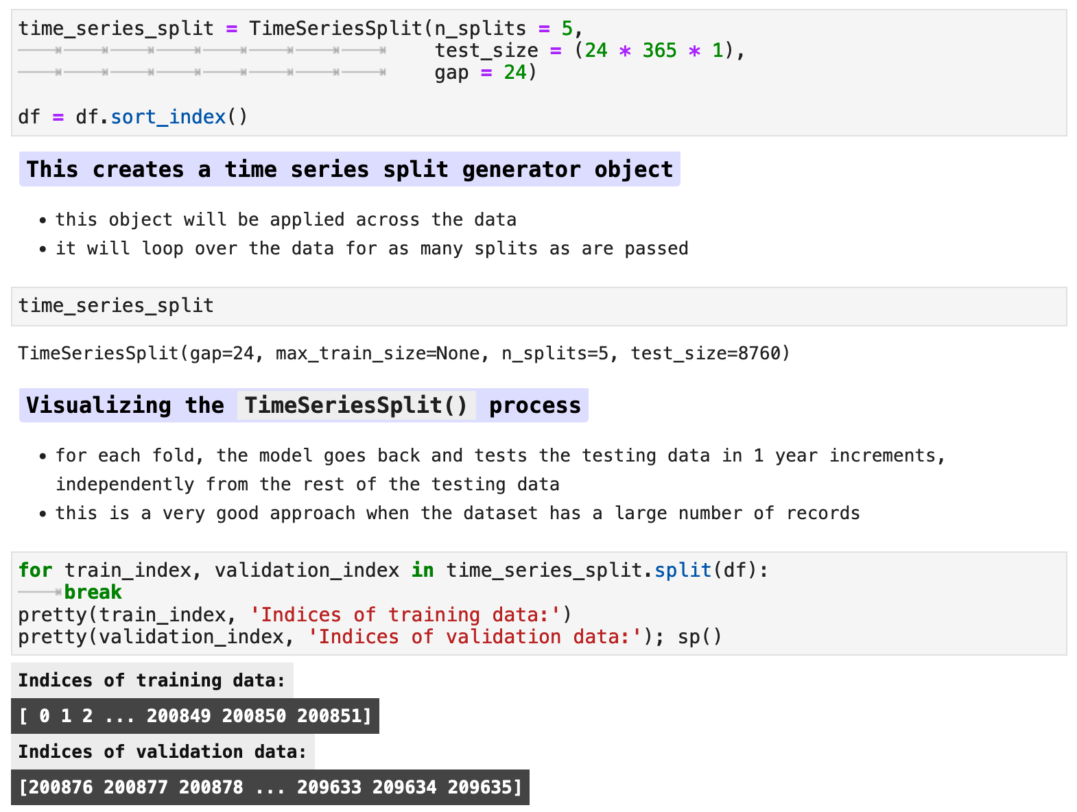
The following visualization shows the splits if we were to use 5 splits in the data. I chose to use 16 for training, but here you can see how the data is split between the various training and evaluation splits.
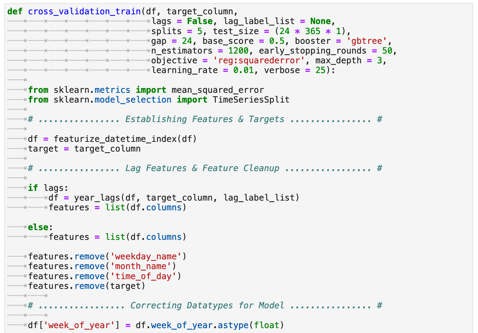
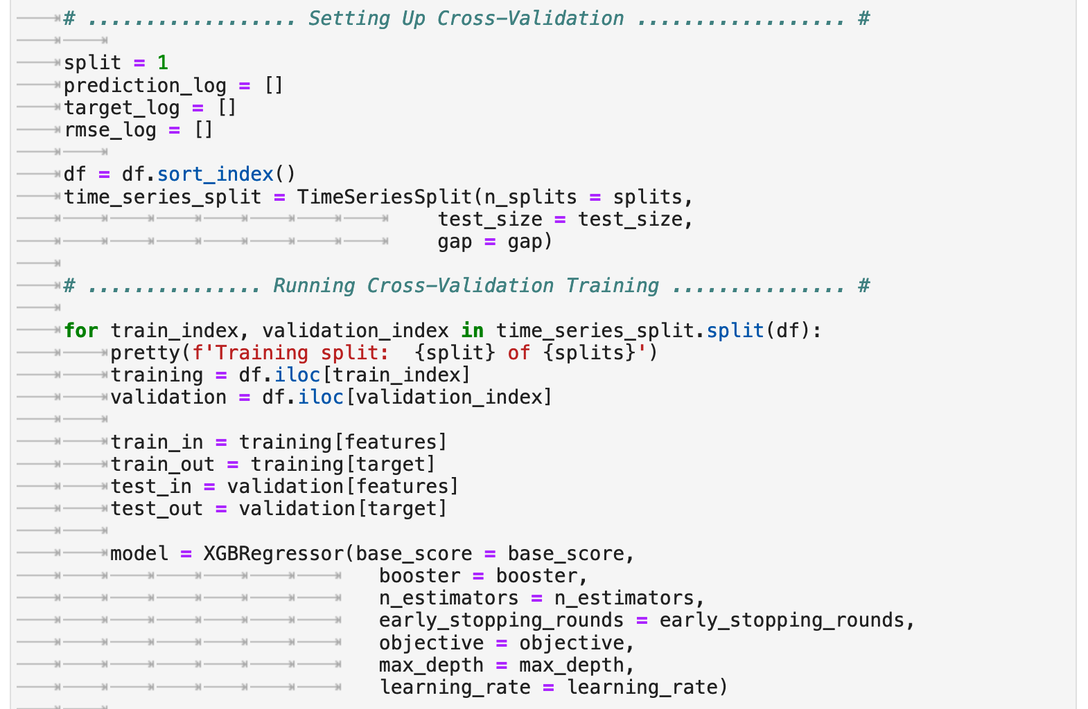
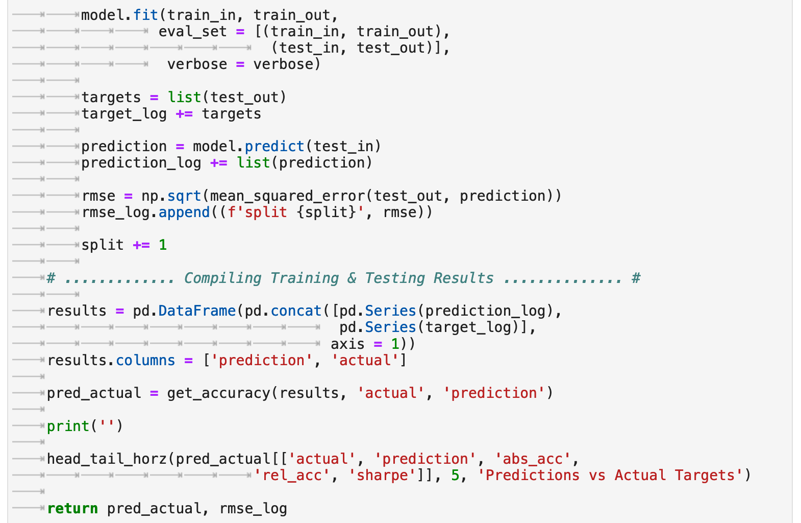
The following is a function I created which will perform all steps we covered previously for preparing the data only this time using sklearn's TimeSeriesSplit() as our method of splitting the data for testing. The function allows for the option of using lag features or not. And we will investigate both.
The following are the accuracy results from training with cross-validation without the lag features enabled. Interestingly, we get almost identical results to the prediction accuracy using the traditional train-test split. By some metrics, we actually even scored a bit lower this time.
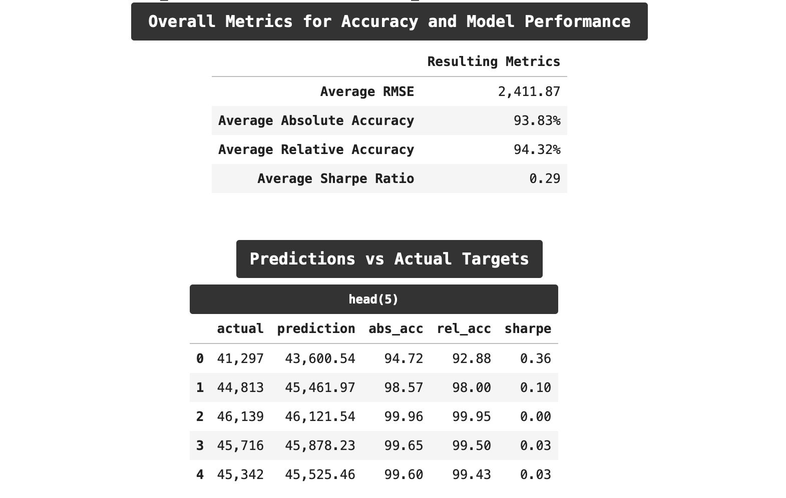
Now let's look at the results of using cross-validation and incorporating lag features. Here we get the best results. Our RMSE scores are lower by a small amount. Both of our accuracy scores are lower, and surprisingly, we even outperformed on relative accuracy as compared to absolute accuracy. But most encouraging is the drop in the sharpe ratio. We are down from 0.33 t0 0.29, which may not seem like much numerically speaking, but those familiar with the trials and tribulations of machine learning know that is significant progress!
Sections: ● Top ● The Data ● Feature Engineering ● Investigating Correlation ● Lag Features ● Splitting ● The Model ● Results with Traditional Split ● Using Cross-Validation ● Making Future Predictions
9. Making Future Predictions
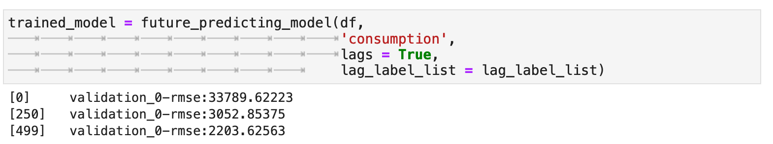
To make future predictions, we go over the same steps we have done so far, but this time rather than testing our model on a testing set, we will retrain the model on the entirety of the data and create a dataframe of predictions that forecasts into the future. I have created the following function, future_predicting_model to streamline the process, combine all these steps, and output a trained model for the purpose of future prediction.
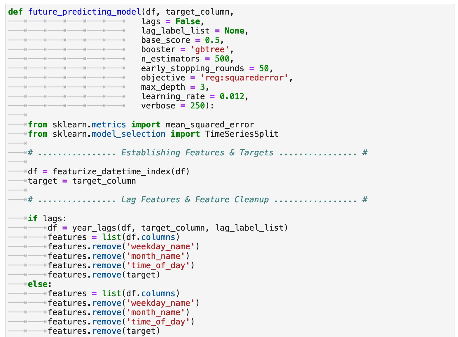
Due to the success above with lag features, I decided to incorporate them into our future predictions as well. We end up with a robust model and a very nice, low RMSE score!
Now that the model is trained, we can create an empty dataframe with a datetime index for the span of time for which we want to make predictions. In our case, it will be one year out from the last date included in the training data. The frequency of predictions will be every hour. And here, we can view the prediction range that will serve as our index.
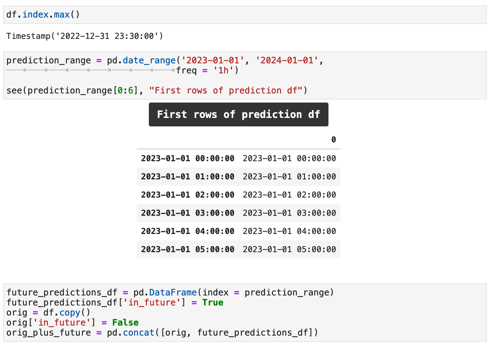
Above, I have also created a boolean column called in_future. This will indicate for a record whether or not it is a future prediction or if it comes from our original data and is in the past. I also have concatenated the past data with the template for our future predictions.
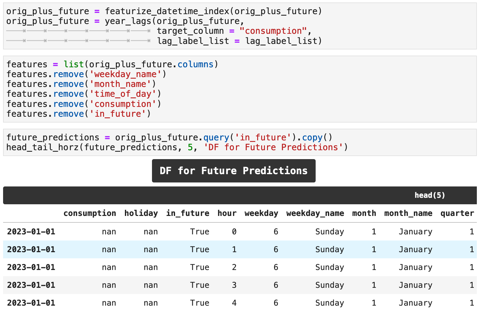
The code below featurizes the data as we have done previously, utilizing the new datetime-created features and the lag features. It also removes the features that were only included for visualization as well as the target column and in_future column from the features list that will be used with the model for predictions. This results in a dataframe for future predictions that has NaN values currently. We will fill these values with predictions shortly.
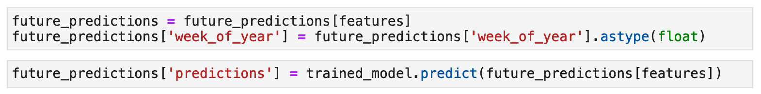
To get our future predictions, we use the trained model output from the future_predictions_model function.
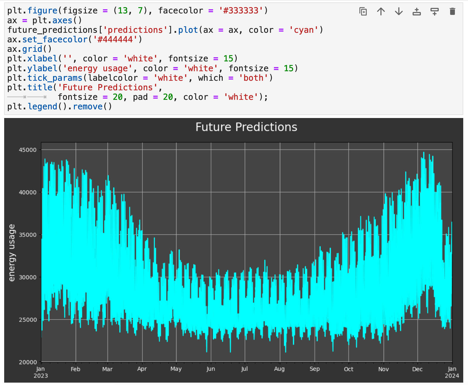
And now we can visualize our future predictions. They follow exactly the same trends as we saw in the data from 2009-2022. And we can surmise that the accuracy will be well within the mid-90s, as we have seen with our previous training-testing results.
So there you have it: time series prediction with XGBoost! Check back soon for more articles on the topic of time series prediction, where I plan to explore various libraries that streamline this process even further and hopefully will lead to even better results!
Happy training and data wrangling!
Sections: ● Top ● The Data ● Feature Engineering ● Investigating Correlation ● Lag Features ● Splitting ● The Model ● Results with Traditional Split ● Using Cross-Validation ● Making Future Predictions