🏅 The Olympics: Deep Data Analysis


This is a comprehensive project on data import, data cleaning, data merging,
and statistical analysis, as well as advanced data visualization with
Seaborn. The data for this project is incredibly interesting and provocative, covering all of the Olympic medal-winning athletes from the beginning of the Olympics up through recent games.
In this article, we will take a look at this data from a wide variety of perspectives, finding intriguing correlations, and at the same time as we dive deep into data analysis, we will also immerse ourselves in the beauty of Pandas and Python and how readily available they make all sorts of analytical procedures for a user who truly knows how to wield their power. (Yes, I have a special relationship with Pandas and Python, and yes I am literally this in love with both.)
Along the way, you will find navigation menus at the end of each section, which allow you to jump easily between sections. You will also find links to the code at the beginning of the body of the article and at the end. These code links include an interactive Jupyter notebook link, a PDF link, a GitHub link to the basic Python code for the project, and the link for helpers.py, which contains many very useful functions that help keep this project a smooth read. Because I made the Jupyter notebook as visually pleasing as possible, much of the helper code contains functions for presenting the dataframes in a more attractive manner. So if you like what you see here and are interested in that aspect of this project, be sure to check out helpers.py. As you read through the code, h.function_name() will indicate a helper function that can be investigated further in helpers.py.
Now, let's dive in to the deep dive analysis! First, let's look at the data.
The Code: Jupyter | PDF | Git | helpers.py
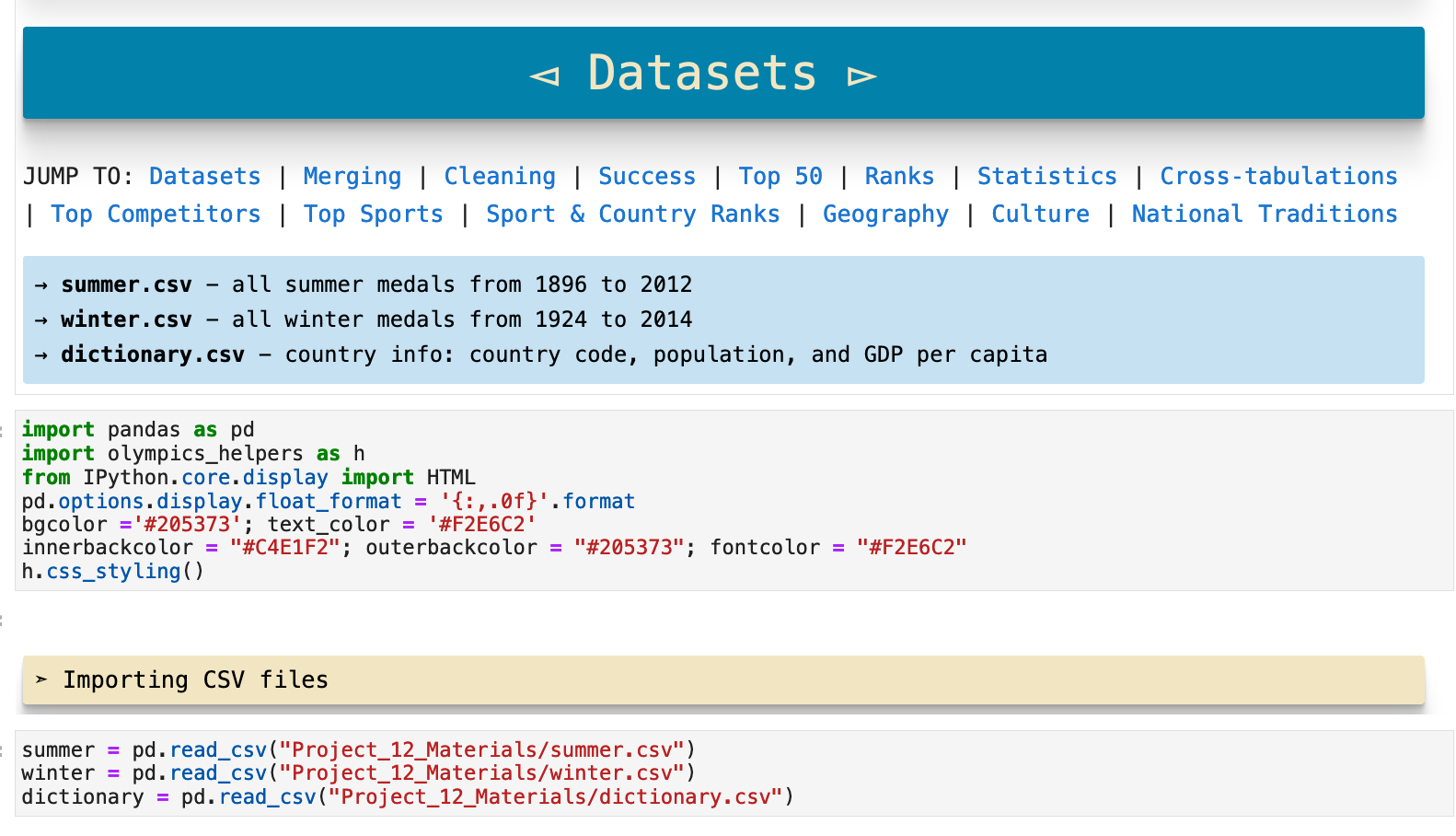
JUMP TO: Datasets | Merging | Cleaning | Success | Top 50 | Ranks | Statistics | Cross-tabulations | Sport & Country Ranks | Geography | Culture | National Traditions | Rare
The Datasets
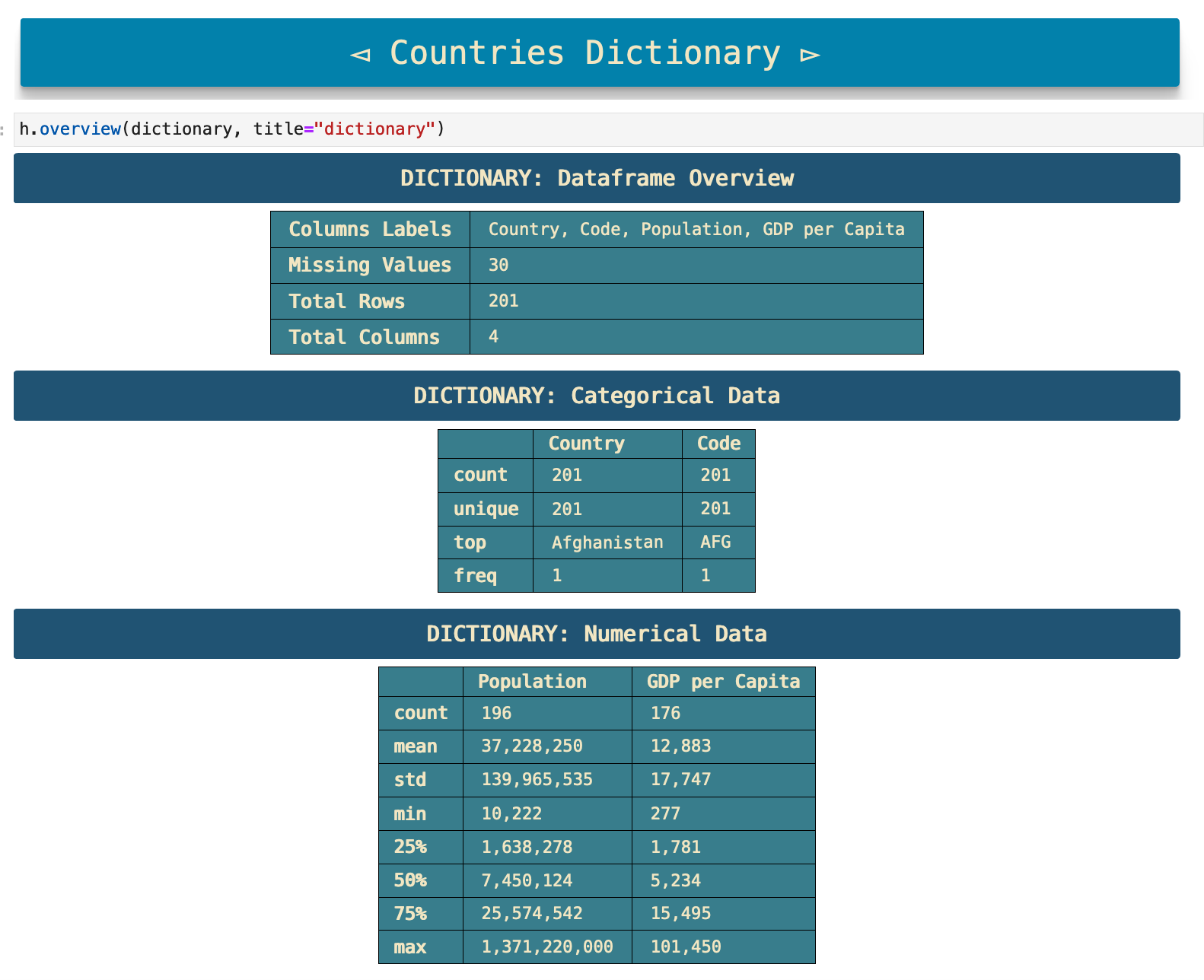
As you can see in the code below, there are three CSV files that make up the data for this project. The summer.csv file contains all of the data for the summer Olympic Games starting at their beginning in 1896 and going up through the 2012 games. The winter.csv file contains the same for the winter games, starting at their beginning in 1924 and running up through the 2014 games. The third file is dictionary.csv, which contains data about the countries that participate in the Olympics: their names, country codes, populations, and GDP per capita data.
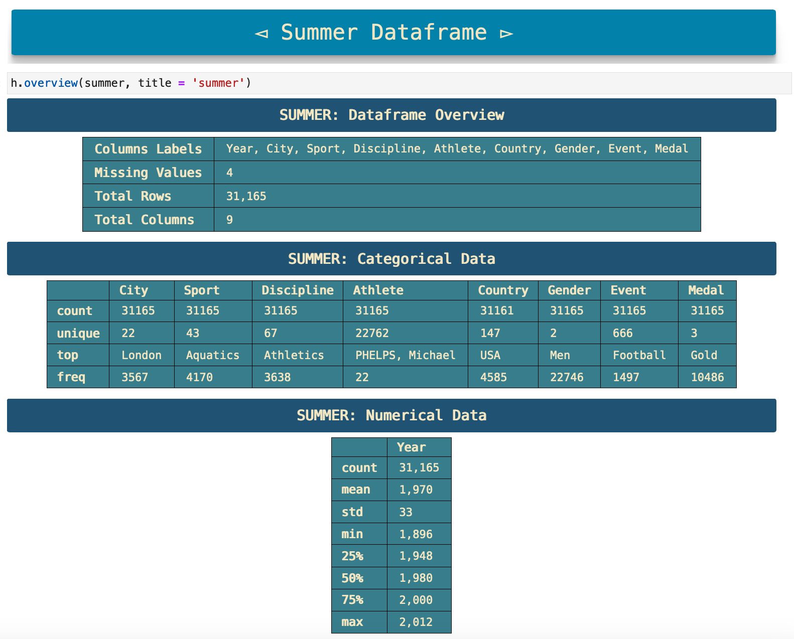
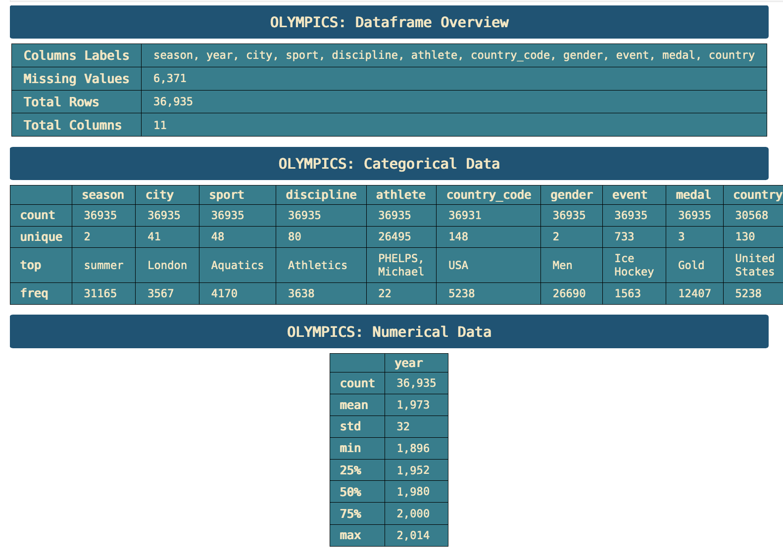
The following code output comes from a function I created called overview(). Because the first step in data analysis after importing the data is generally to find the dimensions of the dataset, the missing values, columns names, the various data we get from the pd.dataframe.describe() method, and so on, I created this function to combine all of those steps into one step that cleanly represents a summary of the data in an easily readable format.
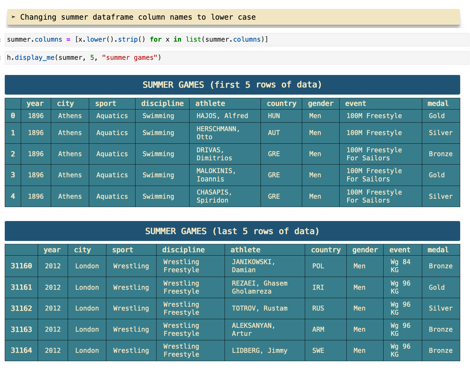
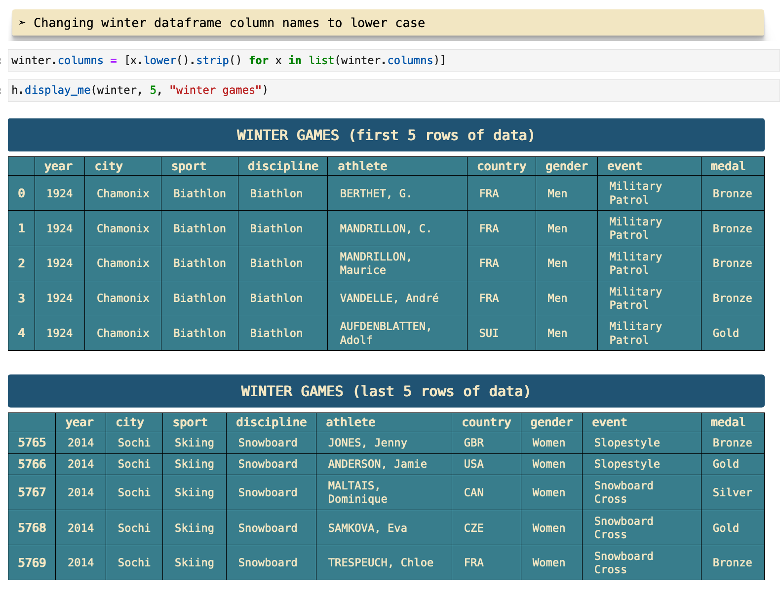
The next step I always take in initial data investigation is to look at the 5 first and 5 last rows of the dataset. So I combined these steps in a function called display_me() which takes a dataframe and the number of first and last rows desired and uses pd.dataframe.head() and pd.dataframe.tail() to display the data. I also find it very useful to have headings that clearly label what dataframe I am looking at and what part of the data it is. So I include the headings as well in this function. This is very useful when scrolling through data and looking for something in particular or just when wanting to skim over the notebook.
The function that produces the heading for the data here is called div_print() and will be used outside of this function many times for other headers, various print statements, and more. I find it much easier to digest information and allow my subconscious to quickly organize the data in my mind when the data is represented in a visually organized fashion like this. So I tend to take a little extra time to make that a part of my projects.
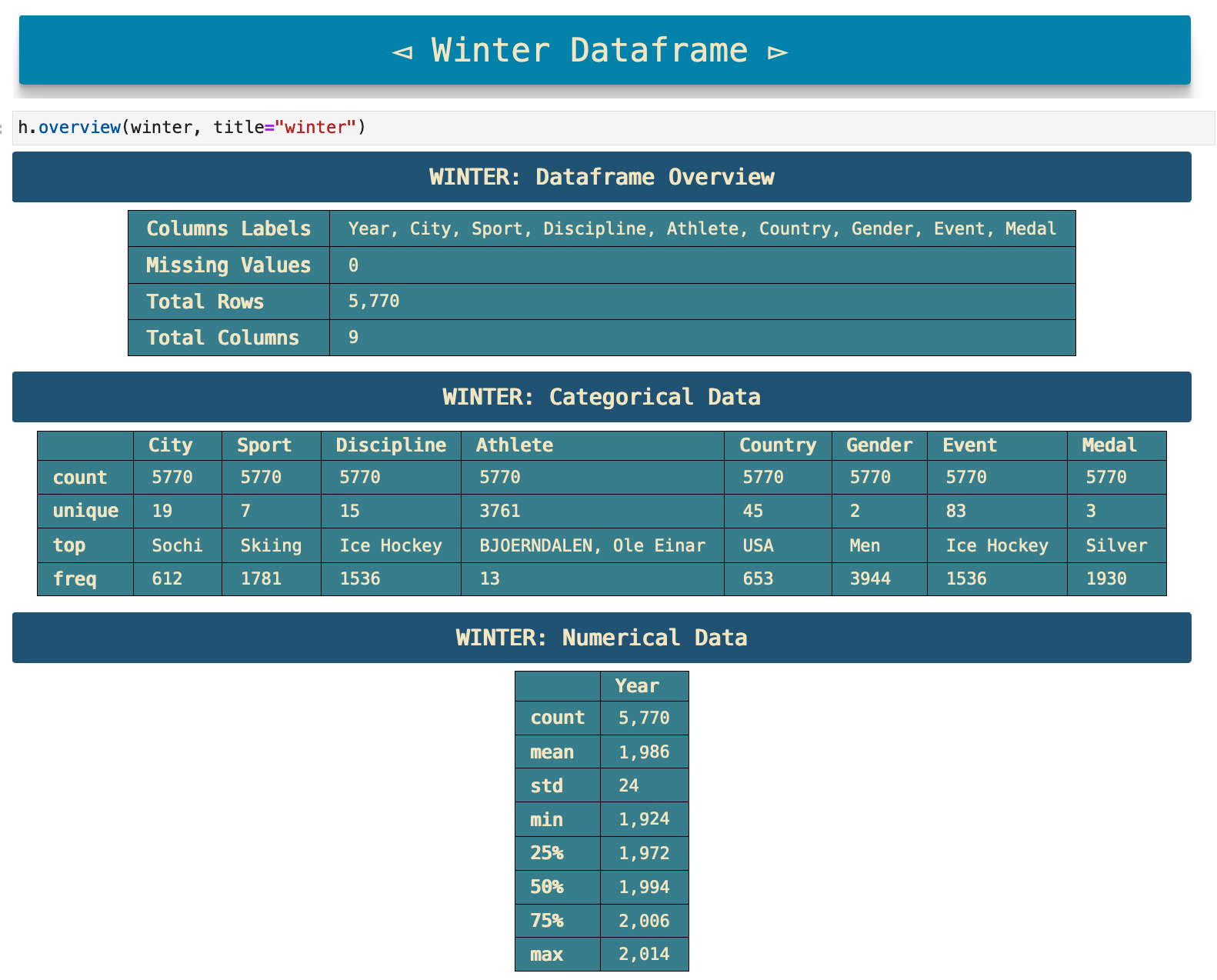
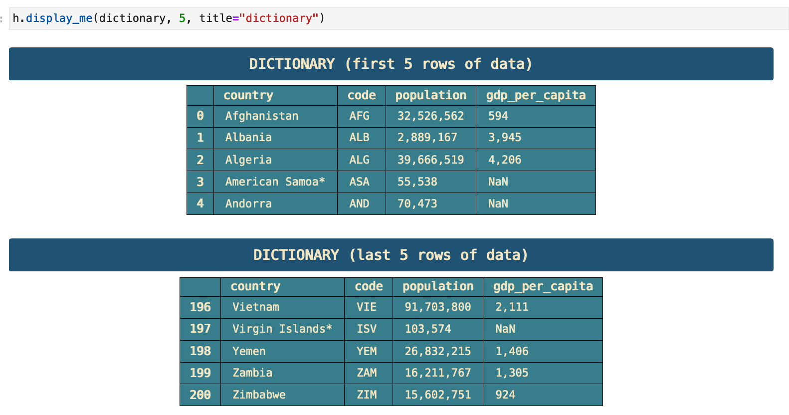
Just as I used overview() and display_me() on the summer games data, below I follow the same steps for the winter games data, as well as the countries dictionary data.
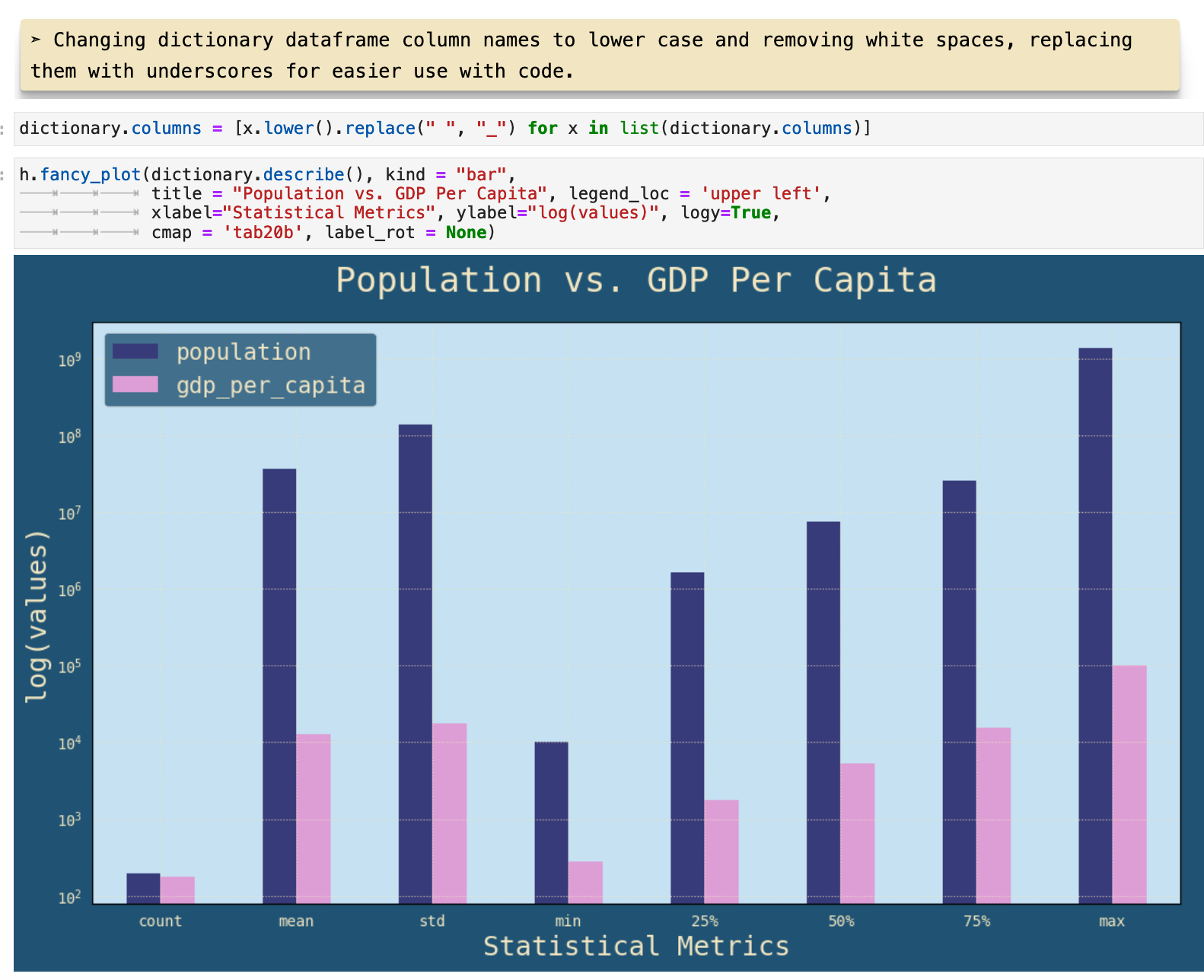
I have a habit of wanting to dive into data visualization fairly immediately, as soon as I see anything in the data that could be even remotely interesting to visualize. So at this point, I saw that it could be very intriguing to look at the correlation between the statistical data of a country's population and GDP.
The function I used to plot this data is called fancy_plot(), which is basically a customized version of pd.dataframe.plot() with the settings that I like to use, inlcuding the figure size, the font, and whatever color scheme I have chosen for a project. You can get to know this function better in helpers.py.
JUMP TO: Datasets | Merging | Cleaning | Success | Top 50 | Ranks | Statistics | Cross-tabulations | Sport & Country Ranks | Geography | Culture | National Traditions | Rare
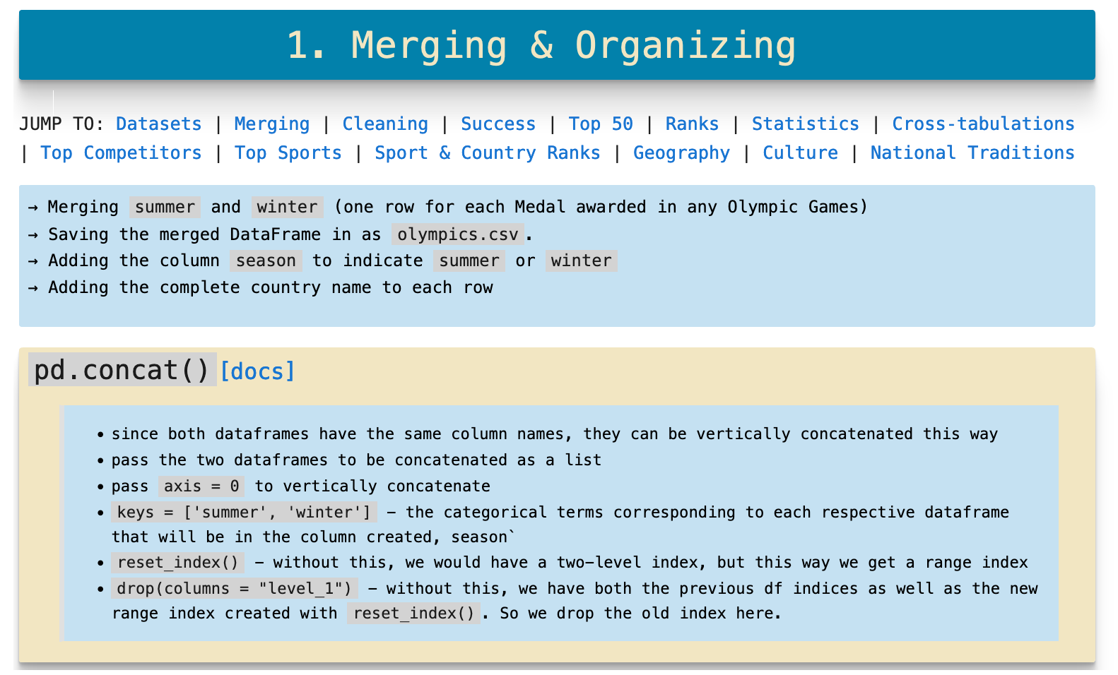
Merging and Concatenating
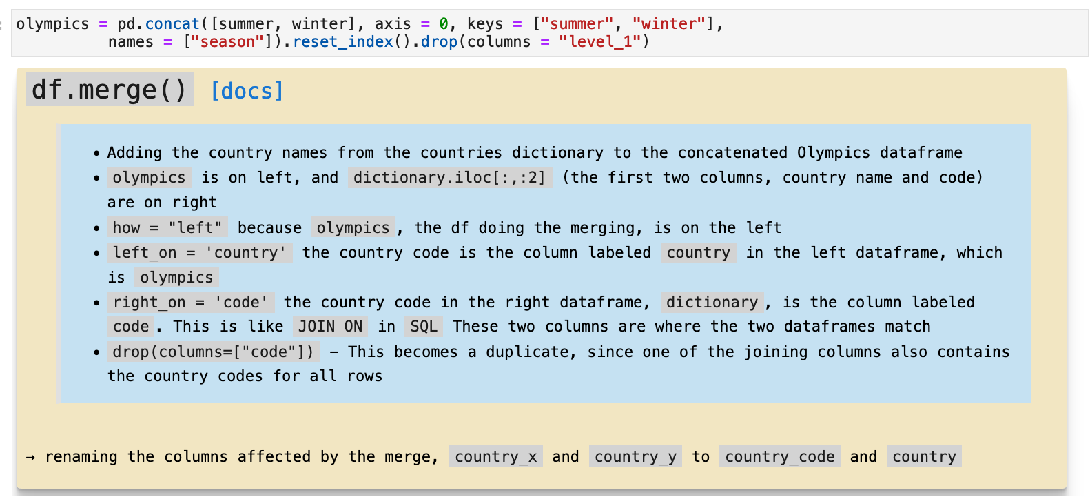
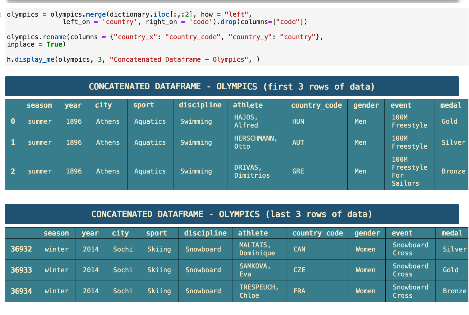
This is the messiest part in my opinion, and what I mean is...the part that can get easily messed up without great attention. So here, I outline the uses of pd.dataframe.concat() and pd.dataframe.merge() to clarify the steps I take in putting all this data together. The steps are to merge the two season dataframes into one, to add a column that specifies which season each record belongs to, and to add the name of each country to the dataframe. The winter and summer dataframes only contain country codes. And since we want to be able to quickly peruse and digest the data, having the actual name of the country in the data as well will be very important.
JUMP TO: Datasets | Merging | Cleaning | Success | Top 50 | Ranks | Statistics | Cross-tabulations | Sport & Country Ranks | Geography | Culture | National Traditions | Rare
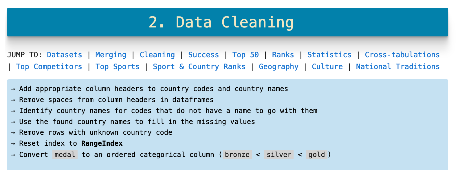
Data Cleaning
Everyone loves a good data cleaning, right? I am serious. Wait, am I the only one? Do you not find the immediate gratification of beautified data enthralling and a valid ASMR experience?! Wow, I am so sorry! That must be hard. You just leave that to me then!
This is an overview of the concatenated and merged original dataframes.
The data did not need a great deal of work. The main issue was that many of the country names were missing.
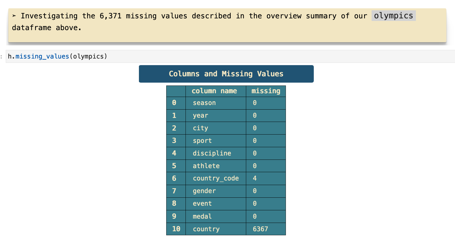
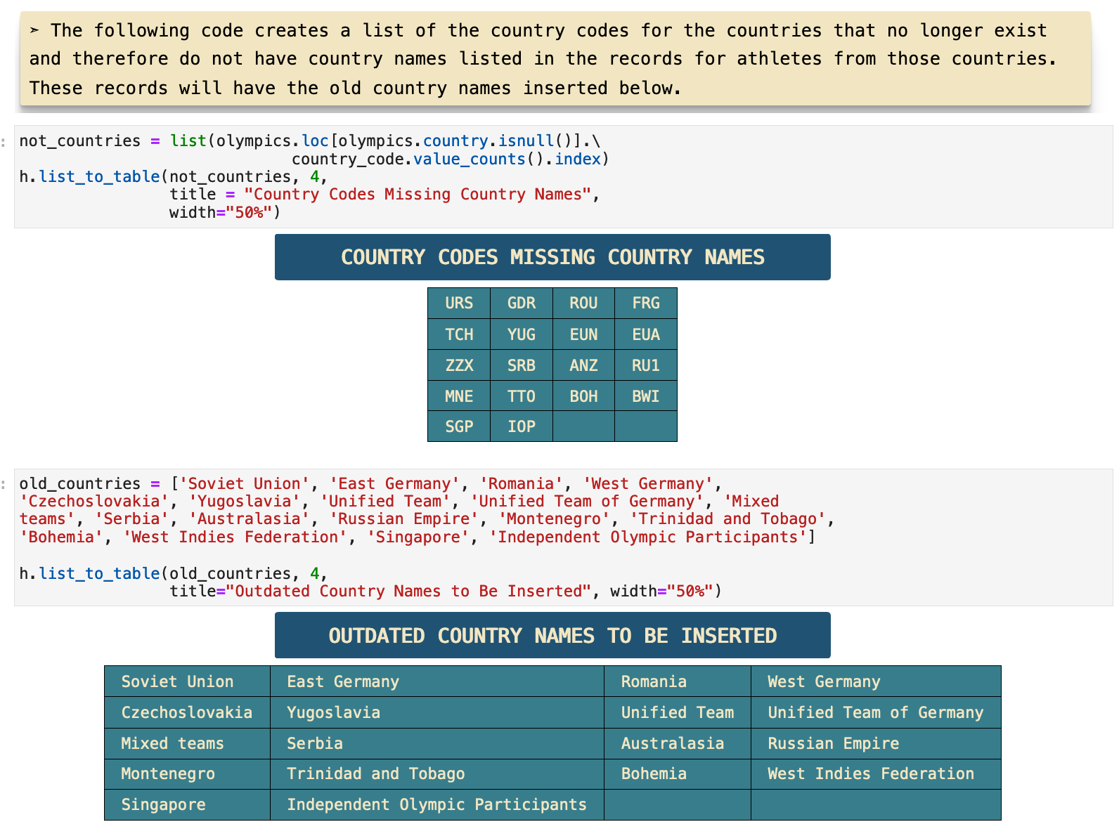
Upon further investigation, it is clear that the countries that are missing their names and only contain the country code are generally countries that now have other names. For example, the Soviet Union is now Russia, as well as a host of others. And many countries that were a part of the Soviet Union have become their own countries and compete under their respective country names. Then there are other countries that do not exist any longer like West Germany.
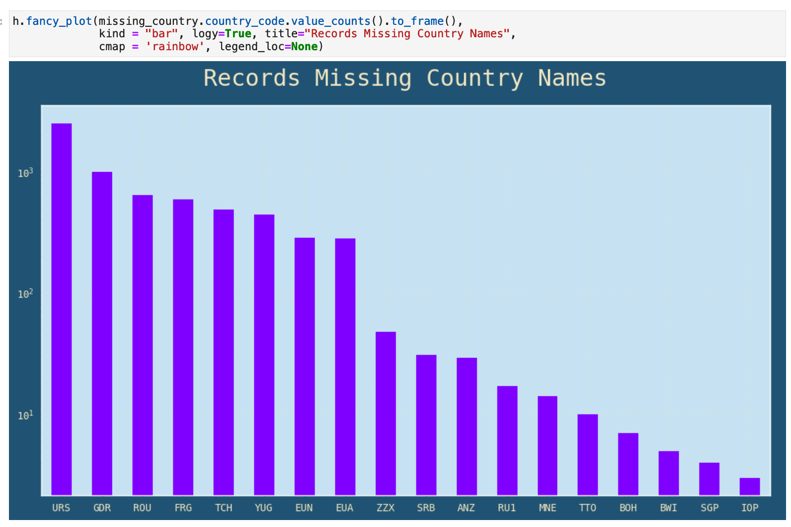
This is a visual representation of the counts for each country code that is missing its respective name.
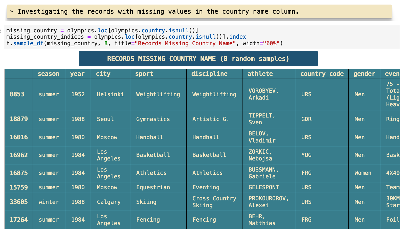
The following code output shows two lists, the country codes missing their countries and the country names that need to be connected with their respective codes and then input into the dataframe.
The function I used to display these lists is called list_to_table(). I find that it is often more useful and comprehensible to see a list of data presented this way rather that as Python code output. So, tada!
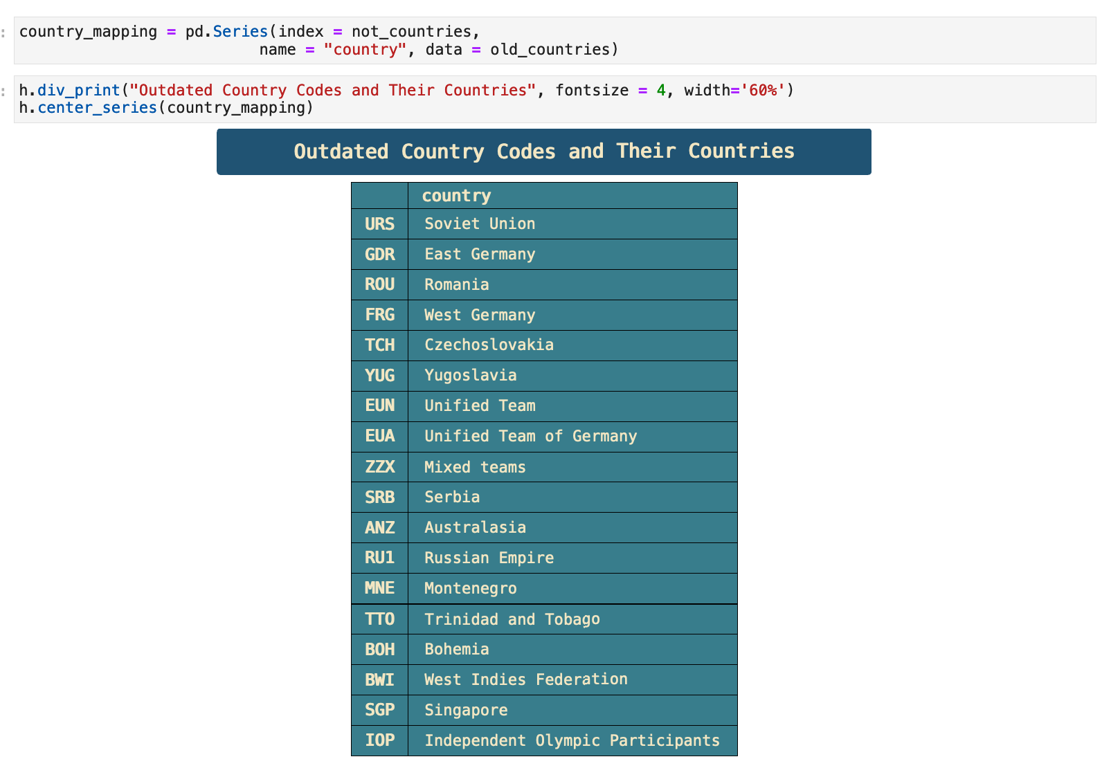
Now these two lists can be mapped together to create a Pandas series with country codes as indices and country names as data. This will make it easy to insert the country name data into the dataframe and fix almost all of the missing data issues.
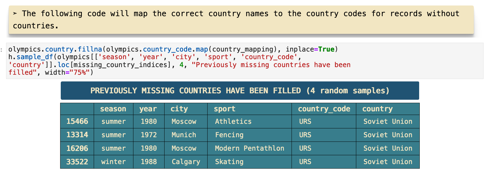
And now, we can have a look at a sample of the section of the dataframe where the country names have been inserted where previously missing. The function I use here is another custom helper called sample_df() that essentially takes pd.dataframe.sample() and gives it a better visual representation with descriptive header.
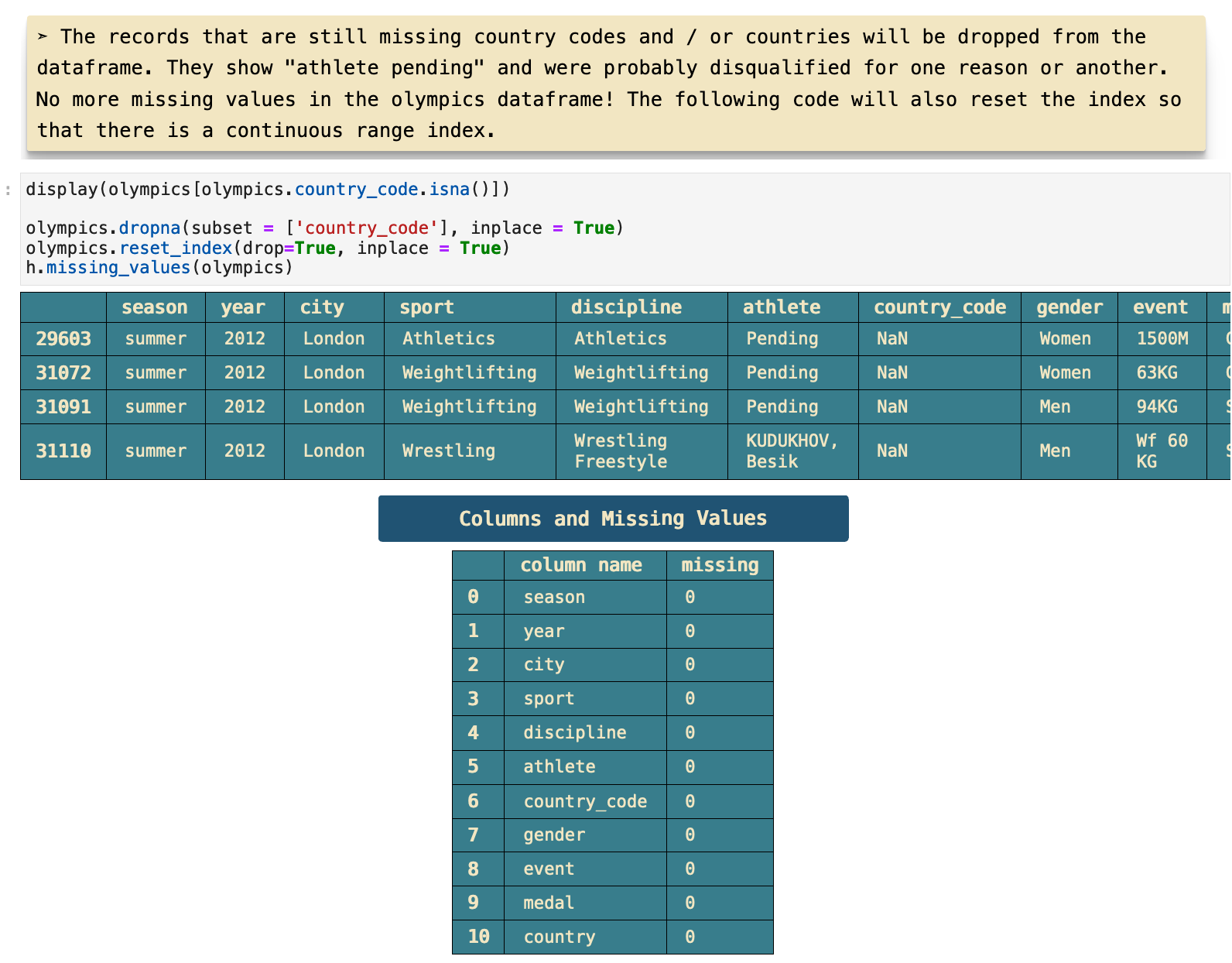
The only records that are still missing their country names are ones that are also missing a number of other very important values, rendering them useless. So these four records will be dropped from the data completely.
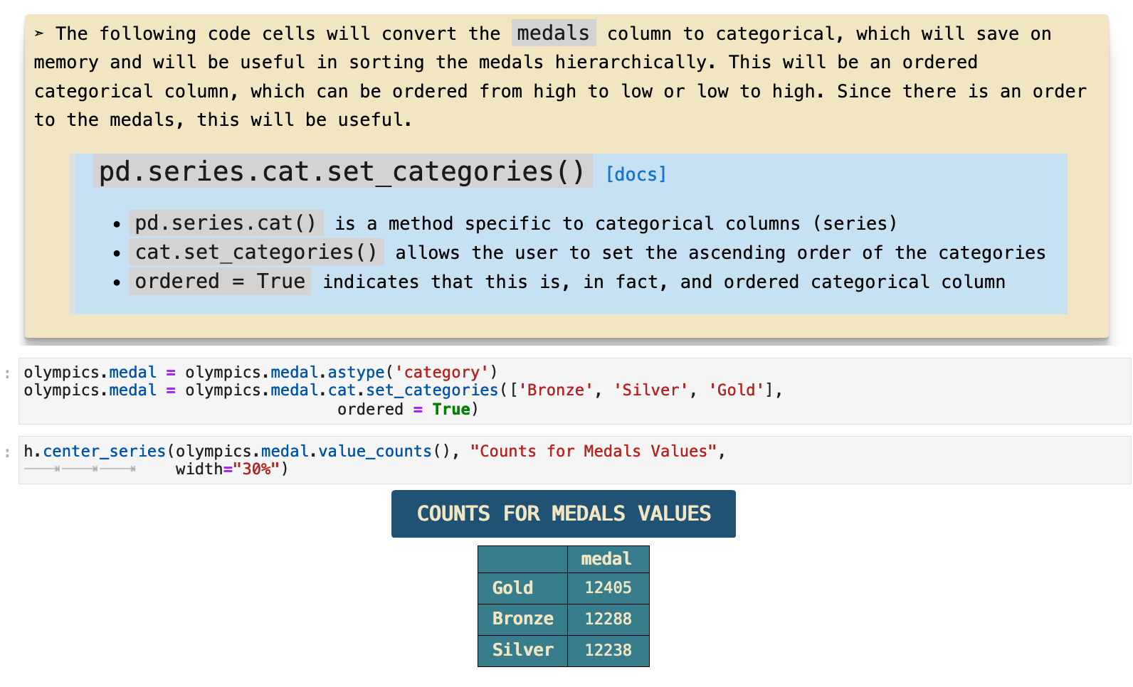
The last step here, which is effectively a cross between data cleaning and feature engineering, is to create a categorical and hierarchical ordering for the values in the medals column of the dataframe. Although it is important to truly be sure that converting a column to category is the best choice, in this case it is not only safe from causing any errors in the data, it also offers the option to assign an order to the values for the categories rather than just alphabetical. We can therefor assign bronze a lesser categorical place in the hierarchy than silver and gold, and so on.
JUMP TO: Datasets | Merging | Cleaning | Success | Top 50 | Ranks | Statistics | Cross-tabulations | Sport & Country Ranks | Geography | Culture | National Traditions | Rare
Most Successful Countries
Now it is time to get to the fun stuff! Let's start by looking at a sample of our data, which is always a good idea at the beginning of a step in an investigation or section of analysis. Here we have 5 random samples from the olympics dataframe.
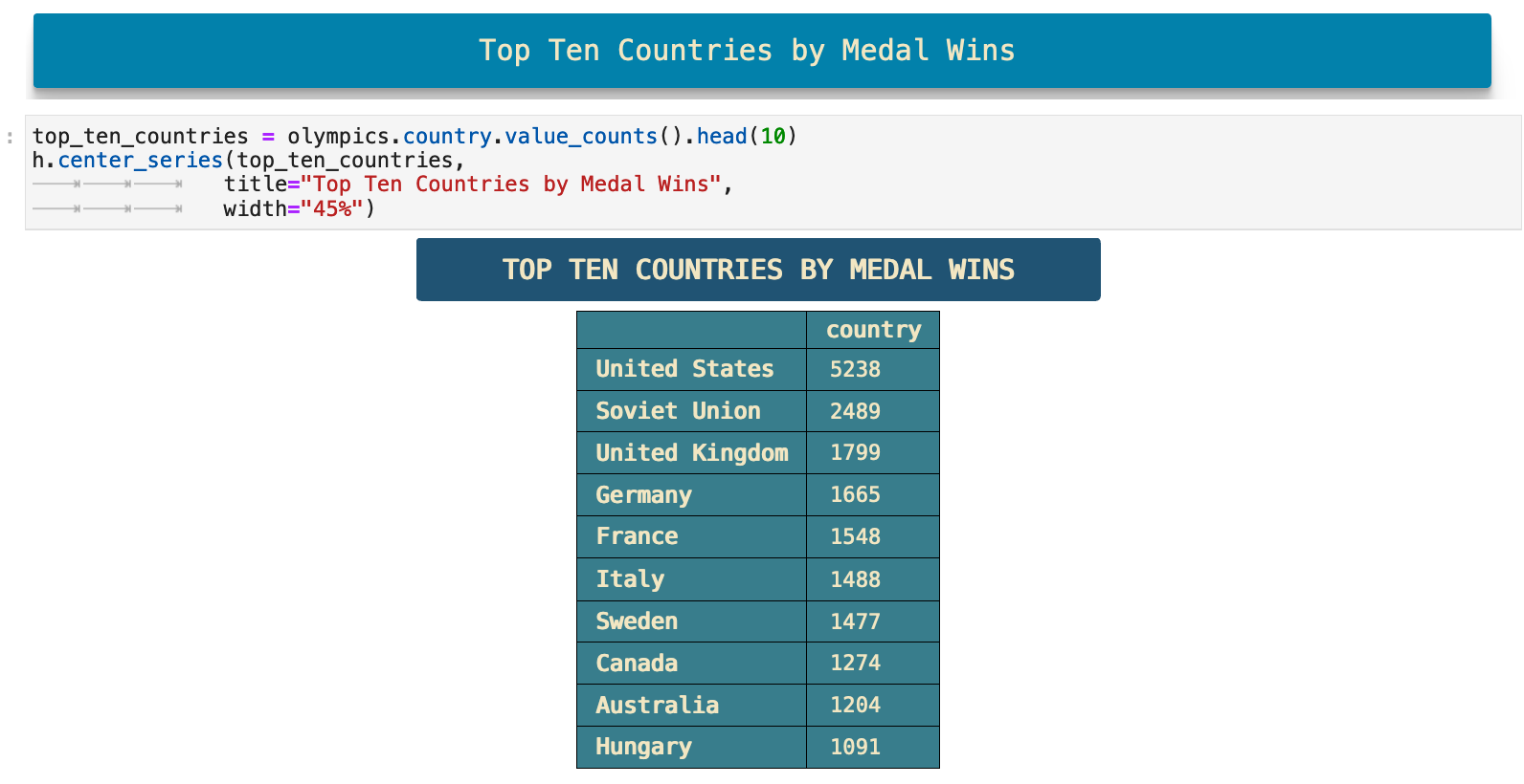
Now we can get the top 10 country names by how many times they appear in the data, which indicates how many medals have been won by an athlete representing that country. Keep in mind here that our data spans well over 100 years and that the Sovient Union did not exist for the last twenty-some years of the data. So while it would still put them at a place lower than the United States, the relative comparison is slightly skewed by this shift politically, culturally, thus also numerically.
This is one of those places where now I would like to go back and do the same calculation only up until 1989 or 1990 and see how different the comparison might be, thus eliminating the time period when so many of the athletes who competed for the Soviet Union shifted to competing for their own independent countries. But alas, the rabbit holes are neverending.
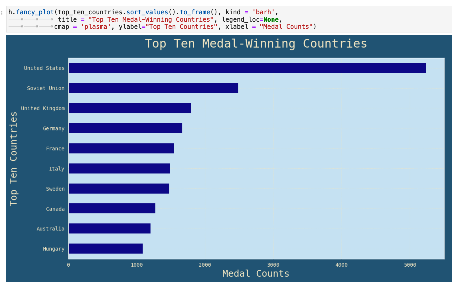
This is clearly data that beckons us to give it a visual representation. So who are we to say no to such a plea? Alas...
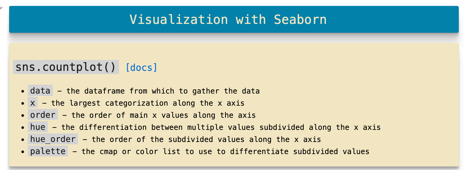
And now that we are so inspired by the flourish of color and life that visual representation affords our data! Let's dive deeper into this particular facet, one of my VERY favorite parts! And we shall make full use of the concept and implementation of colormaps as we go wild learning more about our data. This section will use Seaborn countplots, an incredibly simple, but at the same time incredibly communicative, form of visualization.
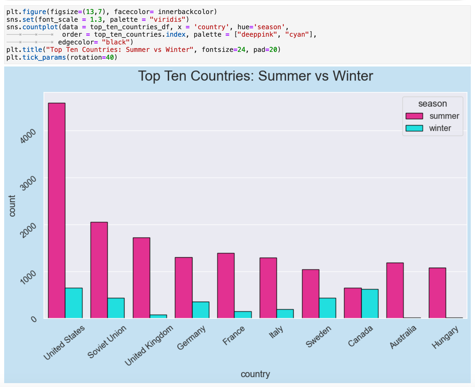
Our first countplot is a comparison of the medal-winnings for the top 10 overall medal-winning countries for the summer olympics versus the winter olympics. Keep in mind that the summer olympics have existed for 28 years longer than the winter olympics and were always the effective Olympics OG. Thus, for just about any country other than Canada, there is naturally a considerable difference between the two.
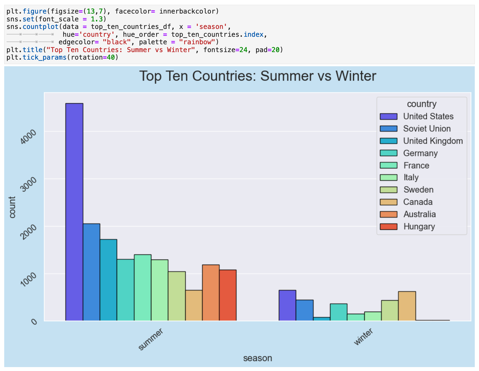
This difference is possible even more striking when we visualize the comparison of the summer Olympics medal totals for all countries versus the winter.
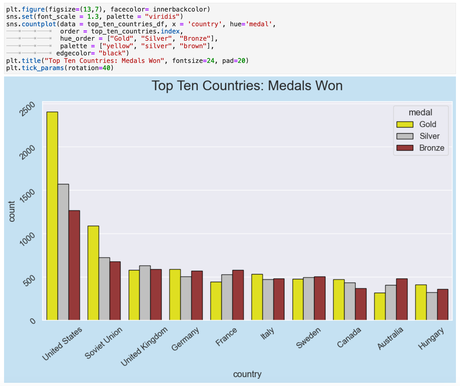
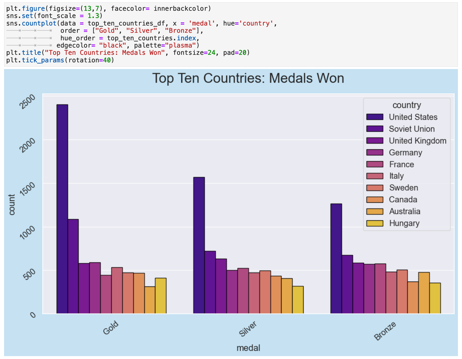
Here we take advantage of the ordered categorical column created earlier with medals. This is a bar plot of the top ten countries and their counts for gold, silver, and bronze medal winnings in descending order, gold to bronze.
Another interesting perspective, although possibly not quite as communicative as the previous ones, is to look at the medal categorical counts organized by all golds, all silvers, and all bronzes. And what a fantastic colormap, I must say!
JUMP TO: Datasets | Merging | Cleaning | Success | Top 50 | Ranks | Statistics | Cross-tabulations | Sport & Country Ranks | Geography | Culture | National Traditions | Rare
The Top 50 Countries
Now we will aggregate the data for the top 50 medal-winning countries in the dataframe. Since these are the countries who also participate the most in the olympics, they are very likely the most informative for data analysis.
Once again, let's start by looking at a random sample from our entire dataframe, olympics.
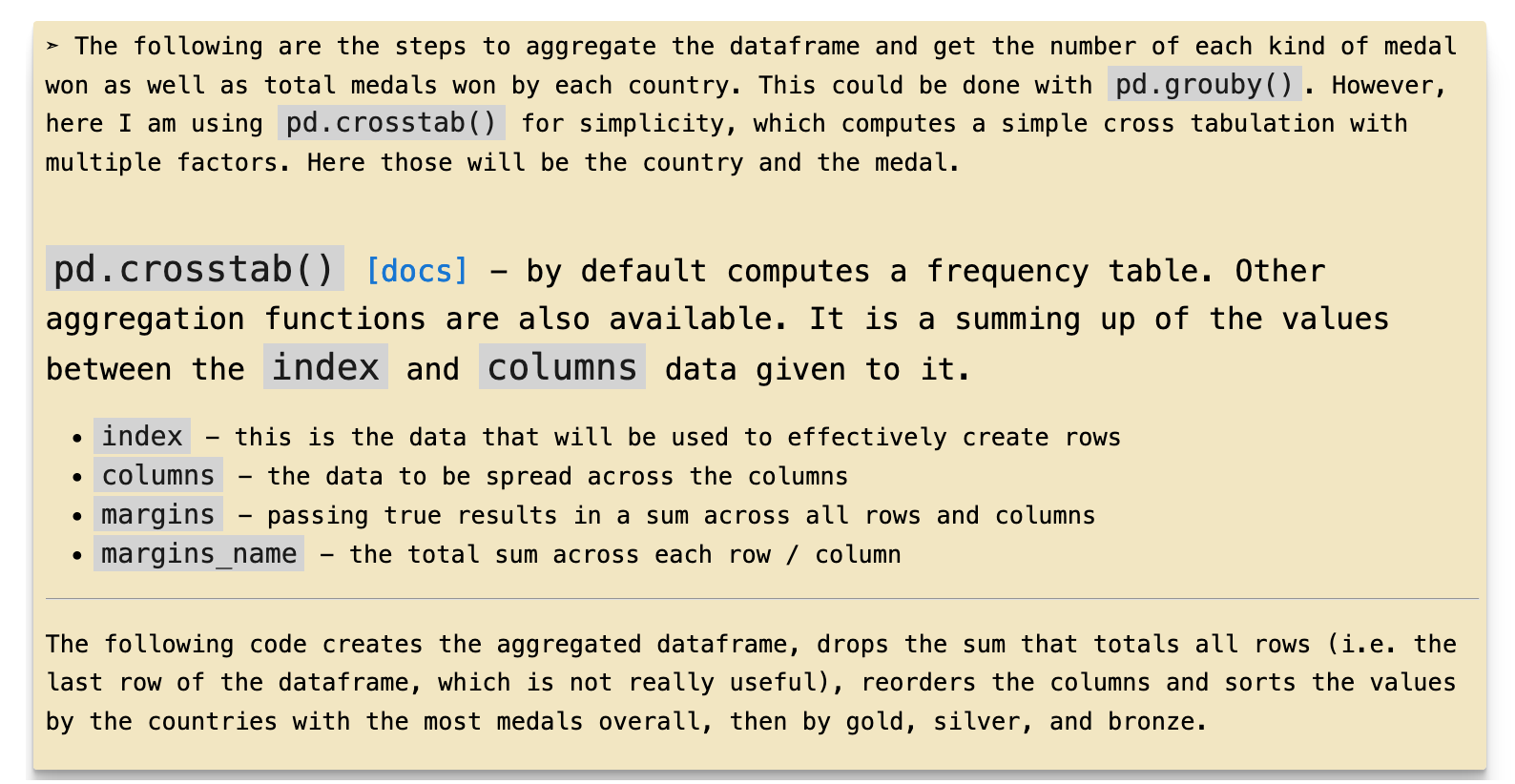
To create the aggregated data, we will use pd.crosstab(). This is a quick overview of how it works and how it will be used. We will create a dataframe that contains a record for each country that has participated in the Olympic games. Each record will contain the total medal counts for each country as well as the categorical counts, with a column for each gold, silver, and bronze medal won for each country.
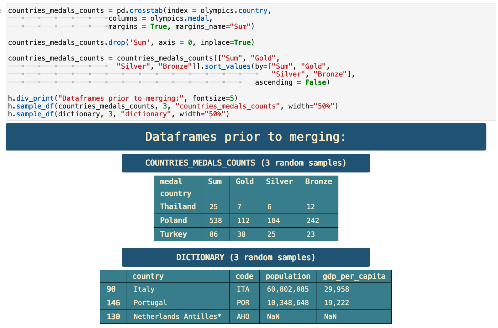
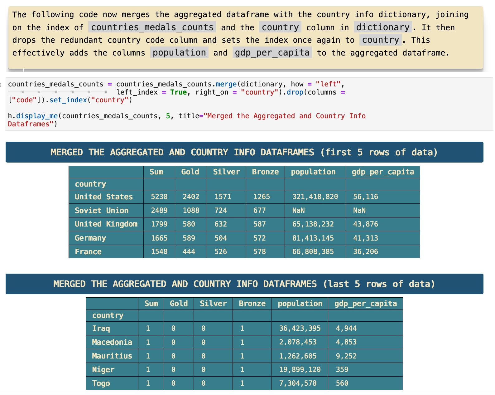
For further data analysis, it will be useful to add the population and GDP per capita data for each country's record.
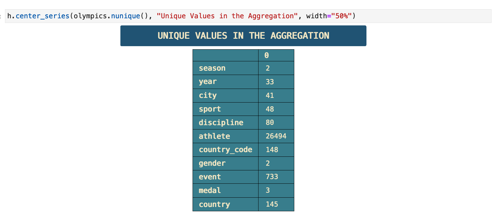
For the purpose of a clearer mental image of our data as we analyze it from a variety of perspetives, it is helpful to create a mental map of the unique value counts within the data.
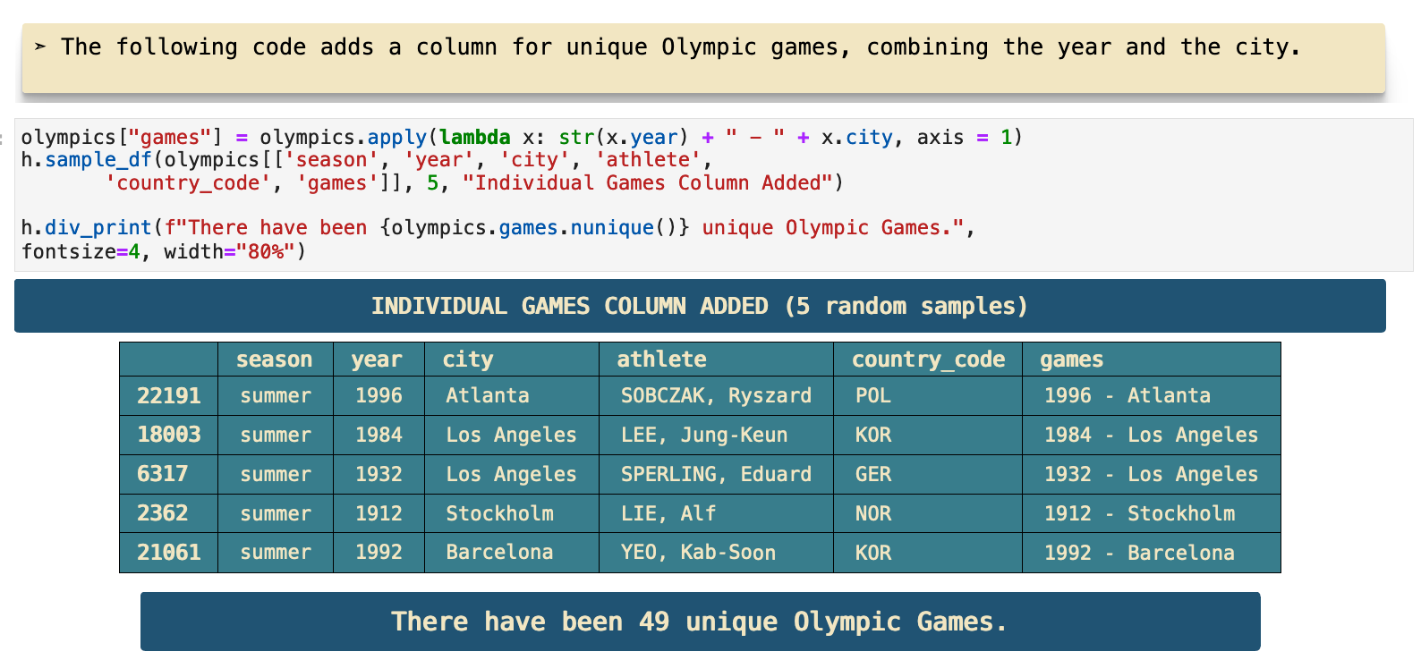
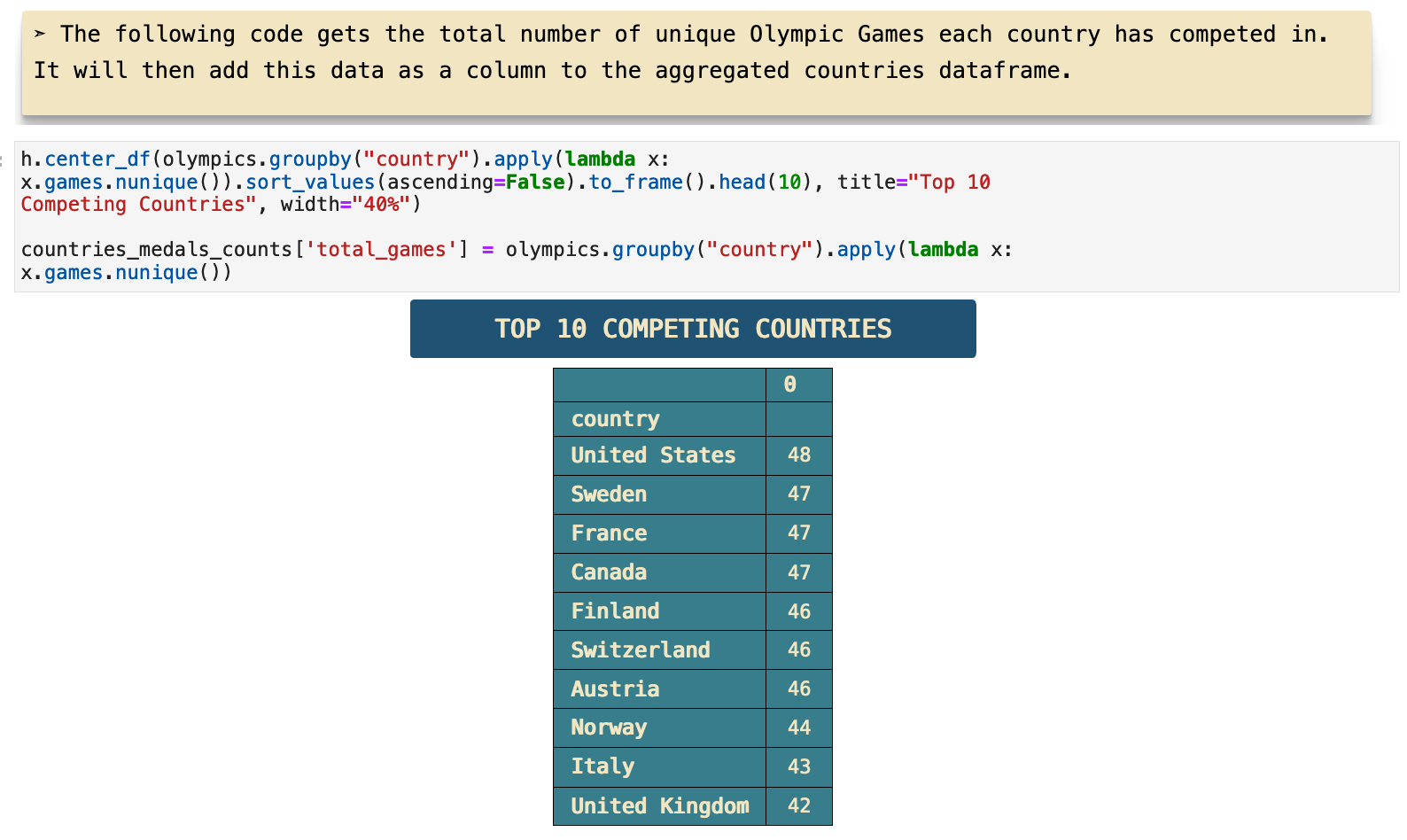
Here is the creation of the unique Olympic games column, which will be useful for future analysis. We can also now see the total number of unique olympic games represented in the dataframe is 49.
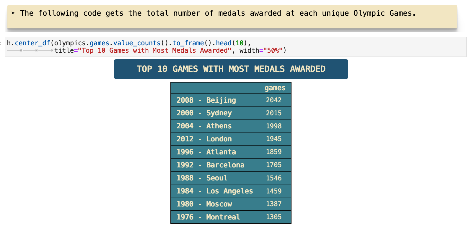
It is also now possible to get a count of the total medals awarded at each Olympic game. These are the top 10.
Here, I add a column with the total number of Olympic games each country has participated in.
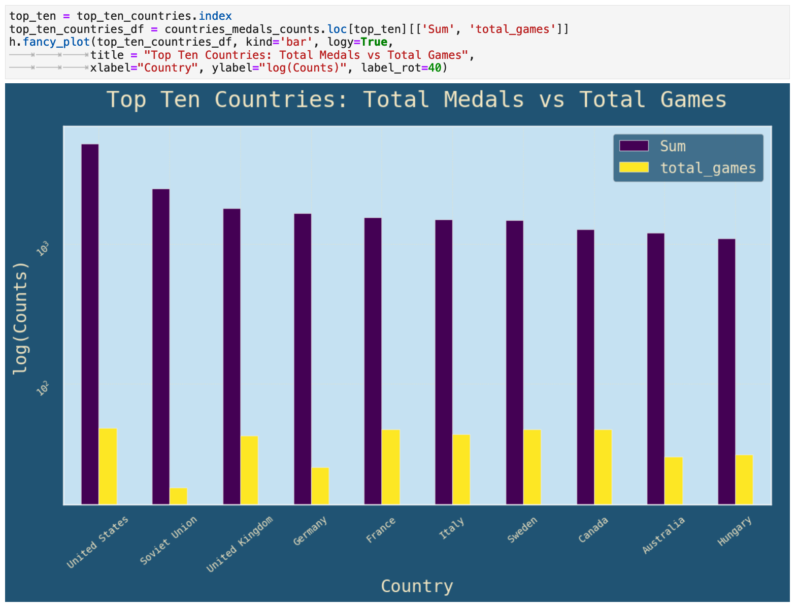
This visualization represents the differences between total medals won, labeled as "Sum" on the graph, and total number of games participated in for each country in the top ten medals won list. I used log values on the y axis, the count for each, for more communicative representation.
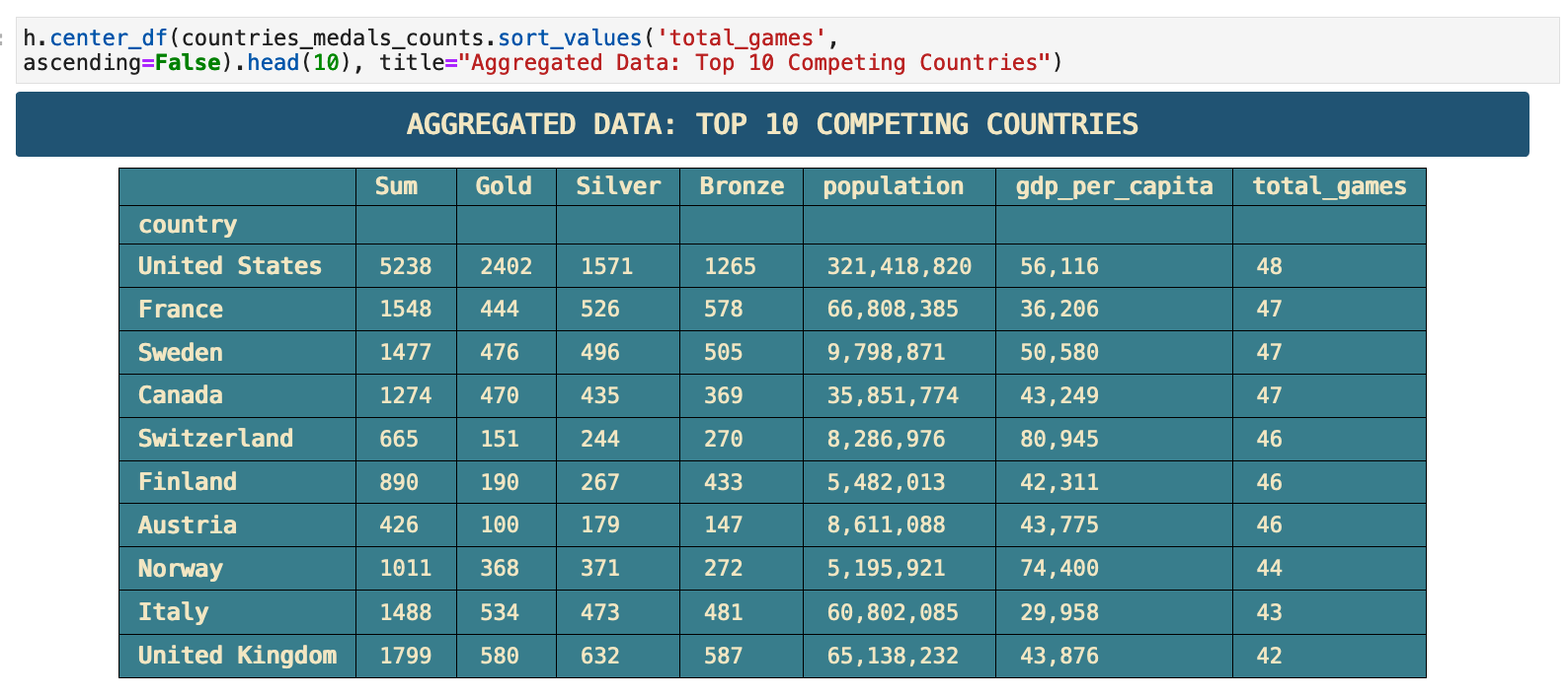
And here it is, the completed top 50 countries aggregated dataframe! This particular portion is the to 10 in the dataframe.
JUMP TO: Datasets | Merging | Cleaning | Success | Top 50 | Ranks | Statistics | Cross-tabulations | Sport & Country Ranks | Geography | Culture | National Traditions | Rare
Ranks Dataframe
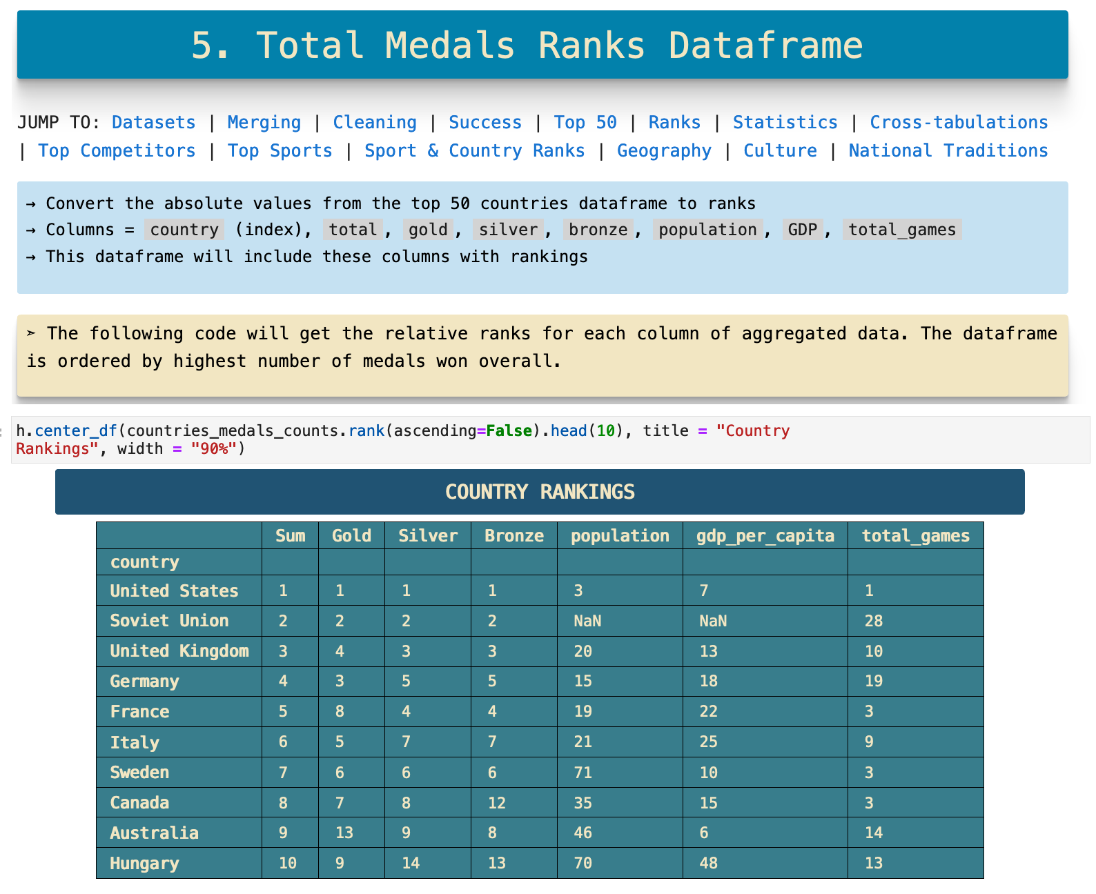
In the previous section, our aggregated dataframe worked with the total number of medals won be each country for each category of medal, the absolute count. But another insightful perspective would be the same top 50 list, but with relative ranking representations for each column rather than absolute counts. This is easy to do with the pd.dataframe.ranks() method as you can see below.
JUMP TO: Datasets | Merging | Cleaning | Success | Top 50 | Ranks | Statistics | Cross-tabulations | Sport & Country Ranks | Geography | Culture | National Traditions | Rare
Statistics with the Ranks Dataframe
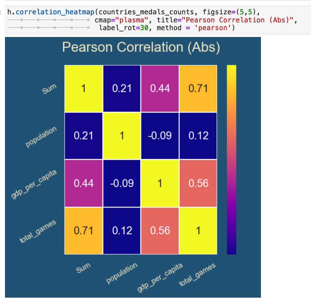
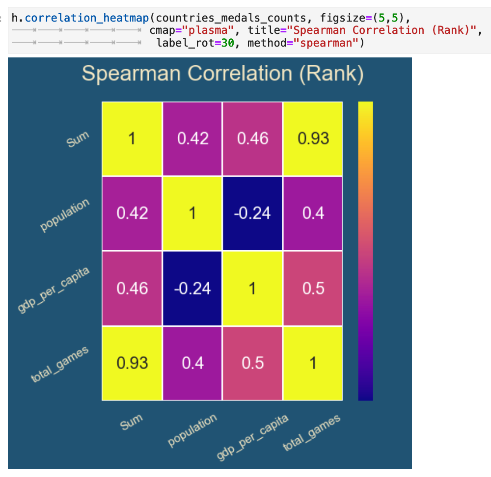
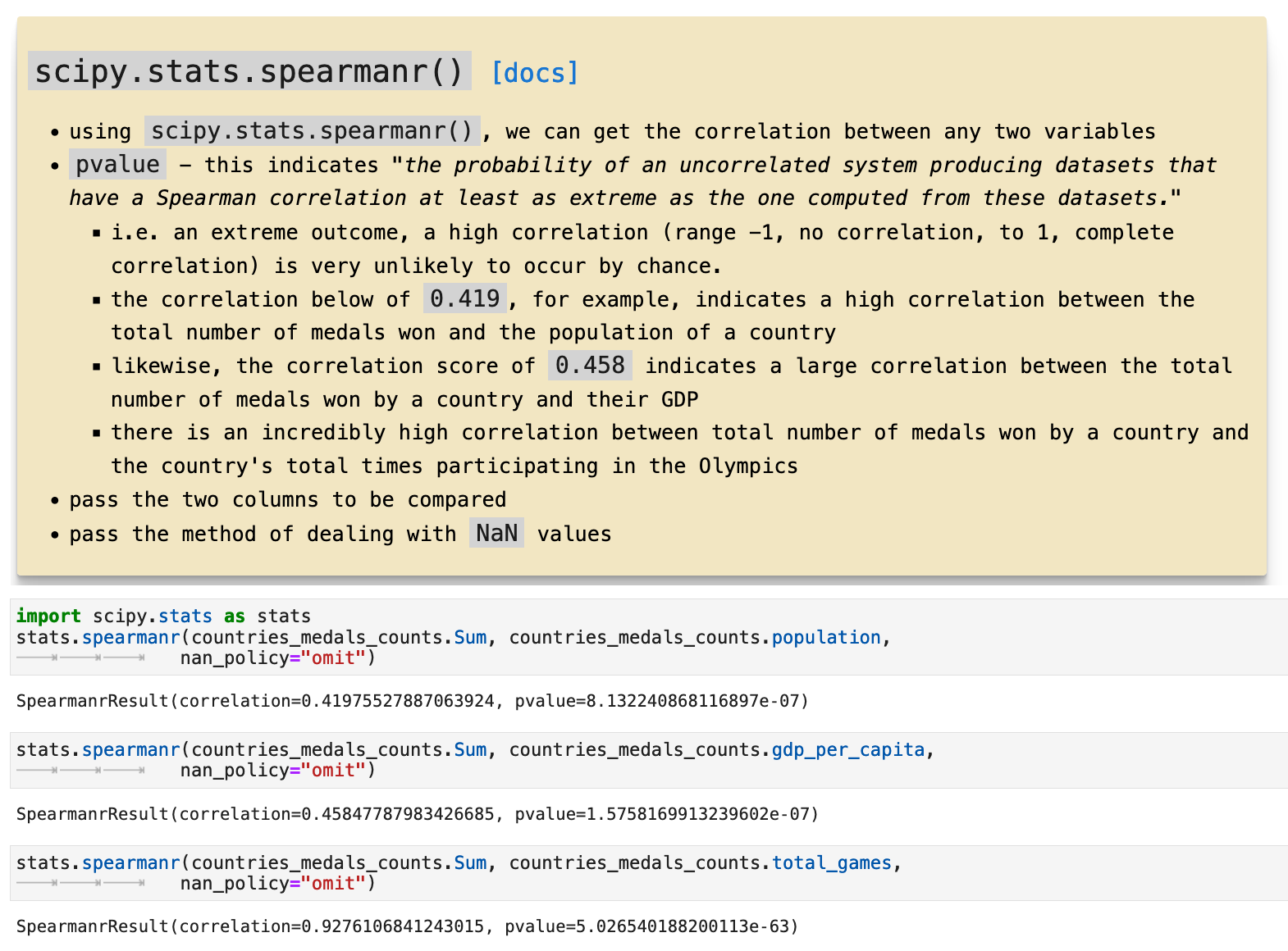
Here we will look at some statistics and correlations between the values in the countries_medals_counts dataframe, which contains the absolute counts for each. We will look at the correlations between Sum, which is the total medals overall won by a country, its population, its GDP per capita, and the total number of times it has competed in the Olympics. We will look at the correlations using two methods, the pearson and the spearman and investigate how they differ and what their relationships are to one another. The following outlines the objectives and the data we will be working with.
The pearson method operates on absolute values. Here we can see a high correlation between the GDP per capita of a country and the total games a country has competed in. This correlation is reasonable, beause a country with more money to invest in training and sending athletes to the Olympics would be more likely to win medals in the games. There is also a high correlation between Sum, the total number of medals every won by athletes representing a country, and total_games, the total number of times a country has competed. It makes sense that the more you compete, the more you win. We also see the slight correlation between GDP per capita and the total number of medals won, which again correlates back to more wealthy countries being able to compete more.
The spearman method offers us a bit more accuracy and precision. It is based on the ranking rather than the absolute count. So here we get higher correlations where they were already appearing in the pearson method version. But we also see new correlations between population of a country and the total numbers of medals won, meaning that there is a correlation between the overall size of a country and how many times they compete, and how many times they therefor win in the Olympics. So in essence, bigger countries compete more. Bigger countries win more.
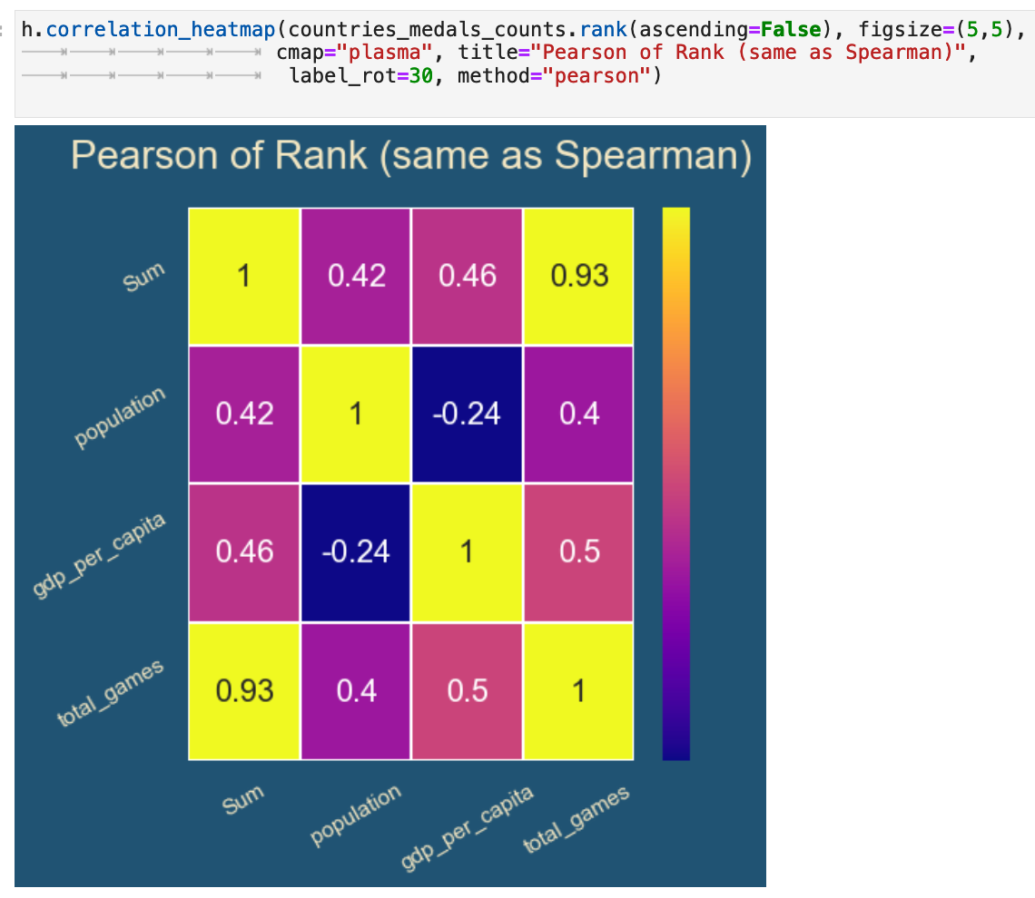
And here we have the pearson method being used but with the dataframe containing the rankings rather than absolute values. You can see how this lines up exactly with the spearman method being applied to the dataframe with absolute values, thus exhibiting the relationship between the two methods.
And to conclude our look into statistics, we will explore for a moment the scipy libarary scipy.stats.spearmanr(), which takes any two features and returns the correlation data for the relationship between the features. Here is a brief explanation of how it works as applied to this data, followed by some examples of it being put to use.
JUMP TO: Datasets | Merging | Cleaning | Success | Top 50 | Ranks | Statistics | Cross-tabulations | Sport & Country Ranks | Geography | Culture | National Traditions | Rare
Cross-Tabulations
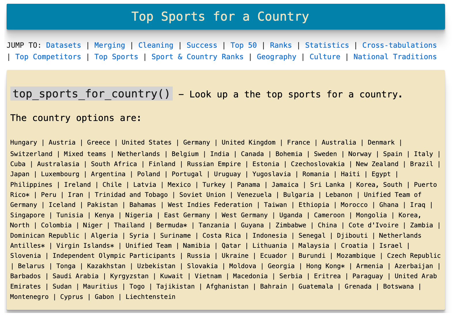
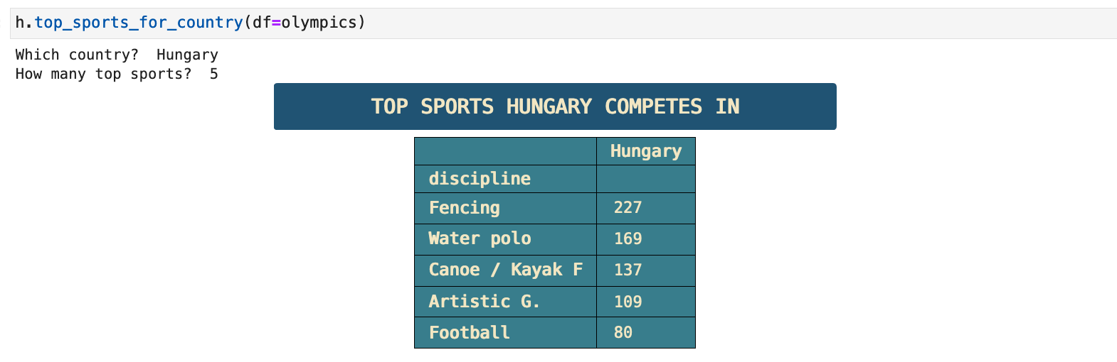
In this section, we will use pd.dataframe.crosstab() on specific features and perform further analysis. I also was inspired to write a couple of functions for querying the data, which I exhibit below. They make it easy and quick to find out about specific countries and sports. Next we look deeper at the top 50 ranking countries and different aspects of ranking as they pertain to geography and culture.
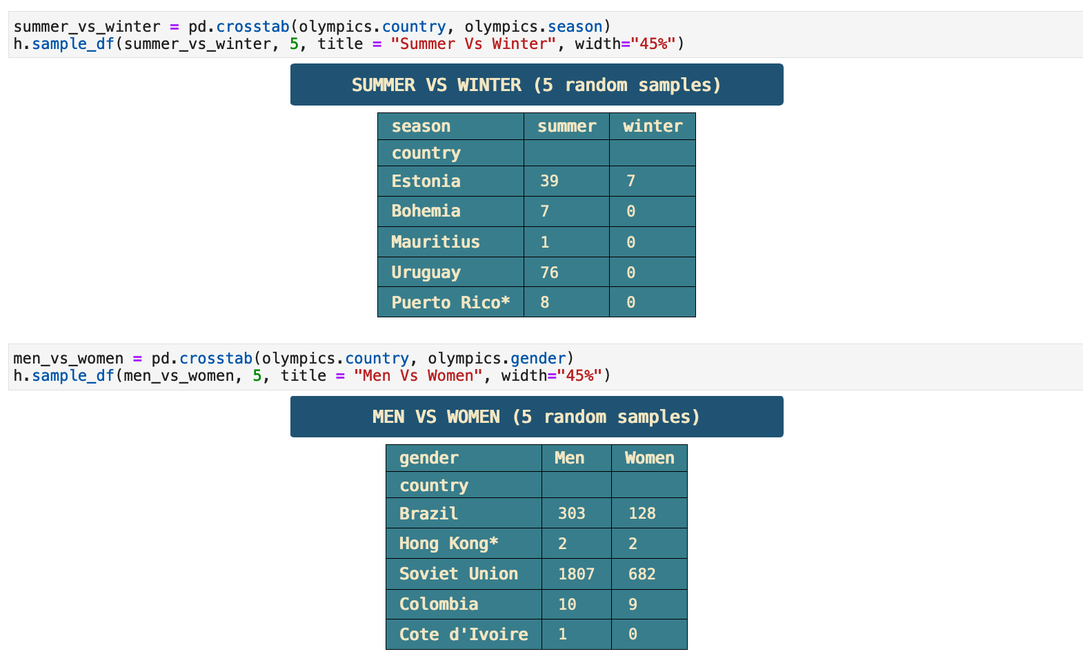
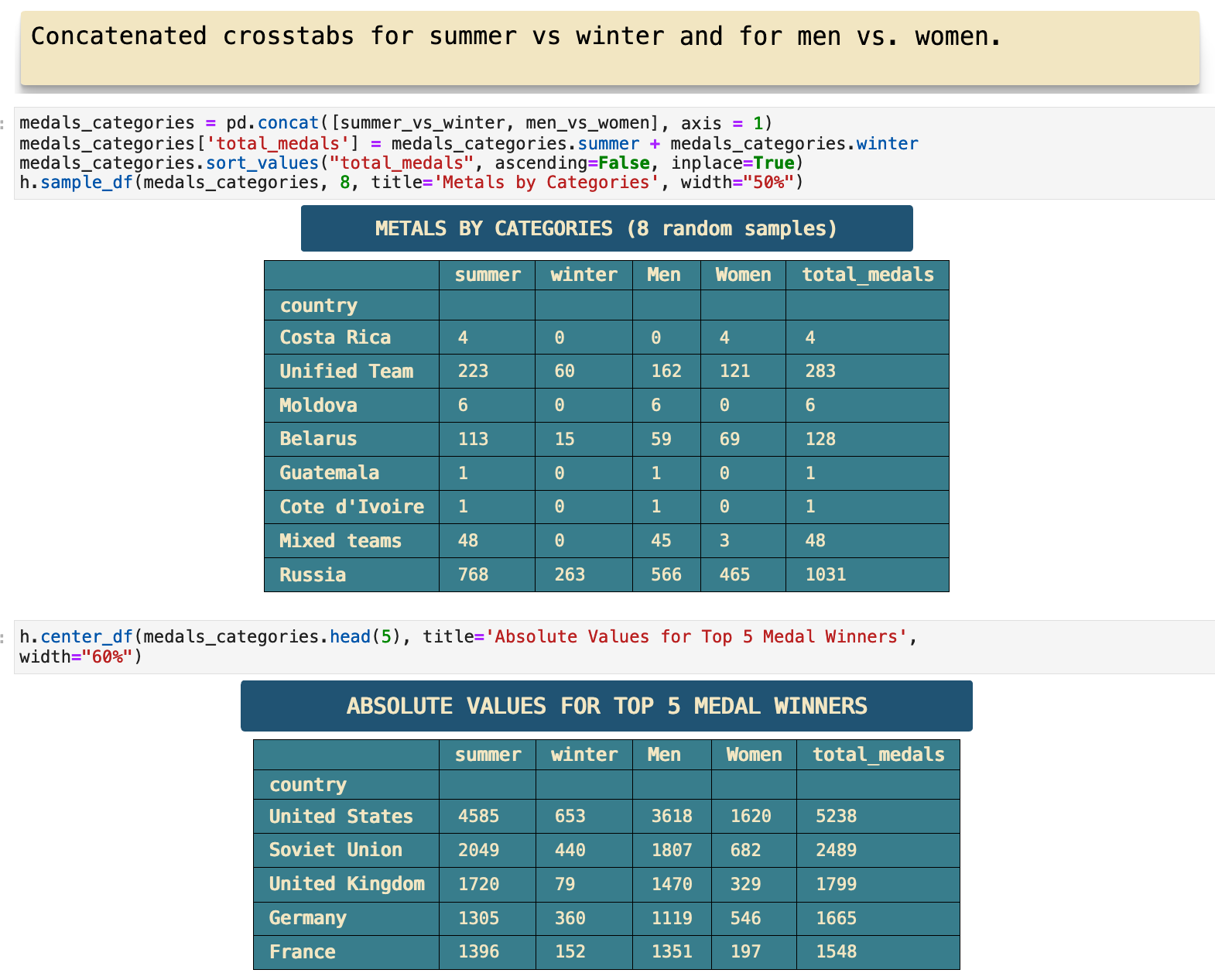
First, we have two cross tabulations, one comparing medals won for summer versus winter for each country and second, total medals won by men versus total medals won by women for each country.
This is the first function I wrote for querying the data. I describe it in the cell below and give an example of a query.
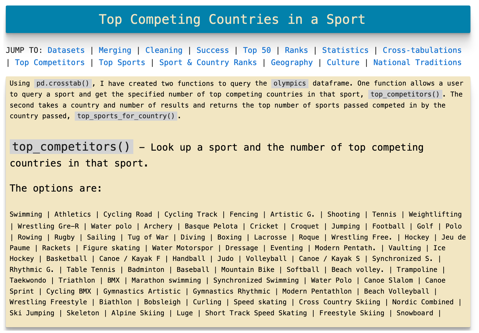

This is the second function I wrote for querying the data. Likewise, I describe it in the cell below and give an example of a query.
The following is a concatenated dataframe of the two comparisons we looked at earlier, summer versus winter and men versus women. This is 8 random samples from the new dataframe and the top 5 as well. Here we get a total medal count for each category, the two seasons and the two genders.
JUMP TO: Datasets | Merging | Cleaning | Success | Top 50 | Ranks | Statistics | Cross-tabulations | Sport & Country Ranks | Geography | Culture | National Traditions | Rare
Sport and Country Rankings
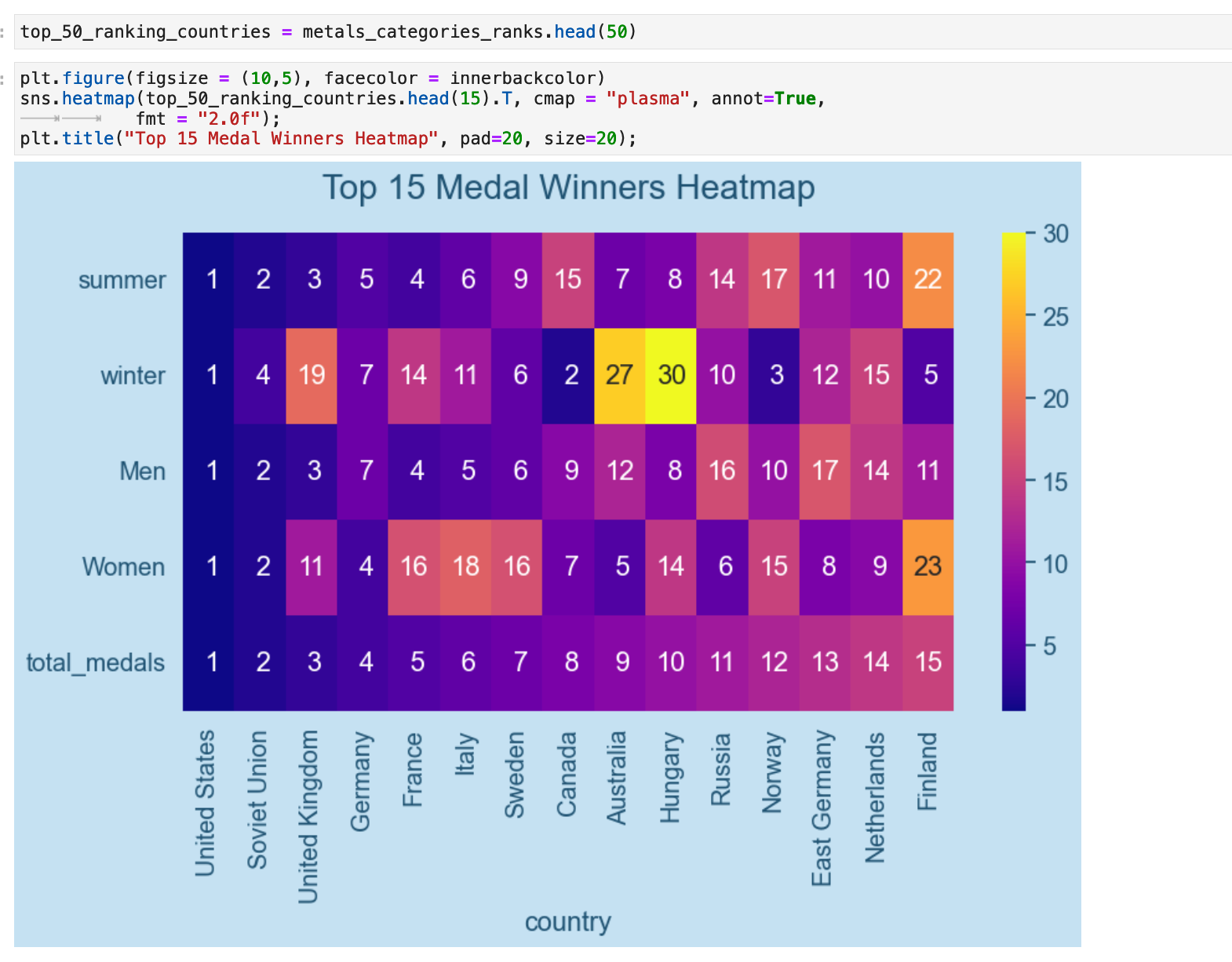
Now we will look at the same categories of data with the rankings for each country. Here is our rankings dataframe with the summer, winter, men, and women medal winnings counts sorted in order of each country's total medals won count.
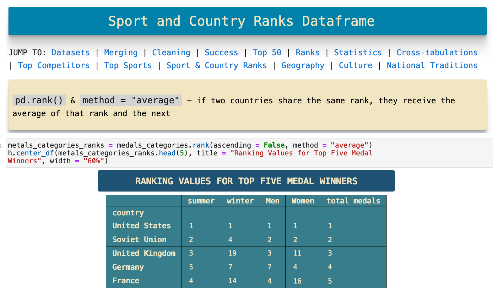
When we visualize this data, we see that the United States ranks first in all categories, the Sovient Union ranks second in almost all categories, but beyond these two countries, we see subtle relationships between the catetories in other countries.
The interesting relaltionships begin for example when we look at the Soviet Union and the one category where they come in fourth instead of second, the winter Olympics. This begs the question why? And if we consider geography, while yes, Russia is cold and gets plenty of snow for practice in winter sports, it does not have as adequate geography for skiing, for example, as does Canada. There are seemingly countless correlations one can find in this data and see very clearly how geography definitely has quite an impact on the sports at which different countries excel. We will investigate this further in the next section.
JUMP TO: Datasets | Merging | Cleaning | Success | Top 50 | Ranks | Statistics | Cross-tabulations | Sport & Country Ranks | Geography | Culture | National Traditions | Rare
The Effects of Geographical Location
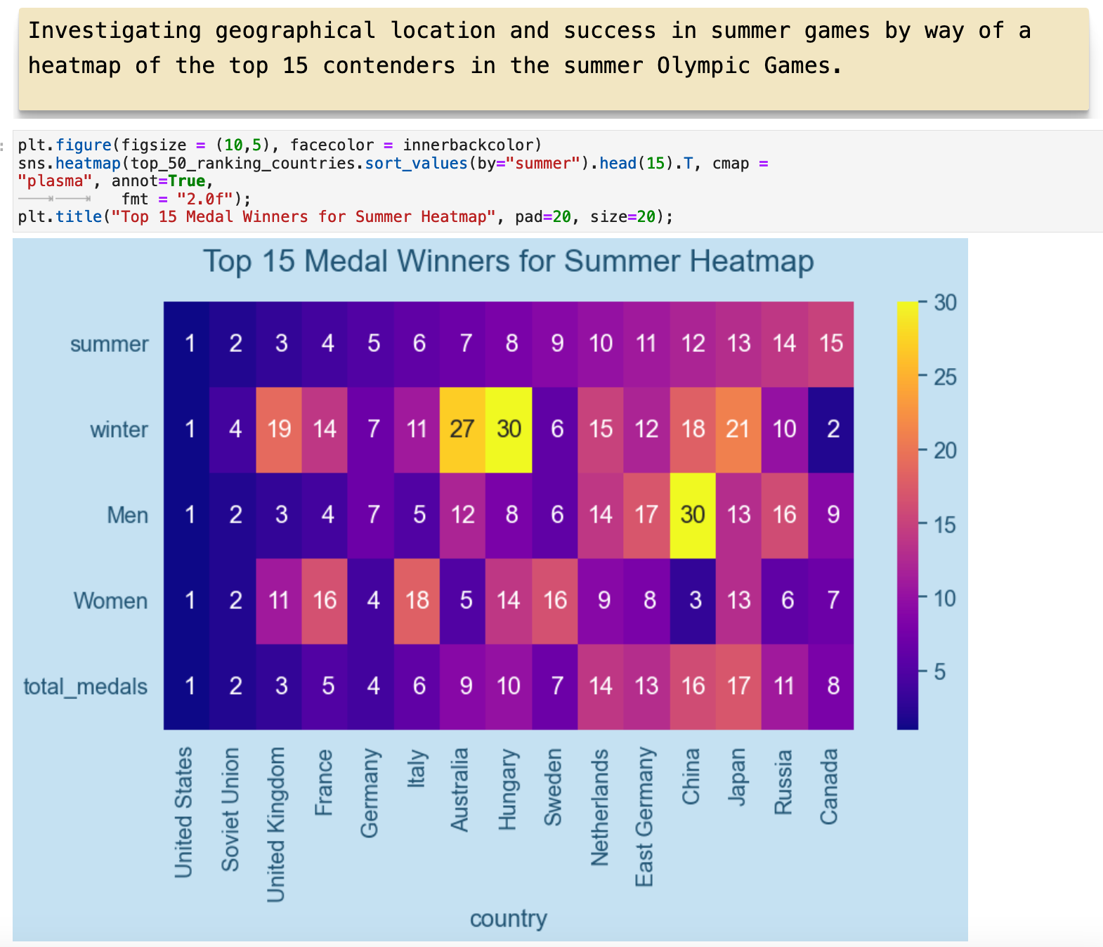
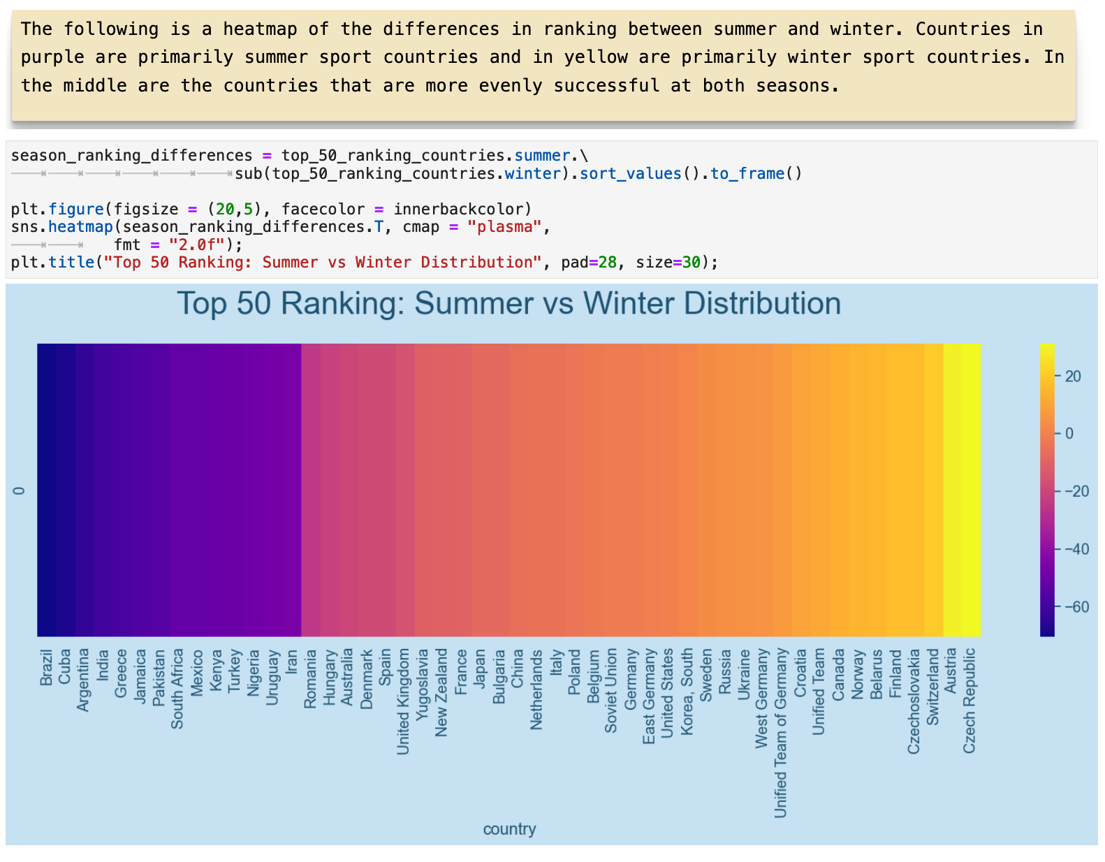
In this section we dive further into the correlations between the geographic locations of countries and the sports they excel at in the Olympics. The following are the two top 5 rankings for summer and winter Olympic Games.
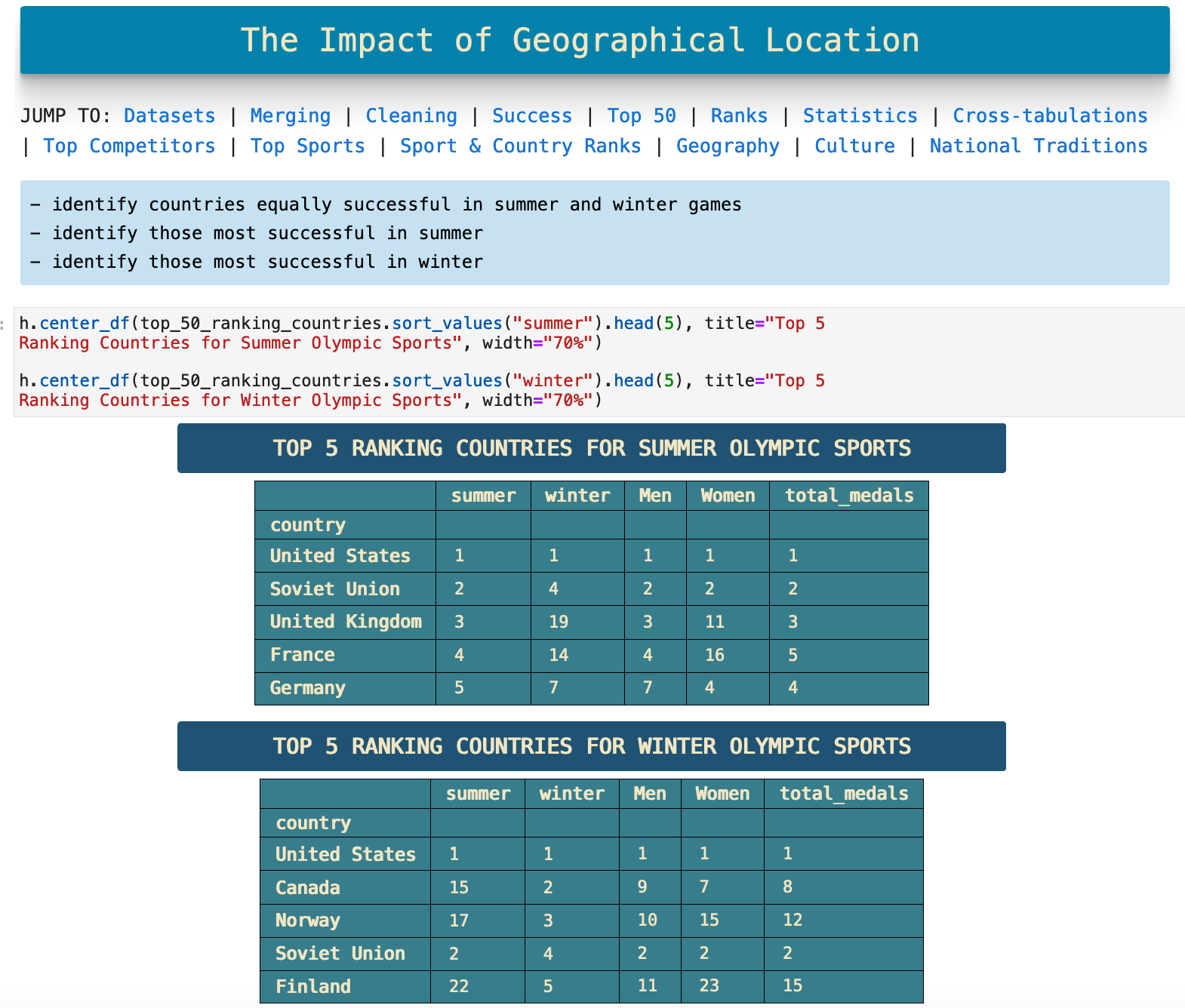
This visualization is organized in order of ranking in summer sports. There are some interesting trends and outliers. One relationship that jumps out fairly quickly is the difference between the number of countries that excel in both winter and summer sports and those that do not. Only 5 of the top 15 perform well at both.
Here we have almost the same visualization but ordered by ranking in winter games.
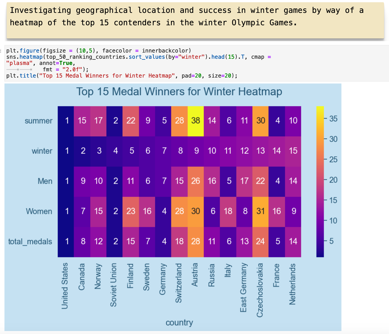
And the visualization below, we can see the spectrum spanning from countries that perform well only in summer sports to those who perform well only in winter sports. In the middle of the color spectrum, are the 5 countries who above we saw performed equally in both. You will notice that the center of the color spectrum is quite off center from the distribution. This is again due to the overall greater distribution of medals won occuring in summer Olympic games.
JUMP TO: Datasets | Merging | Cleaning | Success | Top 50 | Ranks | Statistics | Cross-tabulations | Sport & Country Ranks | Geography | Culture | National Traditions | Rare
The Effects of Culture
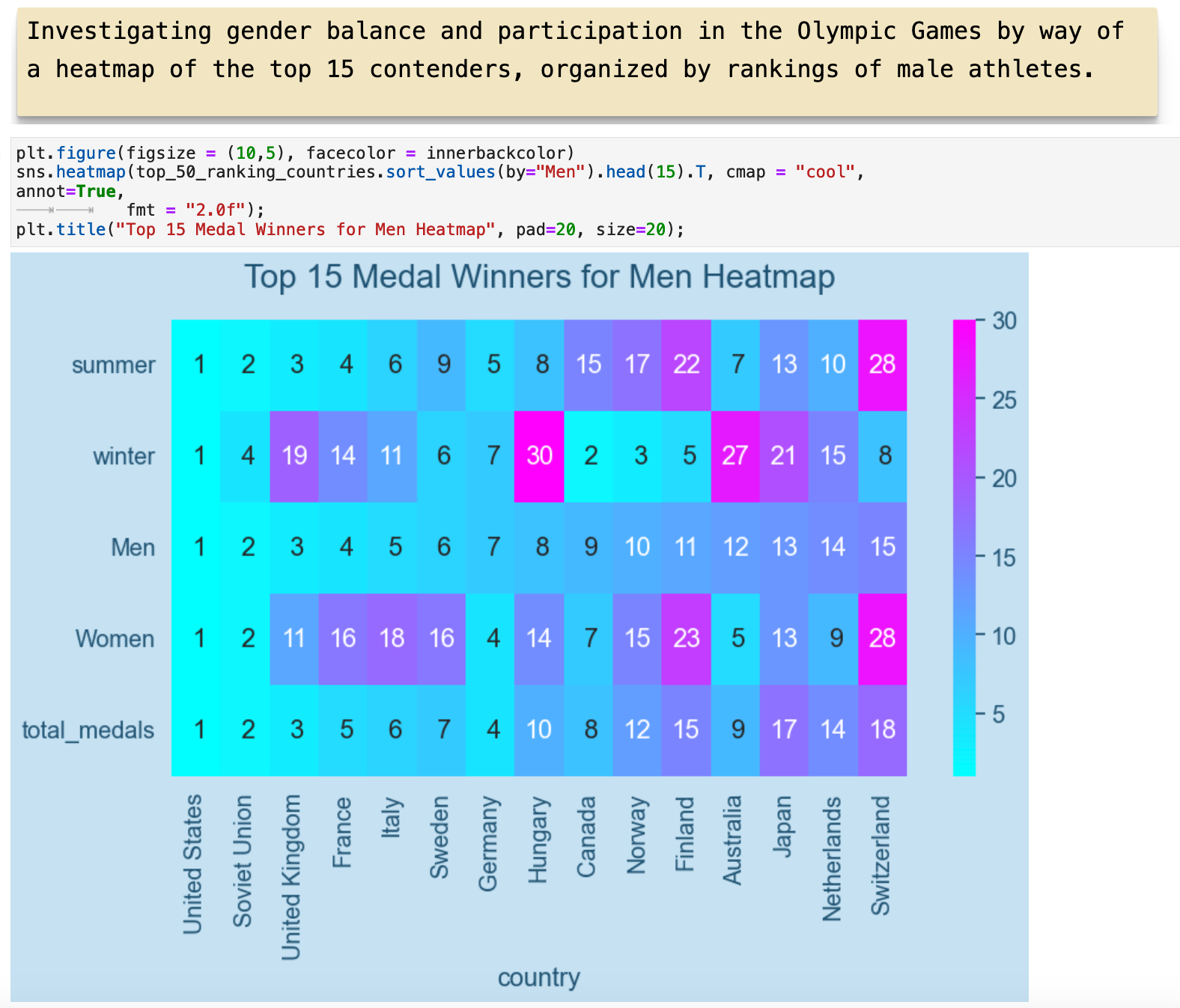
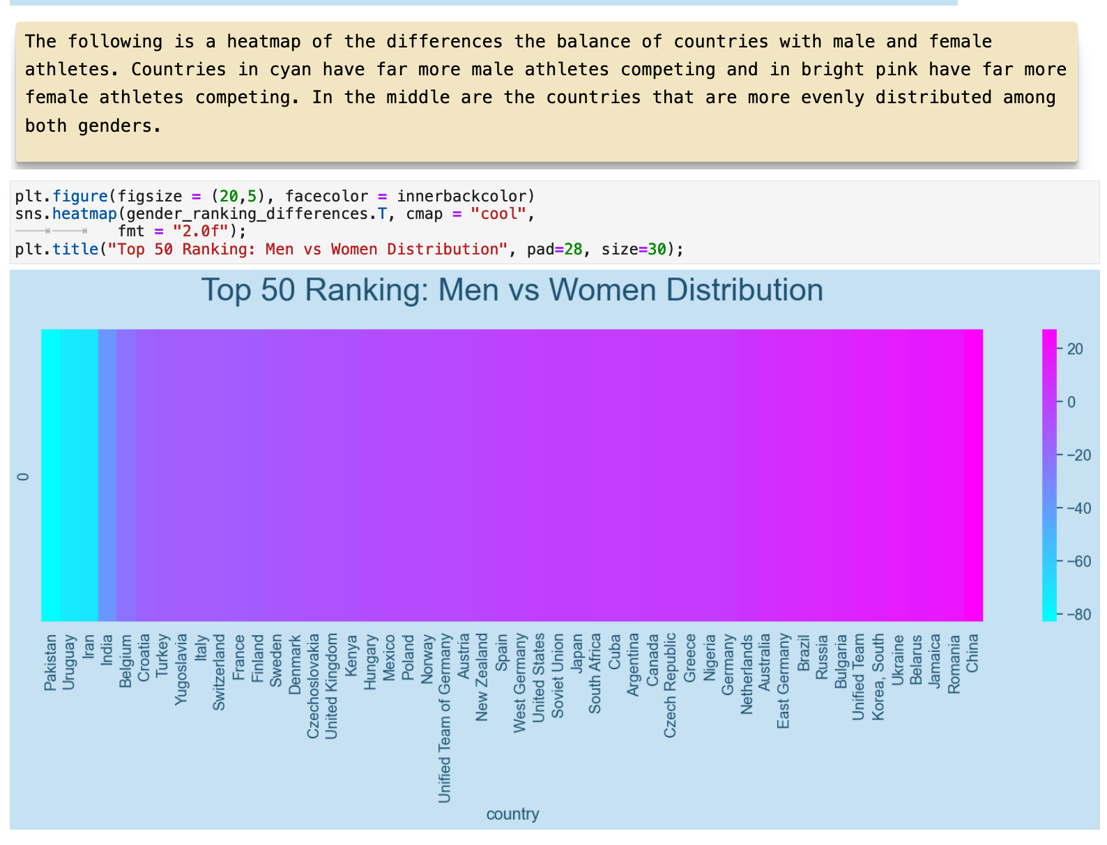
Where the rankings in summer and winter olympics showed a great deal of correlation with the geographical locations of countries, the distribution of medals won by men versus women in a country may also have correlations to cultural factors. Here we have similar heatmap representations to those above this time with regards to gender. Let's see how gender differences in the data might correspond to cultural and possibly religious variations.
This heatmap is ordered according to the highest ranking in the category of total medals won by male athletes. You can see how the United States and the Soviet Union both rank high with both male and female athletes. But then the United Kingdom ranks high in male athletes, but not nearly so high with female athletes.
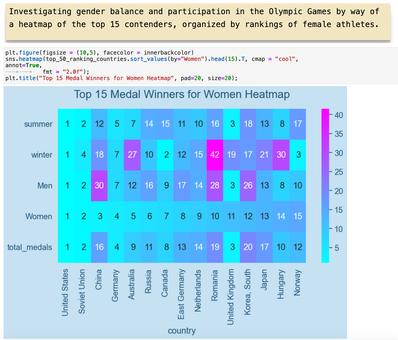
This shows the same relationships ordered by rankings among female athletes.
This heatmap shows the spectrum of countries and the relationship between the total medals won by men versus women. This spectrum is much more centered, with the countries ranking high in both men and women in the very center.
JUMP TO: Datasets | Merging | Cleaning | Success | Top 50 | Ranks | Statistics | Cross-tabulations | Sport & Country Ranks | Geography | Culture | National Traditions | Rare
The Effects of National Traditions
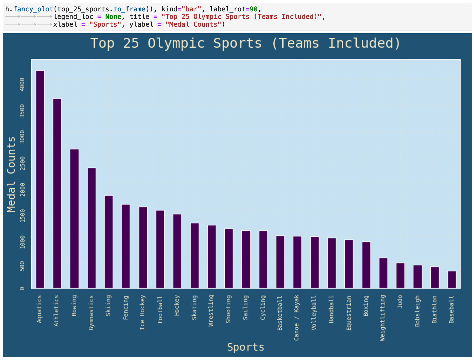
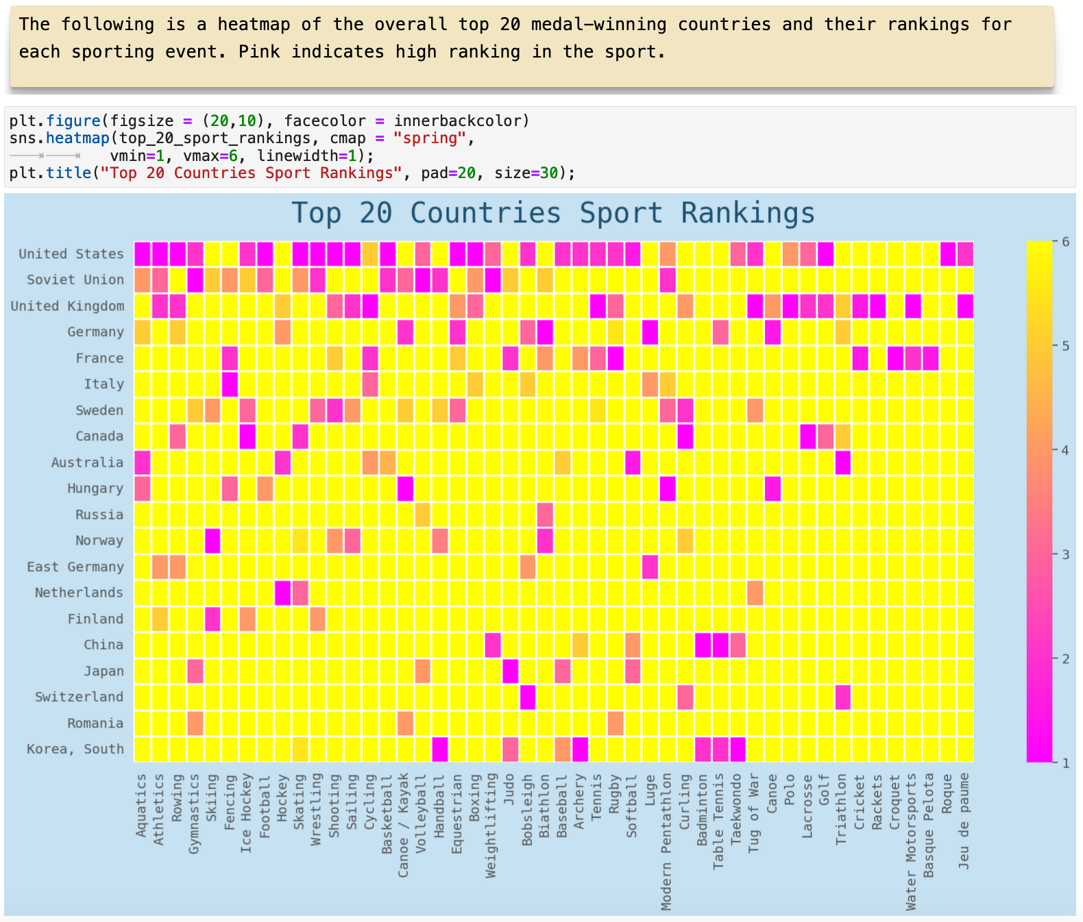
Here we look countries that excel at very specific sports outside of the core Olympic sport categories. In this graph, we see the most popular sports represented with the highest counts of medals awarded. We must keep in mind that this accounts for team sports as well, so the numbers for team sports are definitely inflated in comparison to not-team sports. At the same time, team sports are definitely some of the most popular Olympic sports with the public. So in the following representations, there is no normalization done to account for the differences between team versus not-team sports.
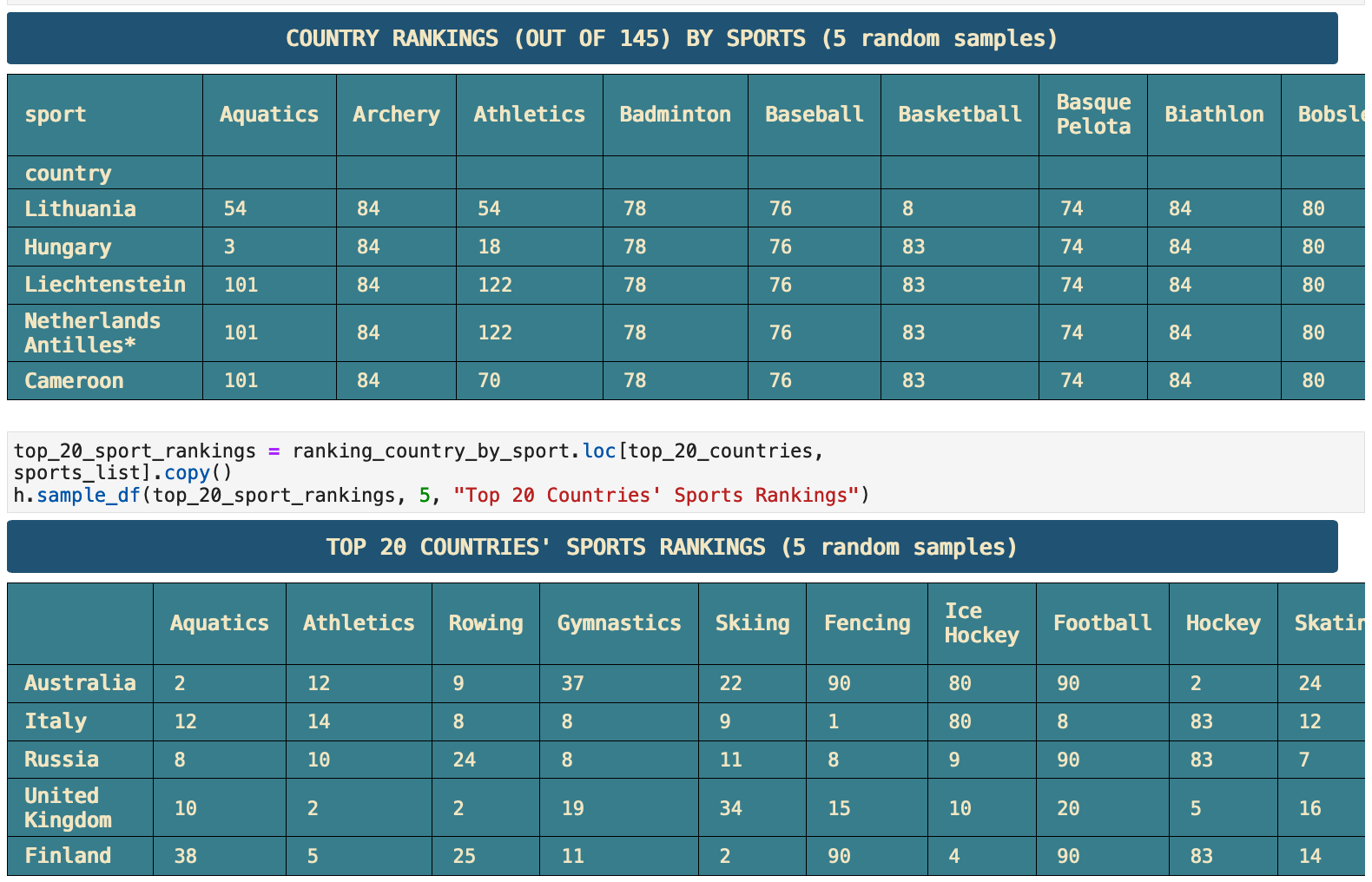
Here we have an incredibly interesting heatmap. It shows the rankings in each sport for the top 20 countries. Here we can see that the Swiss own the bobsleigh. South Korea and China run away with table tennis, badminton, and taekwondo. France, Italy, and Hungary are the places to go for fencing. And Lacrosse and golf definitely belong to the United Kingdom and Canada. So we see that national affinities for certains sports definitely show up in the rankings of countries in particular sports.
JUMP TO: Datasets | Merging | Cleaning | Success | Top 50 | Ranks | Statistics | Cross-tabulations | Sport & Country Ranks | Geography | Culture | National Traditions | Rare
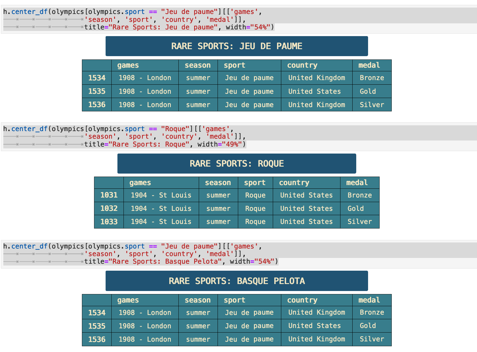
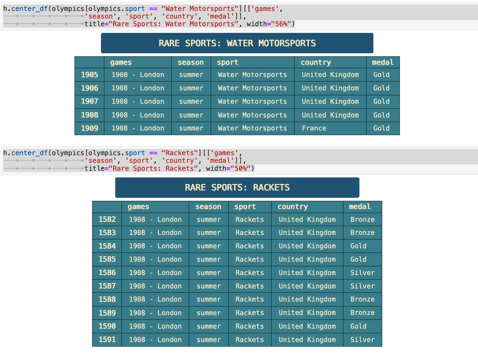
The Most Rare Sports
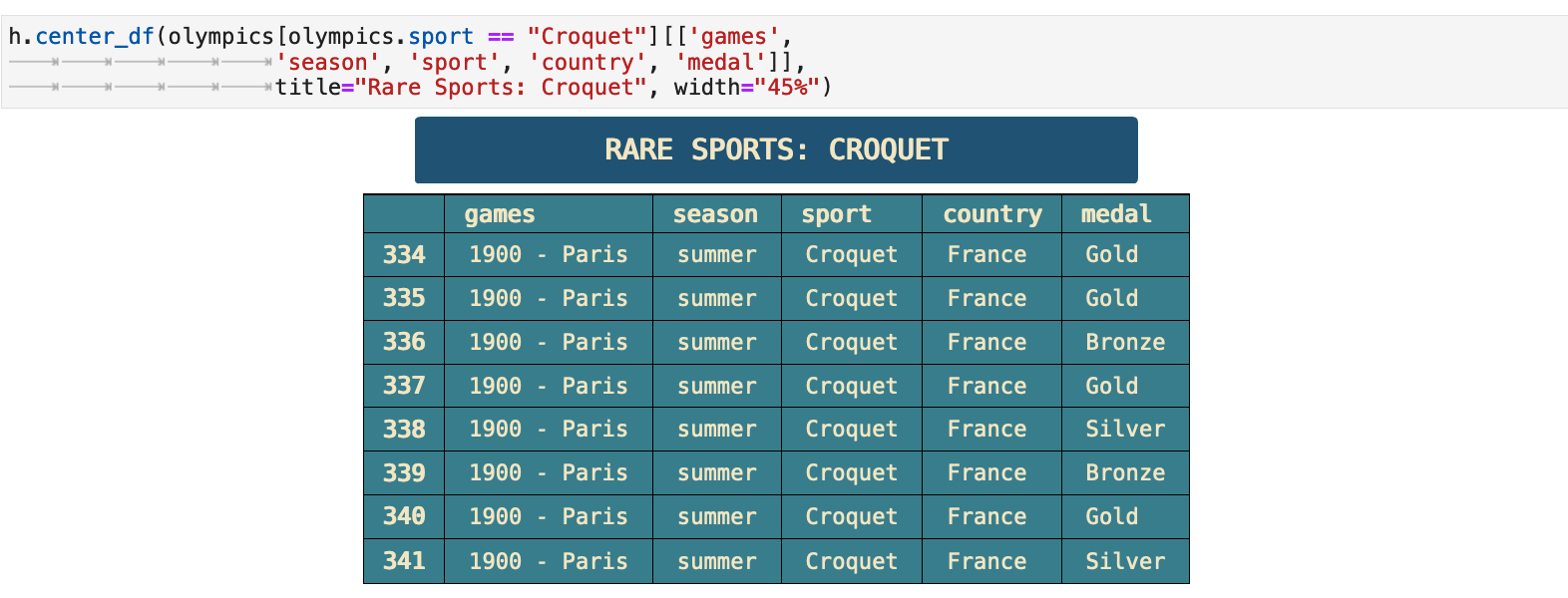
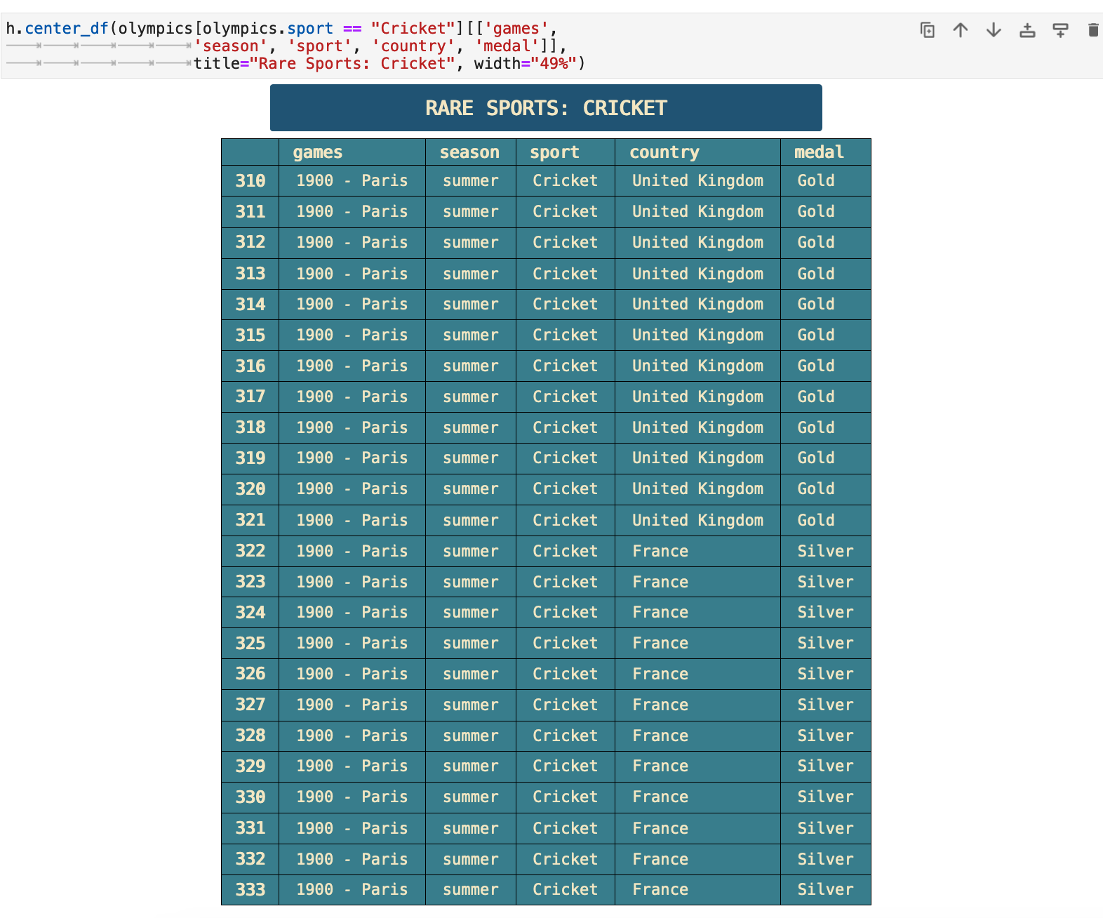
To wrap up our data analysis party, I will share with you some data that I found quite interesting. I grew curious about the sports with the lowest total medals won. I did not know what a few of them even were. So I decided to research them a bit. When I did, I found that the 7 rarest sports each only ever appeared once in a Olympic game.
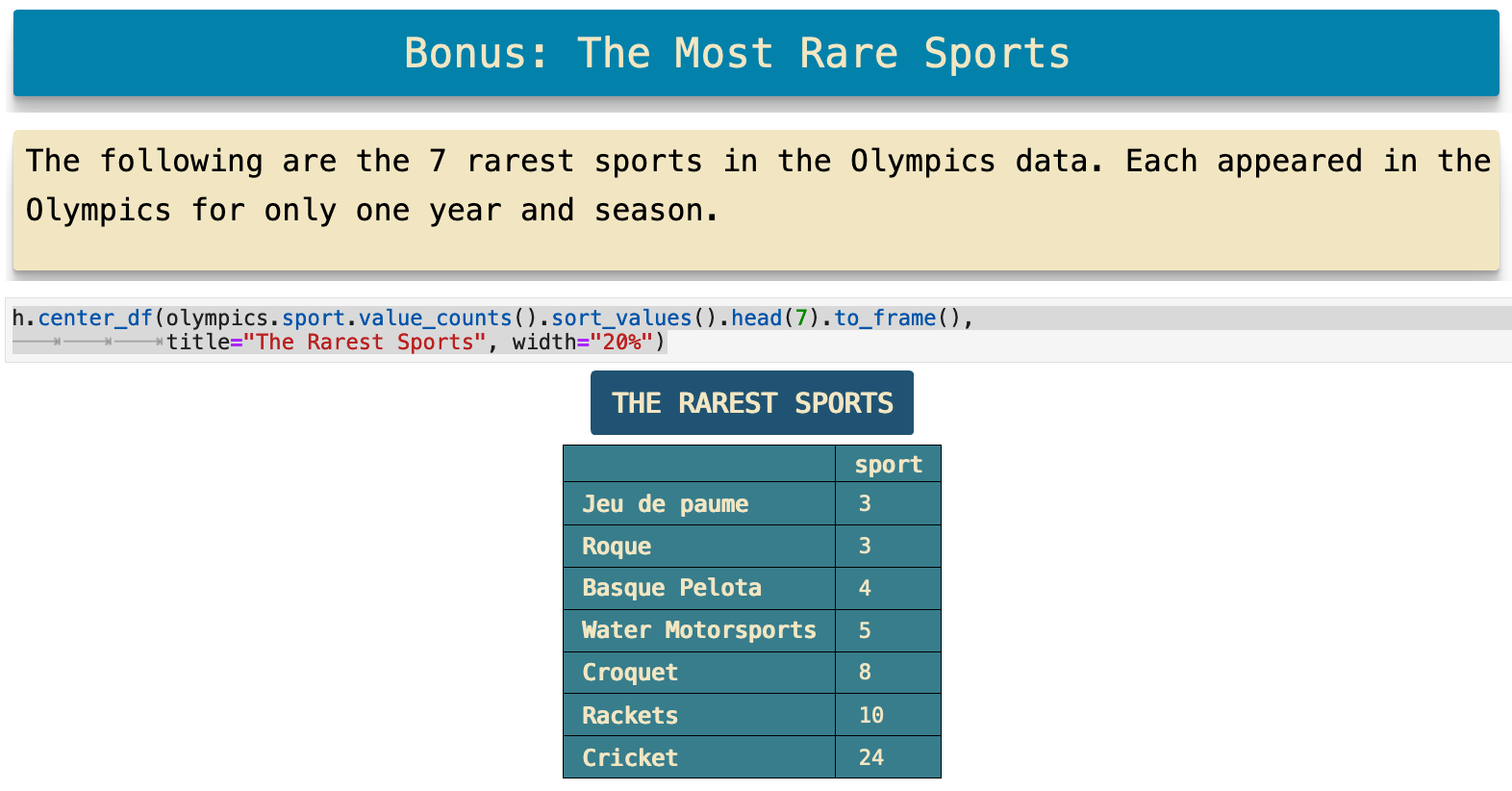
Four of the seven rarest sports shown below took place only once within the same Olympic games, at the 1908 London Olympics. Croquet and cricket only appeared once at the Paris Olympics is 1900. This was in the very beginning of the summer Olympics lifespan, so it is easy to understand why they might experiment with some sports as they are starting out. I was personally surprised that cricket did not make it to become a recurring Olympic sport. When I investigated further, I found that it is being considered for reintroduction. So there is a great deal of interesting history here and many stories to be found.
The links included below for each rare sport are to the Wikipedia articles for each, telling the story of their one-time involvment in the Olympic games.
JUMP TO: Datasets | Merging | Cleaning | Success | Top 50 | Ranks | Statistics | Cross-tabulations | Sport & Country Ranks | Geography | Culture | National Traditions | Rare
Conclusion
Thank you for taking this data journey with me. I truly love the progression of the journey from importing data to the final visualization. And I love sharing the results of those journeys. I hope you learned something new by going with me. Happy data wrangling!
The Code: Jupyter | PDF | Git | helpers.py