📈 Au Tableau: a journey from code to drag-n-drop

I danced with Tableau recently, and it was...interesting. And no, that's a demeaning use of "interesting". It just is what it is. Here's the thing: I have always implemented my visualizations via my lovely friends such as Python, Matplotlib, Pandas, Seaborn, and Plotly. And as much as I LOVE creating data visualizations and considering my career path, I knew I needed to learn Tableau, too.
At first, I was slightly offended. I know it sounds silly. But dragging and dropping data when I am accustomed to using machine learning models to generate the data and code it into luminous visualizations?! But then I opened my mind to the fact that not everyone wants to code and that MAYBE this could be fun and useful, too. By the end of about 5 hours of exploration and work with the platform, I can see its benefits. I get it!
And honestly, now I like it. It will not be my first go-to for visualizations, but I certainly will duplicate my most important visualizations from code to Tableau so that I can more easily share the data and so that users can interact with it.
And that is the part I was missing at the beginning. It is about the user experience. If I want people to care about my data, I have to be able to present it to them in the way that works best for them. And interactive data really is a wonderful thing. So I embrace Tableau now! Besides, it has a great name!
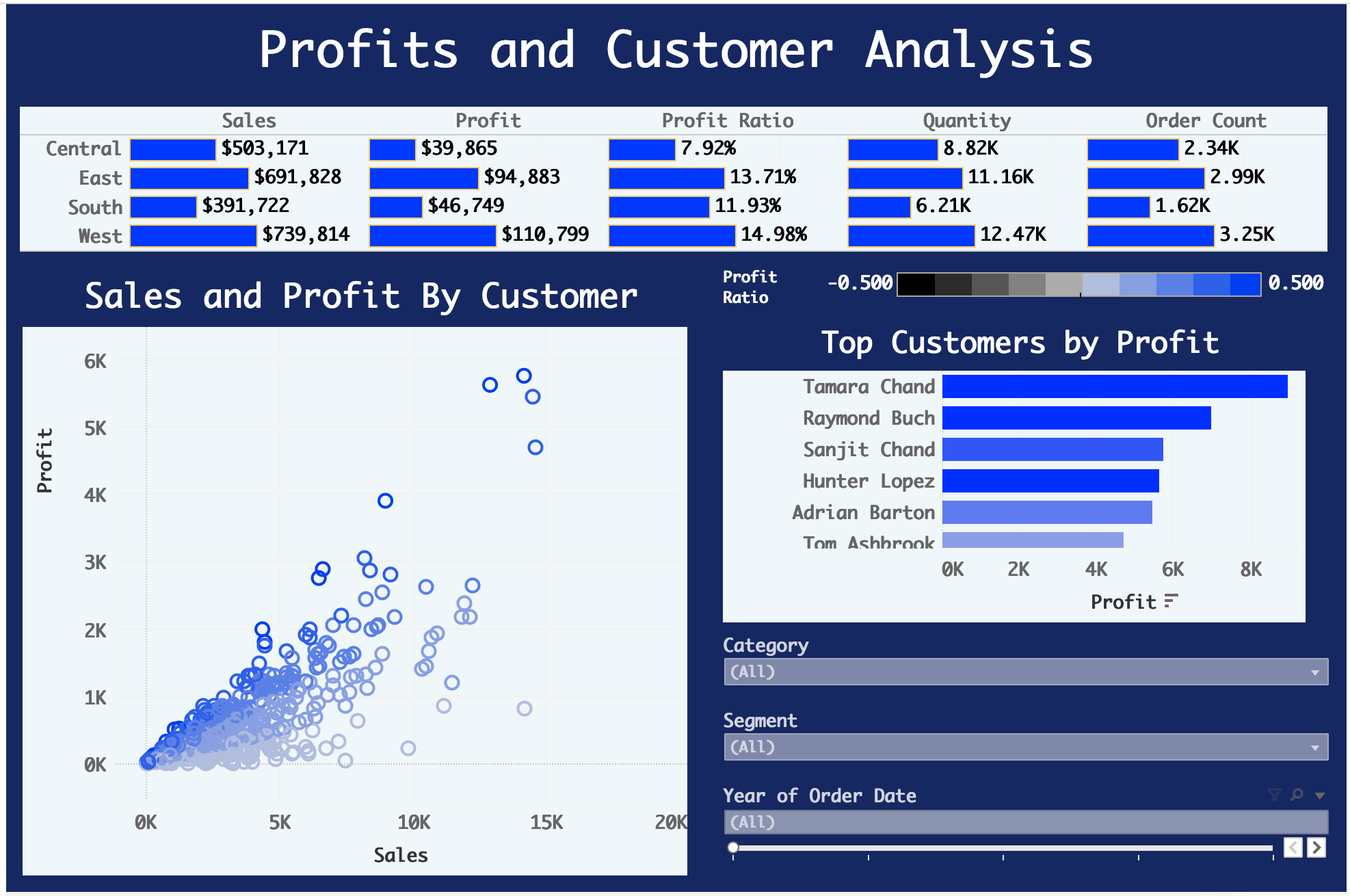
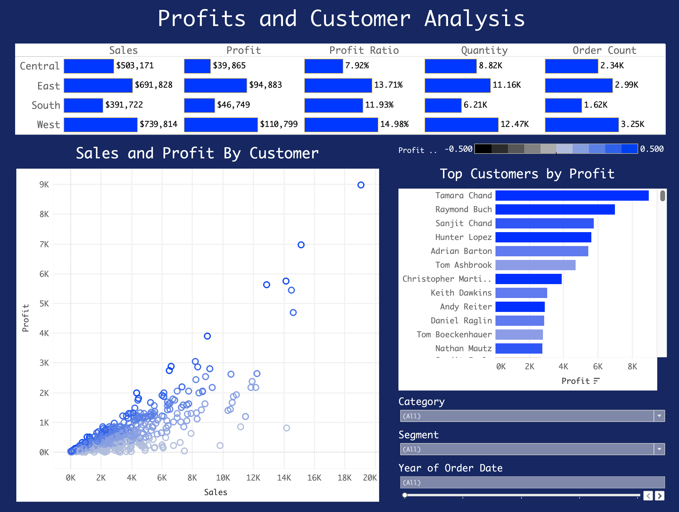
Here is a look at my first Tableau project:
At first, I worked with a light background, but it was not my favorite. I do not mind presenting data this way if someone prefers it, but if it is up to me, well this just hurts my sweet little eye balls. However, it is lovely and clean and easy to interpret. And that is the name of the game. (Click for interactive version at Tableau Public.)
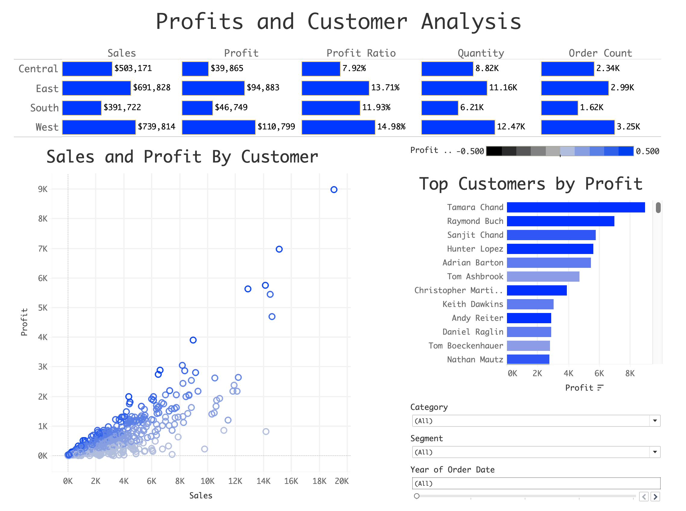
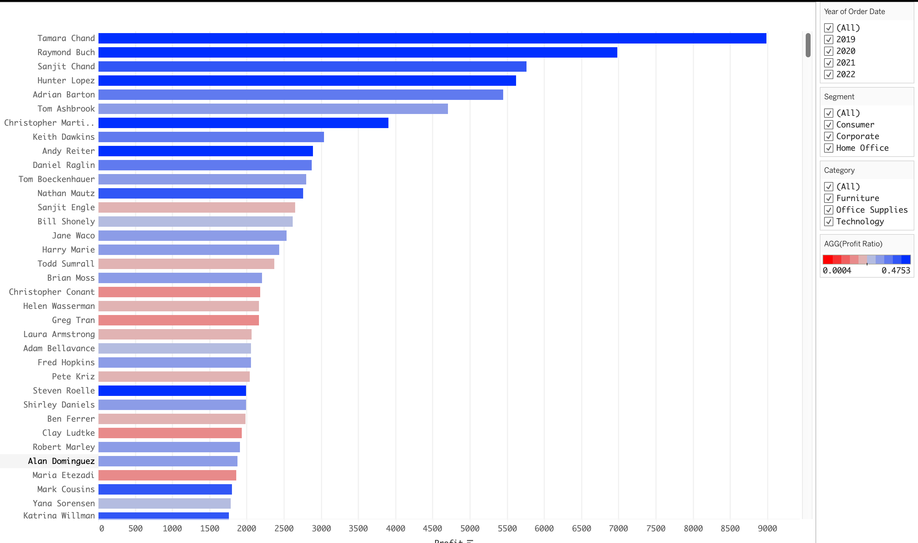
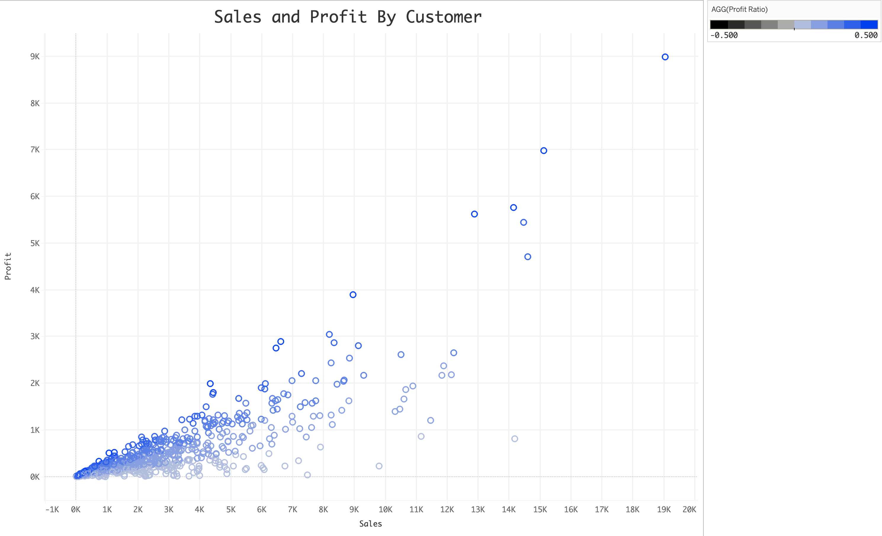
The one thing that frustrated me was how limited Tableau left me feeling when it comes to the use of color. This would have been FAR more informative if Tableau would let me get in there and tweak more the tiny details. But I am still happy with it. (Click for interactive version at Tableau Public.)
Oooooh, you sneaky little outliers, so grealy affecting my plot! But these outliers happen to be very important to the data. So alas, much white space.
And then I tried out dark mode, just for me. Honestly, I like both versions very much. I felt like this version draws the eyes in toward the data a bit more.
So there we have it! I have now expanded and translated my data visualization skills to incorporate Tableau. And I look forward to creating more attractive and informative dashboards soon. Make sure to check them out on Tableau Public.