📊 Plotly: the great and the disappointing

(Jupyter Notebook link for this project)
I was a BUSY girl today! I just spent an entire Sunday, as in a whole 10 and a half hours, learning the ins and outs of Plotly and some very cool dynamic data visualization. I also ran into some GIGANTIC road blocks in functionality. So here is where I sing the praises and whine the shortcomings of Plotly.
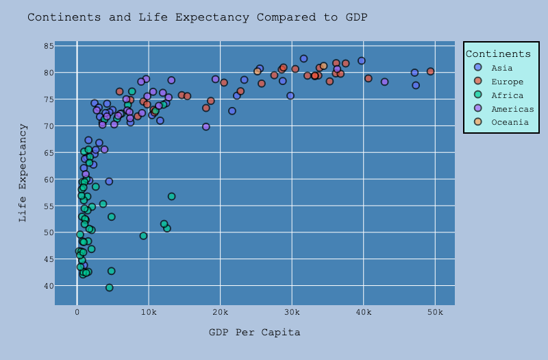
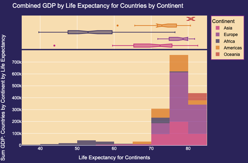
This graph makes it undeniably clear that there is a great deal of starvation still going on in many parts of Africa. No matter how many pretty colors I throw together, no one can look at those low life expectancy numbers and feel like it is an acceptable state, especially in the 21st century when there is so much wealth.
Mostly, I spent those hours learning and learning and loving it. I don't really know why juggling data and making it look pretty is something I enjoy so much. But it has definitely become an obsession of mine as I dive headfirst down the rabbit hole that is the world of data science and machine learning. And every day, I love it even more.
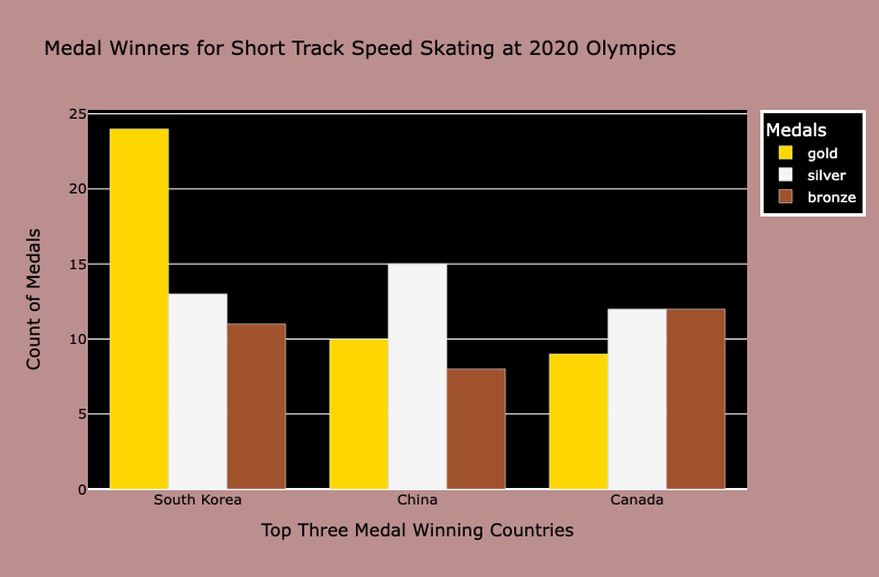
I wanted to keep the gold, silver, and bronze representation here...so it limited my color choices. I am usually more of a glitter and unicorns kinda plotter. Funny how I started out a goth teen and have become obsessed with rainbows and glorious gradients as I mature.
The main take away from today is that there is a lot I can do with Plotly, but there are also MANY things missing and many issues that need remedy before I could say that it would be my go-to graphing library.
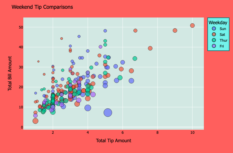
I cannot lie. I got a little obsessed with this dataset. It is just too hard to walk away from. There was so much to look at with regards to tips and percentages and who tips how much and wonder why, and the questions go on and on! PS: circle size correlates to the number of people in each party.
Ok, so what is my main complaint? Here's the thing. I like to work in Jupyter notebooks when I am plotting. I like the immediate gratification of seeing my work so beautifully illustrated so easily. The complaint: I cannot use Plotly inside PyCharm with Jupyter notebooks. No matter the settings, the tweaks, my IDE is going to complain after just ONE tiny line graph. HEAP FULL!!! HEAP FULL!!!!! MAN OVERBOARD!!!!!
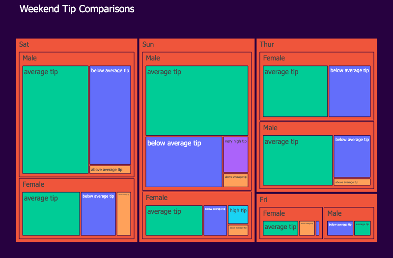
I really hope this dataset is not real. The tipping levels are super sad here, except for that one guy who spent 7 bucks and gave his server a 70% tip. He's cool.
So I gave up after about 2 hours of fighting that. (That is actually how I spent last night...my birthday...is that lame? I was fighting Plotly and Jupyter...and I had to surrender.) I ended up just working online through Binder. And that would be OK if not for the "OMG! You did not look at your computer for 75 seconds, so BYE! Hope you committed!!!!" I have had to go back to a 1998 level of obsession with saving my work. But that's cool. I can do that...
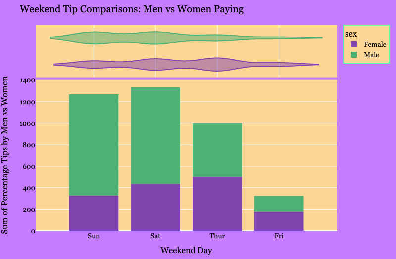
Let the tipping begin!
Another thing about Plotly that gets me is the lack of uniformity in the way they do a lot of things...arguments often seem arbitrary and well as aspects like labels and titles of different parts of the plots or how they differ from one type of plot to another. For the most part, there IS a good deal of standardization, but then when you run into 5 deviations from the norm all of a sudden, it kinda ruins it!
Here's the thing. I still REALLY like Plotly. And that is why the annoyances are so annoying. It could be EPIC!
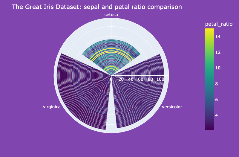
I took a crack at the irises! I had to! I decided to divide the petals and sepals length by width and compare. I was quite surprised at how the ratio for the petals and sepals had the similar pattens with only two of the three types. With setosa, the petals really win.
Will I keep using it? Yeah, sure! It is pretty easy when all is said and done. Will I work hard to become as advanced as possible in Seaborn at the same time? Absolutely!
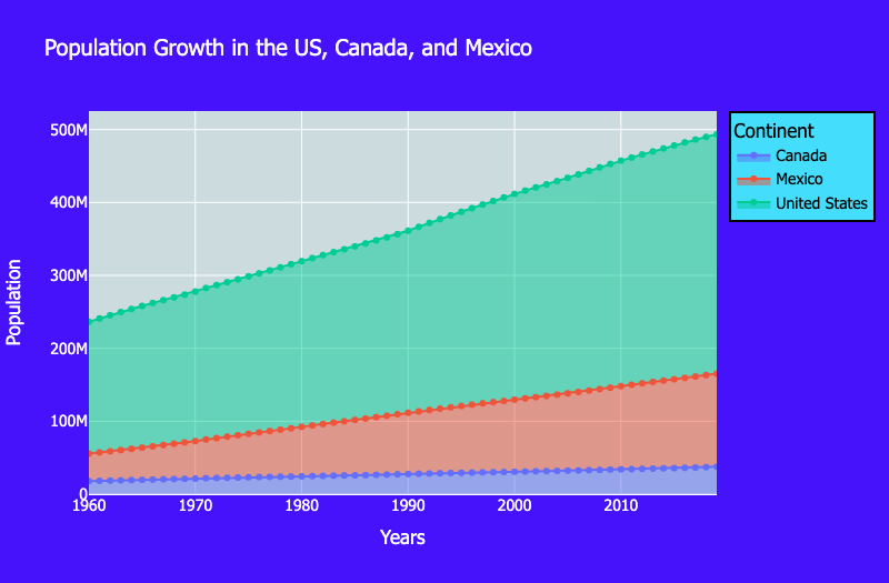
I was absolutely amazed at how steady the population of Canada has remained for so long. I had no idea! And thennnnnn, there is us Americans!
And honestly, I still have a TON to learn. I just hope I have the patience to put in the time to do it. And I am sure I will. But if I have a choice, it will probably be to spend my time on Seaborn and Matplotlib.
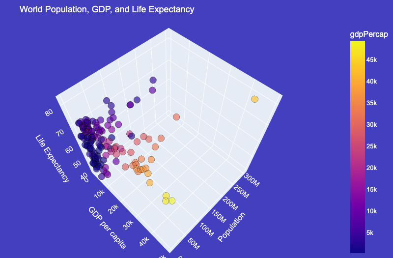
My lovely 3D plot! I had to remove India and China, because they kept throwing off my plot with their giganto populations...kinda like how the US throws it off with our ginormous GDP. Of course I kept us in there...I felt like I had to.
Overall, I had a fantastic time today learning all of this. NO REGERTS! I just hope that maybe there is a bit of a move to better this library for the sake of making it more useful. Because it REALLY does have a lot going for it. I LOVE the interactive aspects and the 3D and animated graphs. They are fantastic. I would REALLY like to be able to use PyCharm though. That is my number one complaint. If that could be fixed, I would deal with ALLLLLL the rest. Because let's be honest. Making data pretty is FUN! (Or is that just me?)