🛠️ Custom Jupyter Helper Functions


I live inside Jupyter notebooks for the vast majority of my waking hours. And I love it there. But I have also put in some serious hours toward making my Jupyter home beautiful, happy, and efficient. In this article, I will share with you some of my very favorite custom Jupyter helper functions for streamlining my workflow and making my notebooks visual masterpieces.
You can find the entire notebook for these helpers embedded at the end of this article or follow the links here.
The Code: Embedded Jupyter | Interactive Jupyter | HTML
Evan Marie online:
EvanMarie@Proton.me | Linked In | GitHub | Hugging Face | Mastadon |
Jovian.ai | TikTok | CodeWars | Discord ⇨ ✨ EvanMarie ✨#6114

Sections: ● Top ● Importing Helpers ● Utilities Helpers ● Display Helpers ● Styling Helpers ● Time Series Helpers ● Code
1. Importing Helpers
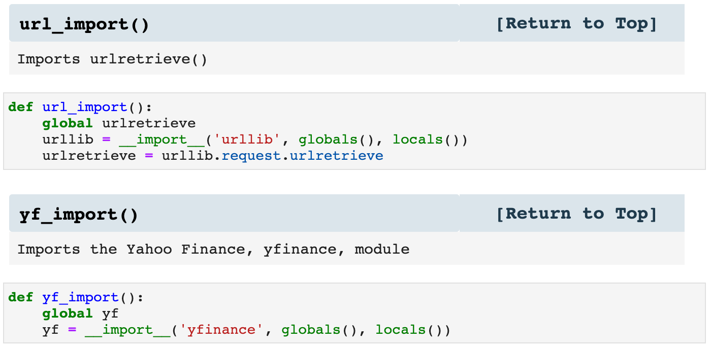
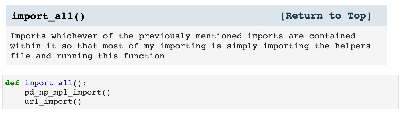
The first type of helpers I use are my import helpers. Since many of the libraries used for data science need to be imported for almost every project, I have made a function that imports Pandas, NumPy, Matplotlib.pyplot, and Seaborn together. I also make other import helpers, such as url_import() and yf_import, which import various other libraries. It's not lazy; it's efficient.
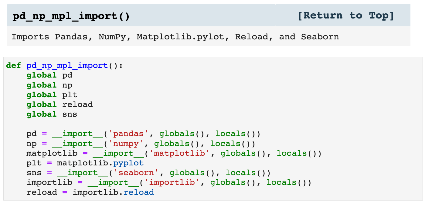
Then I use the function called import_all(), which I customize in the helpers file for different projects, and when I call it inside my Jupyter notebook, all the libraries I need are imported. So essentially, my import cell can be 2 lines of code rather than numerous lines.
Sections: ● Top ● Importing Helpers ● Utilities Helpers ● Display Helpers ● Styling Helpers ● Time Series Helpers ● Code
2. Utilities Helpers
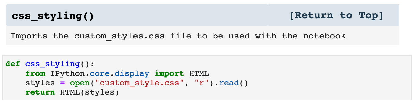
The next helpers in line are those which perform utility functions and just make life easier. For example, when I run the first utility helper below, it tells my notebook to use the specified css file for the styling of my notebook. I will admit that I use this sparingly, however, due to the issues of platform variability with Jupyter notebooks. Sometimes css stylings can look like a complete hot mess. Then there are the times when I need to switch over to Google Colab, and no css is even allowed there. But in my own happy, little Jupyter space, I do like indulging in a bit of css to make things lovely.
The next two functions are just shortcuts for two Pandas functions I use all the time, pd.Series() and pd.Dataframe(). These just make my code more concise and clean while still communicating what is going on.
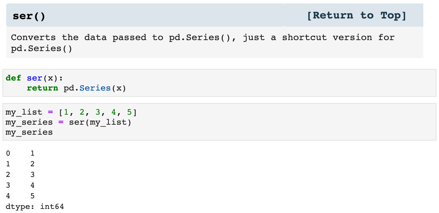
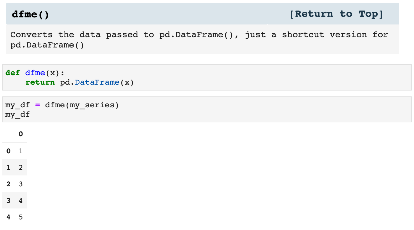
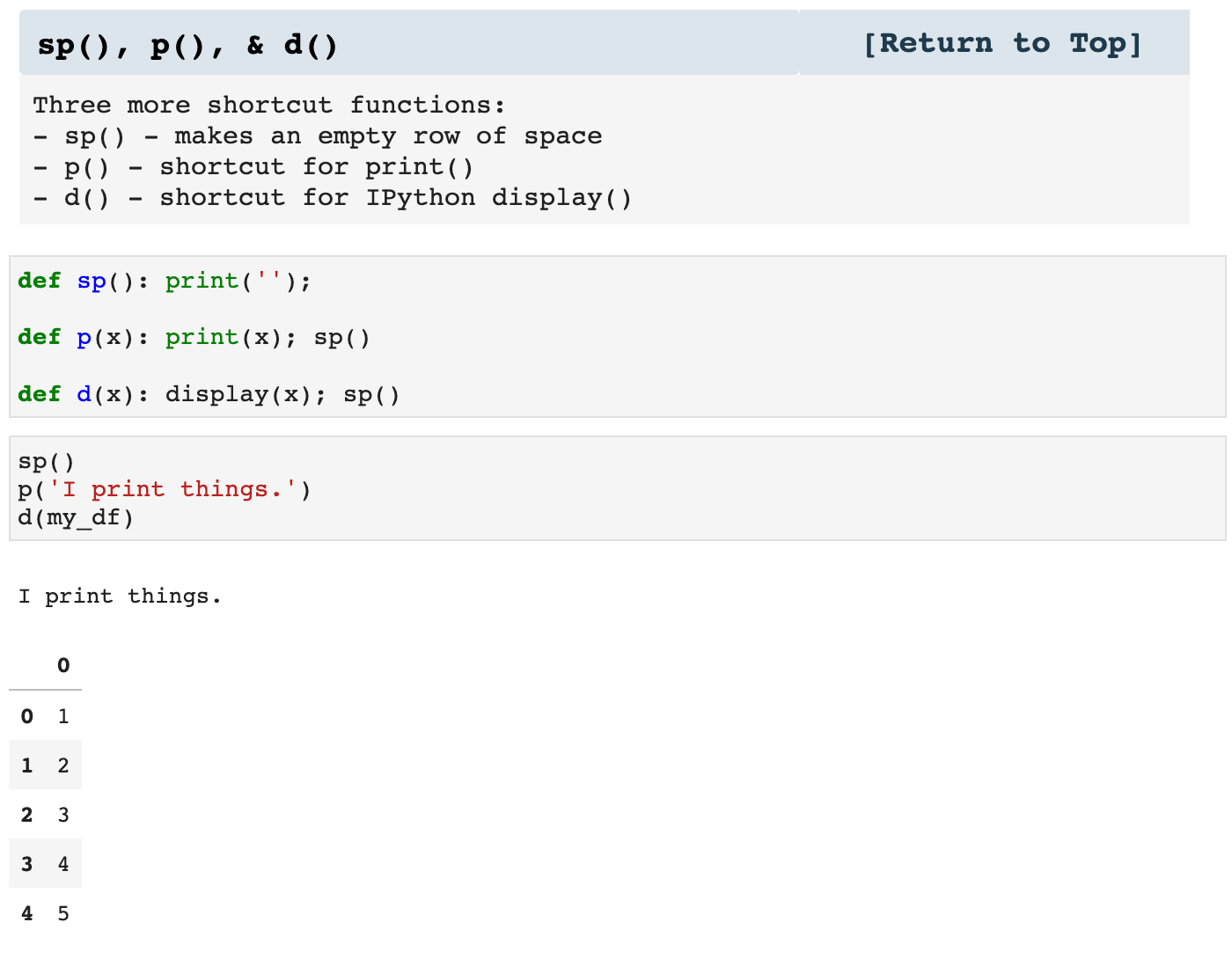
These three little guys are useful inside of other functions, as well as within the entirety of my notebooks. They keep my code sleek and clutter-free.
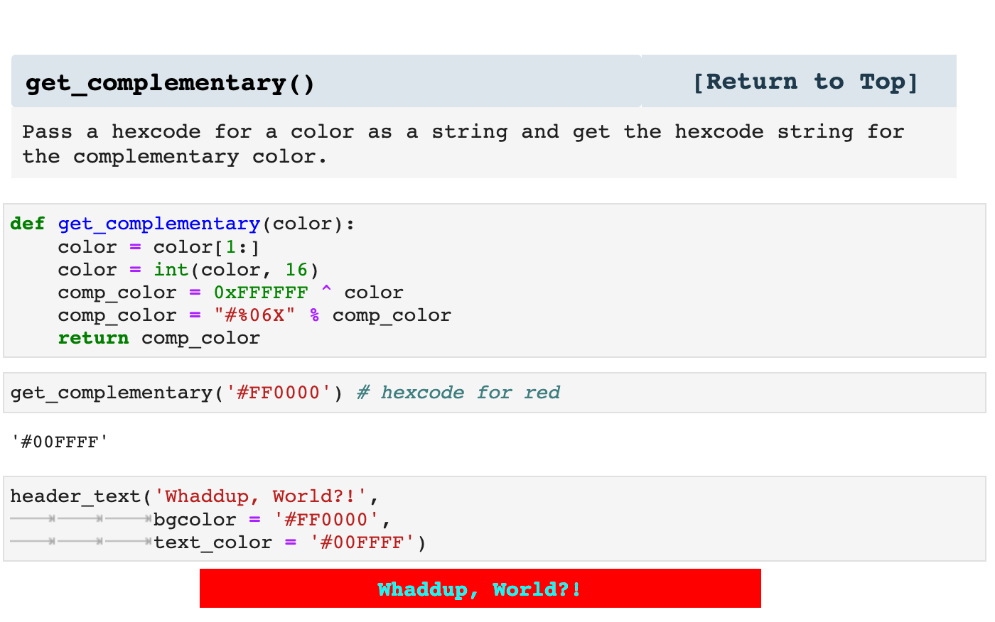
Because I am so big on involving color in my notebooks, the following function is useful in design so that I can pair up colors with their complementary colors. It is nice to have, because I can use it to write functions that specify color stylings and collect complementary colors for contrast. At the same this function makes it possible to specify just a couple of colors for the styling of a project and automatically calculate the complementary from within the code, rather than having to further specify colors throughout the project.
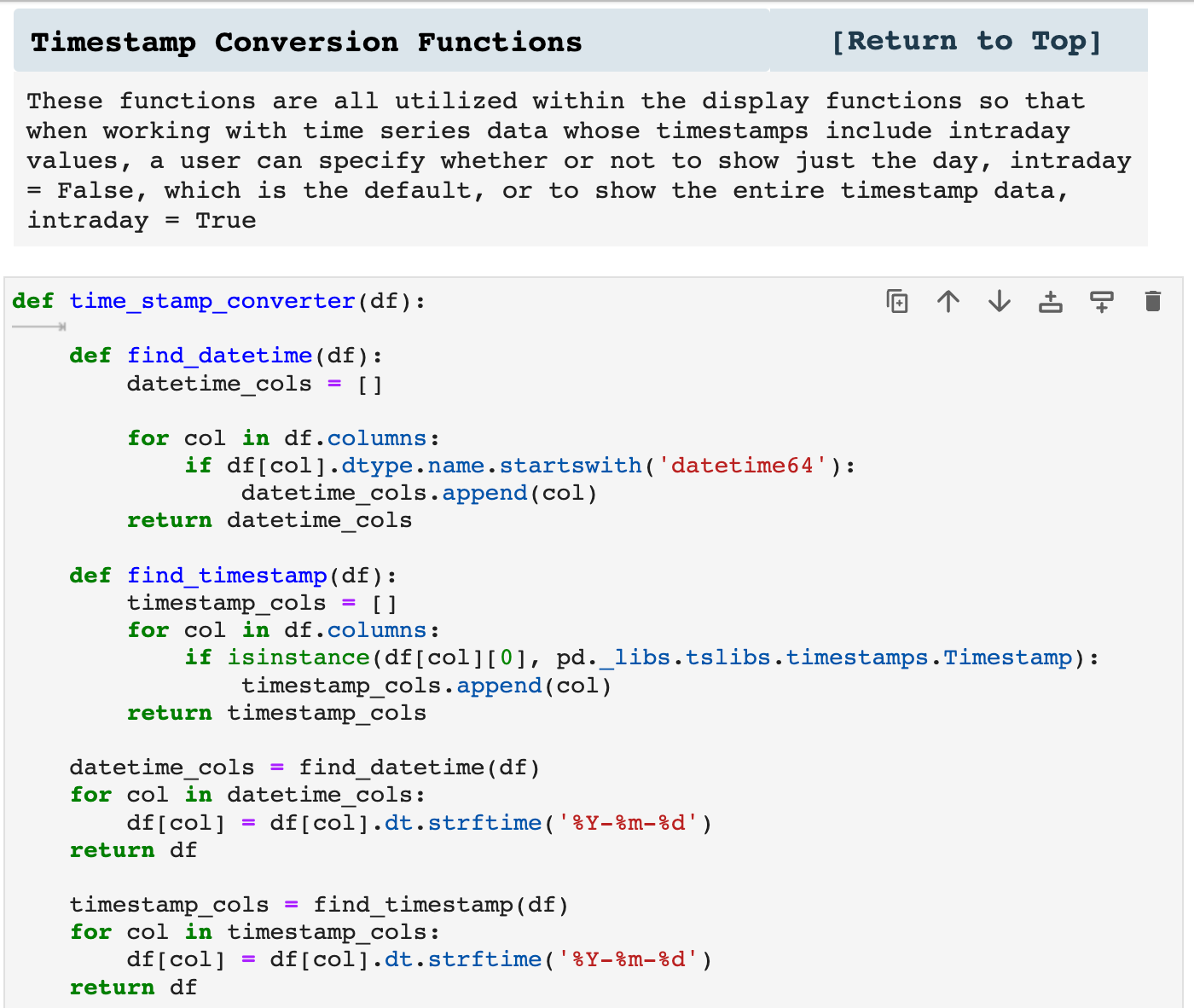
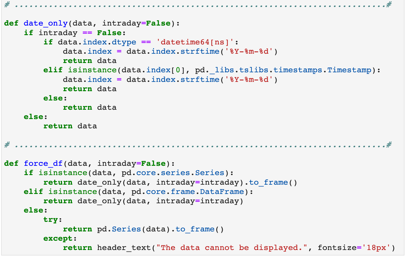
The following functions are used as utilities with many of my other functions. For example, when I am working with time series data, I like to have the choice to spontaneously either include intraday time stamps or just the date within one parameter and not have to change Pandas settings. So many of my displaying functions will use these to convert timestamps to display just the date or to display the entirety of the timestamp. This helps dataframes not be filled with zeros in the timestamps when data is less frequently occuring intervals.
Sections: ● Top ● Importing Helpers ● Utilities Helpers ● Display Helpers ● Styling Helpers ● Time Series Helpers ● Code
3. Display Helpers
These are some of my most favorite helper functions. I am HUGE on displaying my data in such a way that I can scroll through my notebook and quickly find just about anything. And while I do have a habit of including navigation bars at the beginning of each section of my notebooks for quick data access, it is still nice to be able to scroll and clearly know which section of the notebook I am currently look at at any given time by having headers and labels on dataframes and other data.
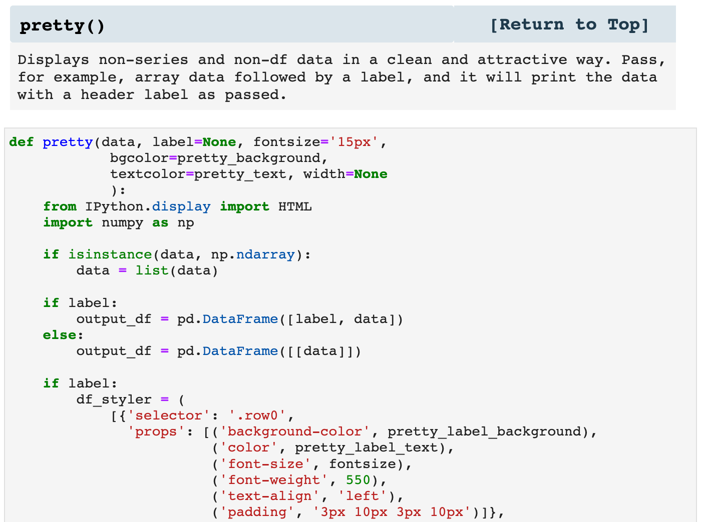
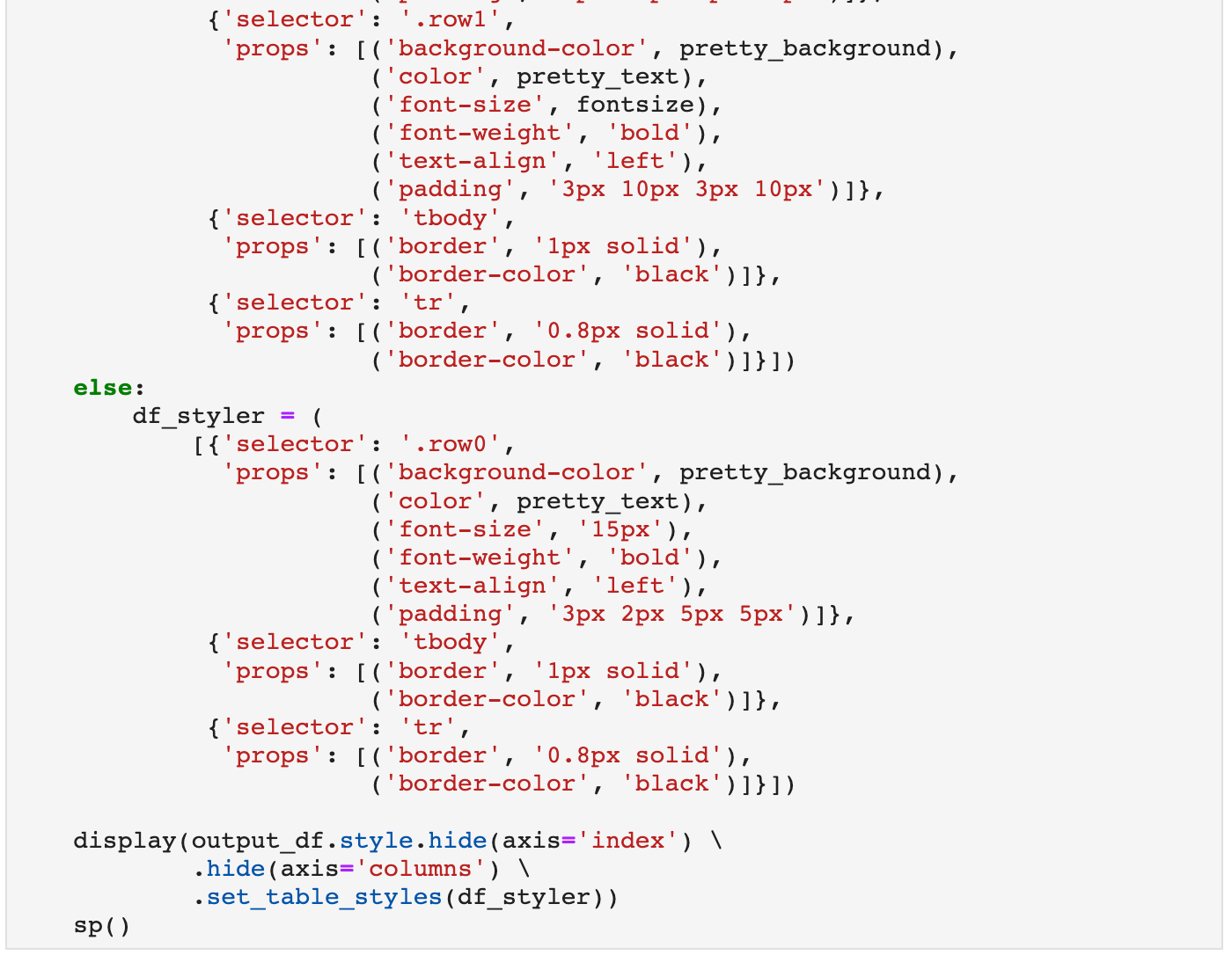
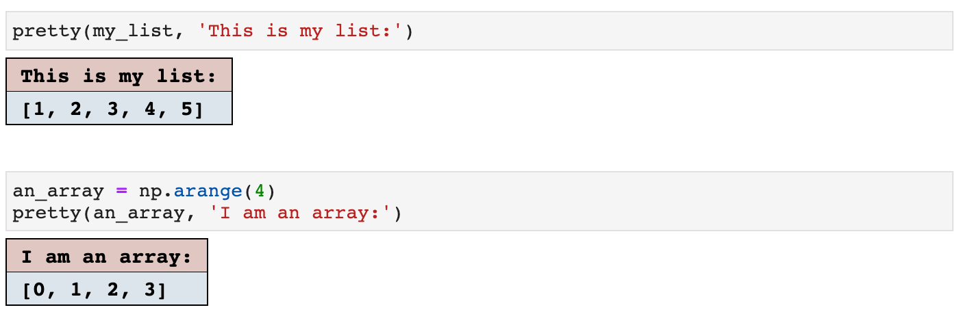
The first example of display helpers is pretty(). It does just that; it makes things pretty. It takes any NumPy array type of data (or text, or almost any kind), and displays it as seen below. The colors are easily customizable, as I set my project colors at the top of the helpers file for each individual project. And all of these functions then utilize those colors throughout the project for a clean and coherent project visually and logistically.
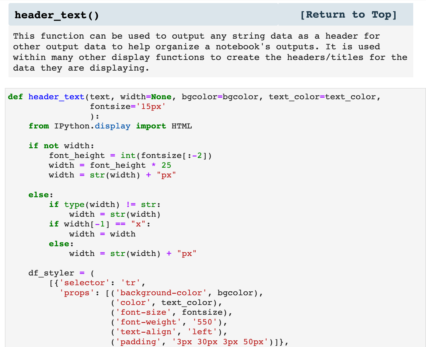
Next is a function that MANY of my other functions utilize for headers above the data they are displaying. It can also be used on its own as a means of labeling the output of a cell.
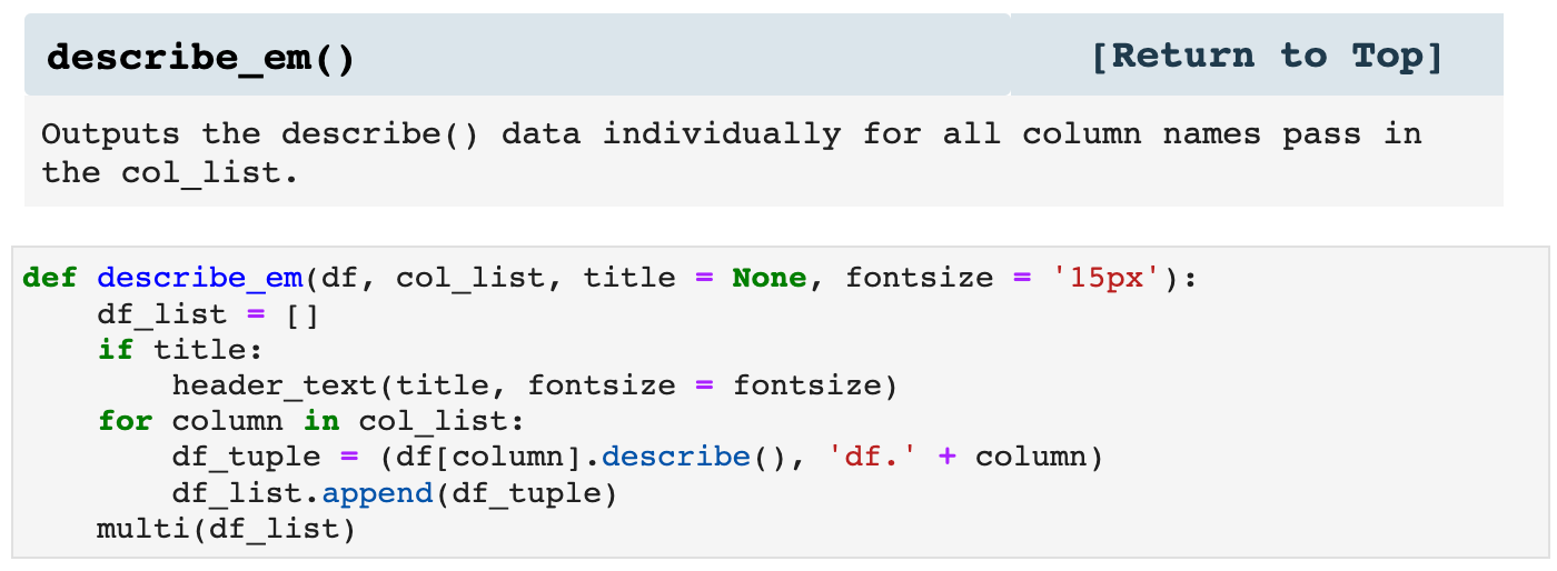
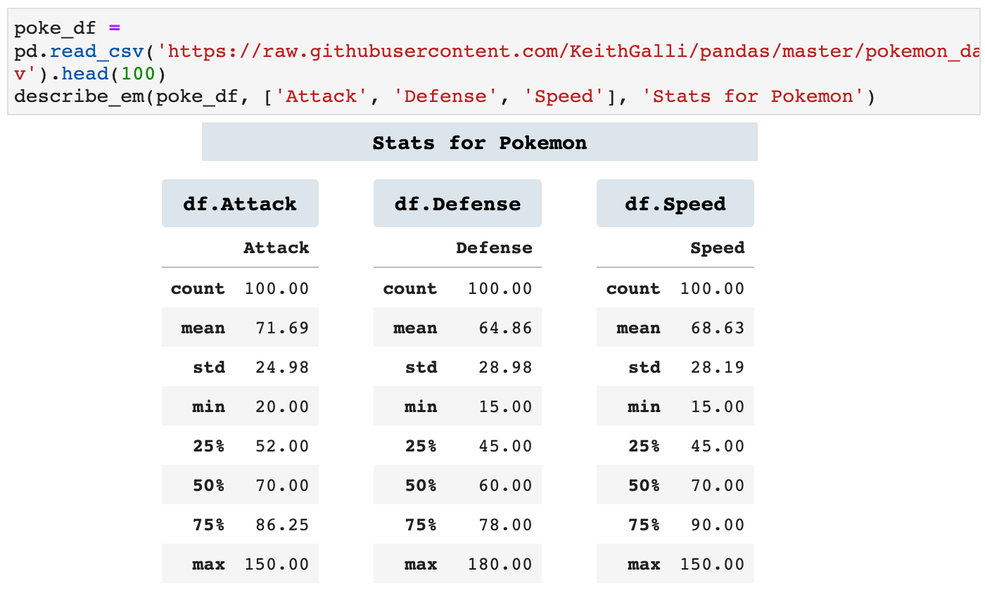
describe_em() essentially calls the Pandas describe() method on individual columns of a dataframe. I personally like to see them sectioned off on their own. For me, this helps me more fully comprehend the relationships in the data as well as the distribution and overall meaning in the data when using the describe() method.
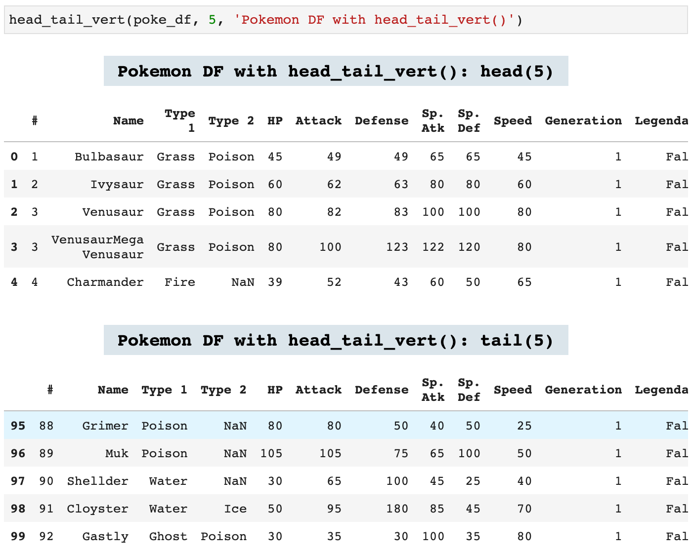
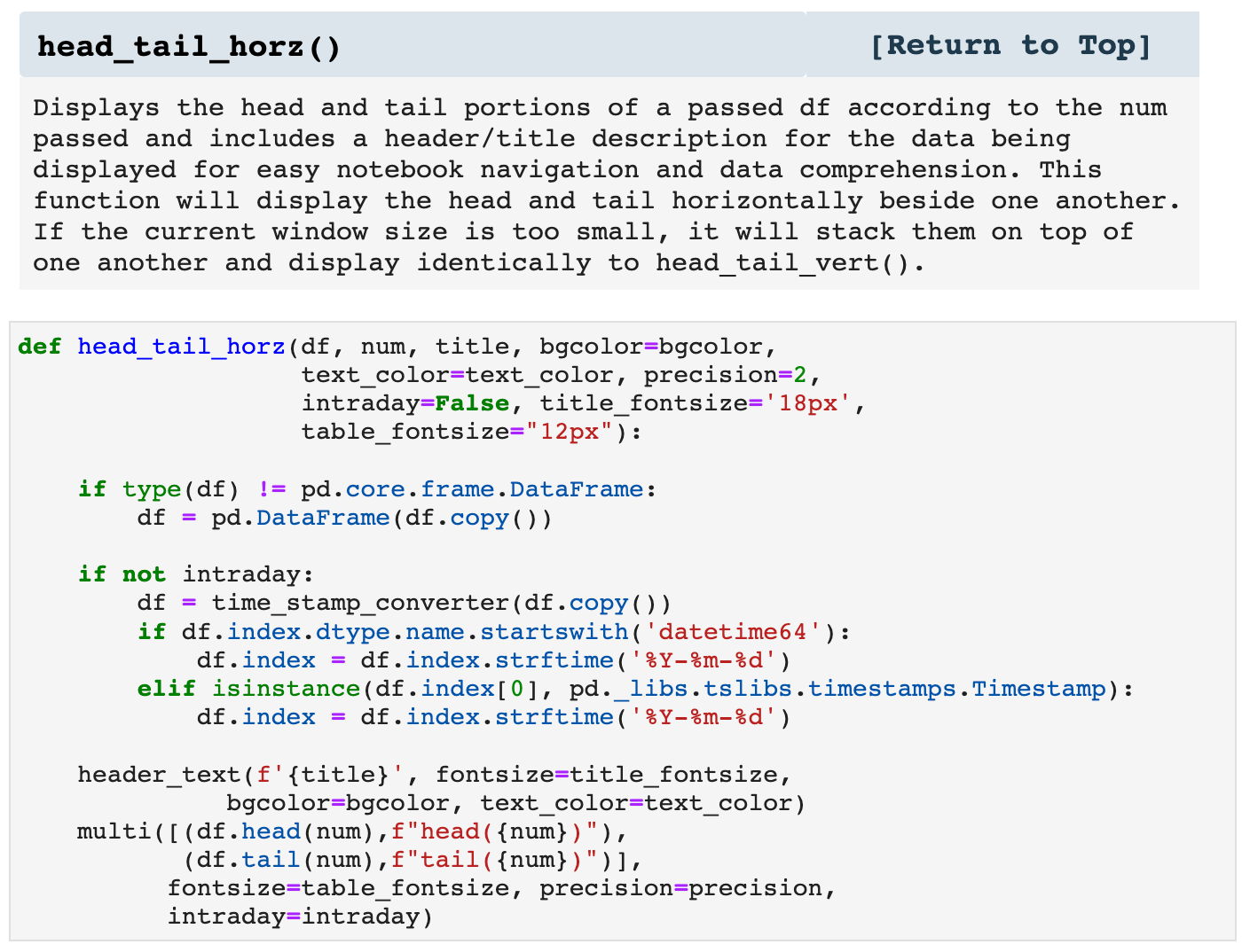
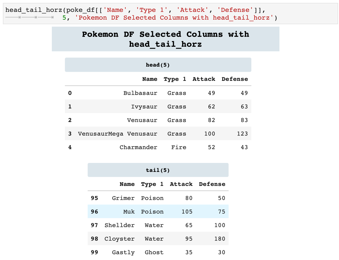
Because we are constantly calling head() and tail() on dataframes, I created the following two functions that call both functions and display them together. One will stack them vertically and one will display them side by side horizontally, if the window is wide enough. If there is not enough space, head_tail_horz() will go ahead and stack the dataframes vertically. This is incredibly helpful in knowing exactly what data you are looking at when scrolling through a notebook, because each is labeled with the data it contains in colorful headers.
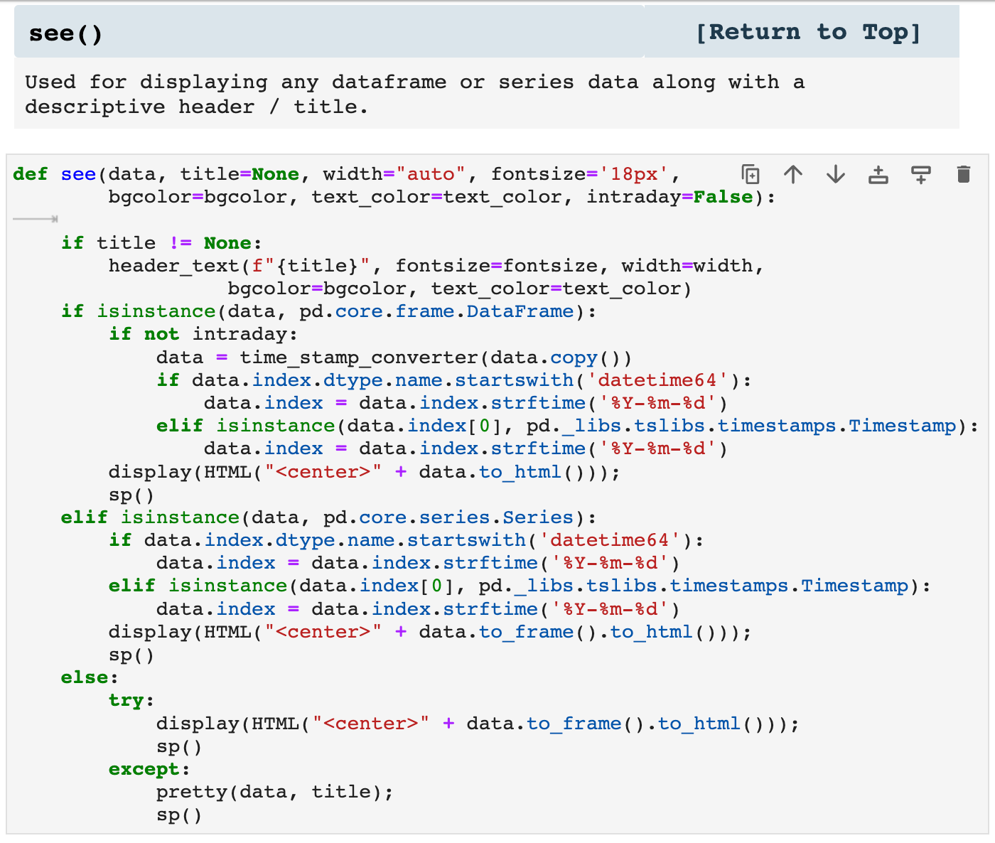
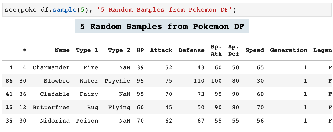
The following function is similar to the two above except that this one will display any dataframe passed. It will display the entirety of the data with a descriptive header.
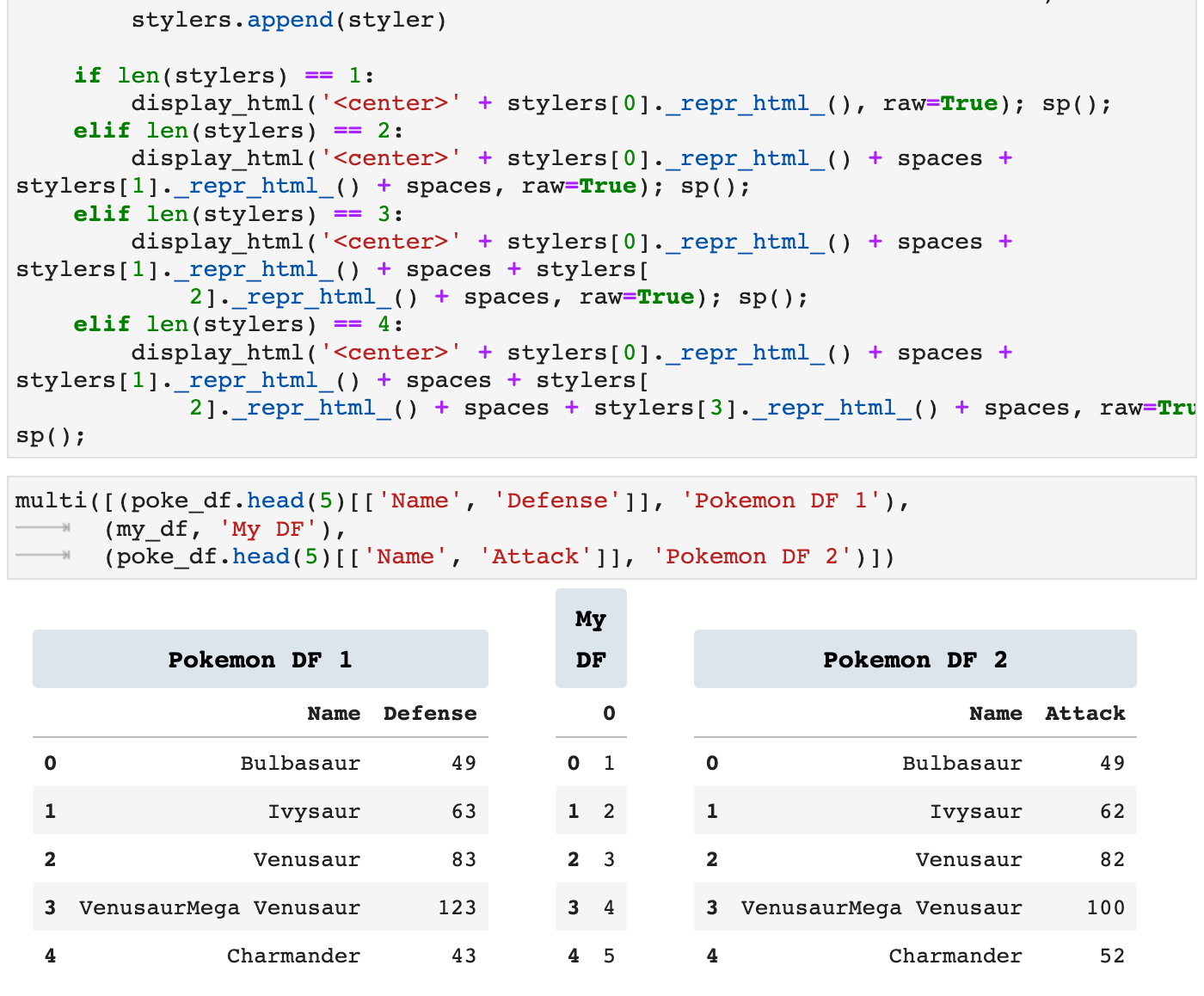
multi() is an incredibly useful function when you need to see data side by side for comparison or to quickly find relationships between data. It also consolidates the space usage on the screen to limit the need to constantly scroll to see other data. This way, narrower data can be displayed side by side cleanly and efficiently.

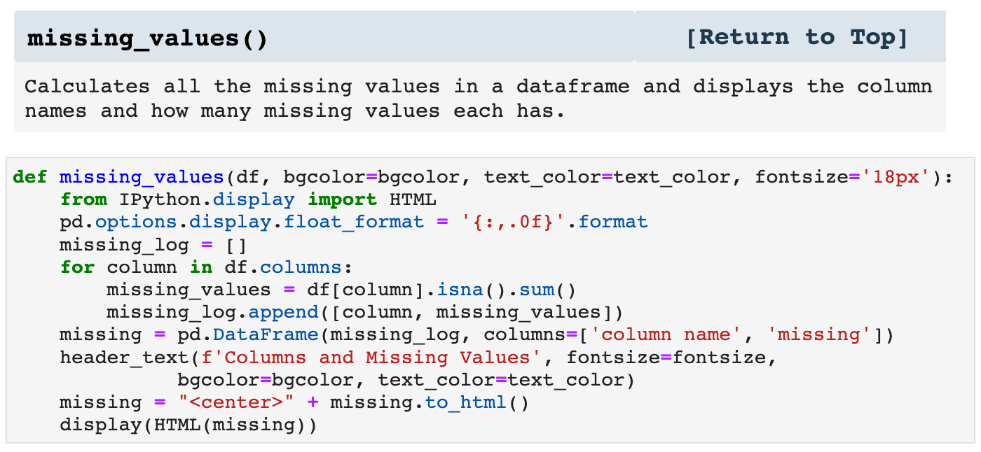
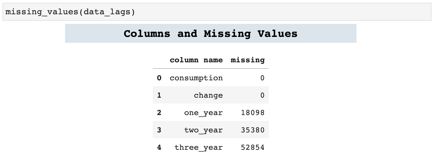
missing_values is a great little function to find out exactly how many missing values there are in each column of data. I prefer this way to calling info and doing the math, simply because the more I streamline these processes, the less my mind has to be taken off whatever task I am focused on to perform smaller tasks that often can distract.
Sections: ● Top ● Importing Helpers ● Utilities Helpers ● Display Helpers ● Styling Helpers ● Time Series Helpers ● Code
4. Styling Helpers
These are some of my favorite functions. I absolutely LOVE styling my dataframes to communicate as much as possible, far more than just the data they contain, but also what is behind that data. Because the css styling code can be cumbersome inside of Python, I created this first function to take a dictionary of dataframe section specifiers, i.e. th (table header) or tr (table row), and their corresponding stylings and compile the properly coded css styler to pass to set_table_styles() in Pandas. This eliminates much of the mess of mixing css code in with Python and keeps things nice and neat.
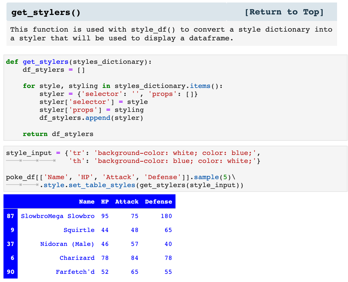
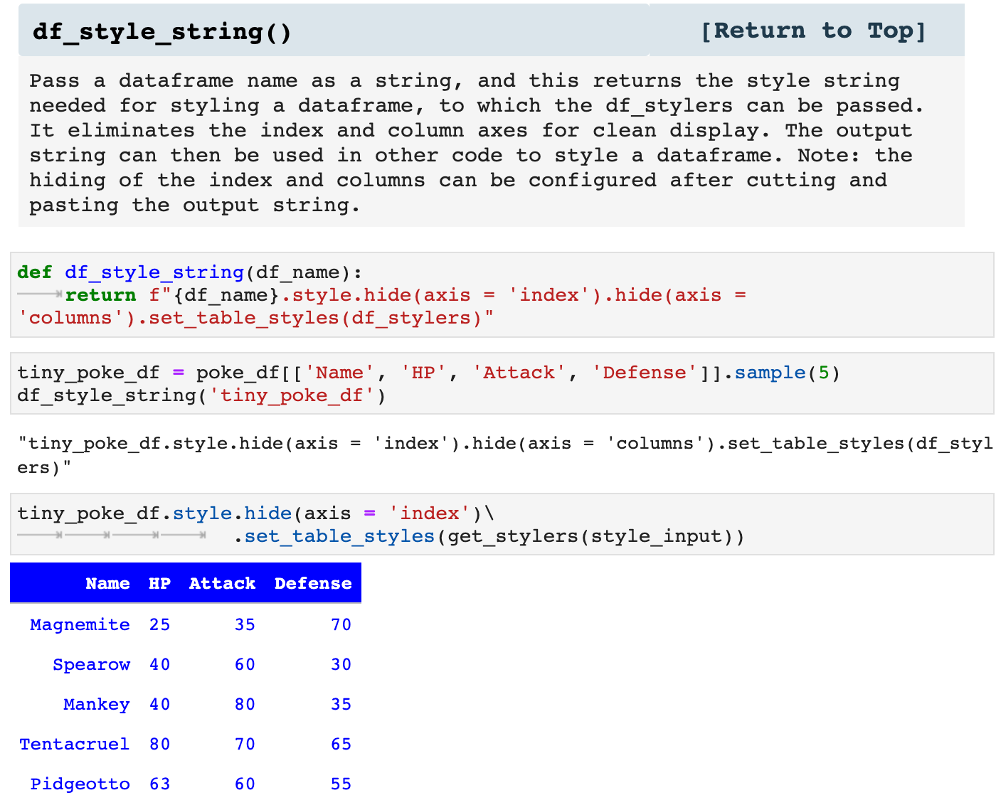
The next function I created simply because I found myself repeatedly trying to remember exactly how Pandas wanted me to specify the styling. The language has changed recently in how these aspects are passed, and I despise deprecation warnings. So I put this function together with the most up to date Pandas language so that if I am in a rush, I can quickly get the string to cut and paste into my code to specify the stylings for a dataframe display.
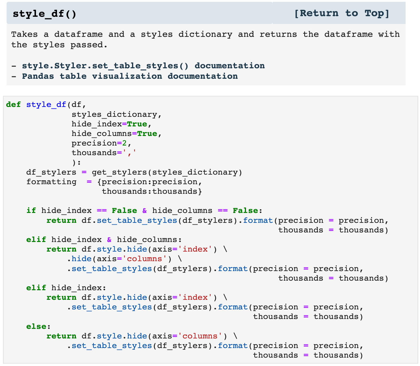
style_df() takes the dataframe and style dictionary you pass it, creates the css stylers based on the dictionary passed, and returns the dataframe with the specified styling. It is a nice, neat, organized way of making dataframes look fantastic and communicate far more than simple data.

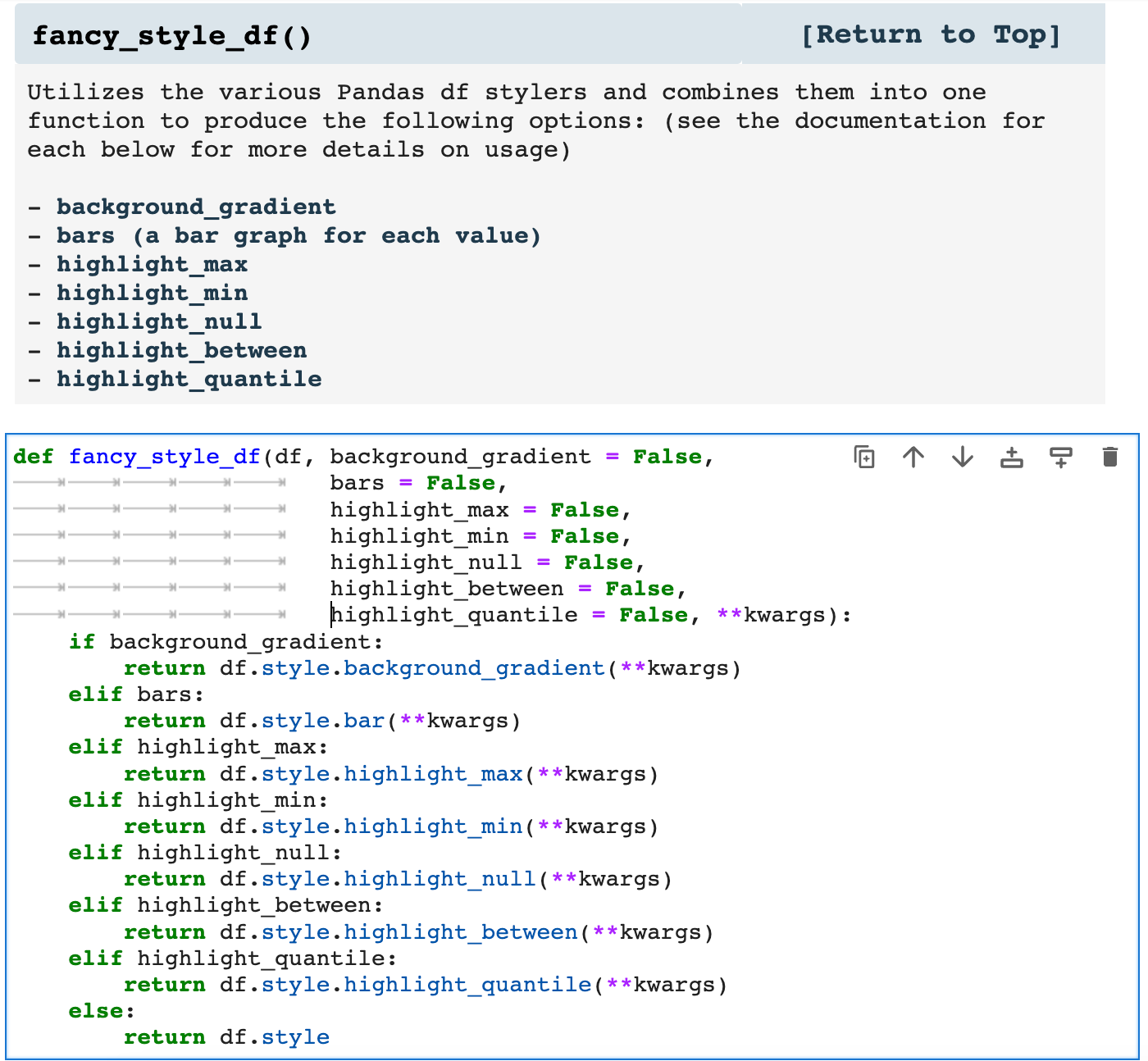
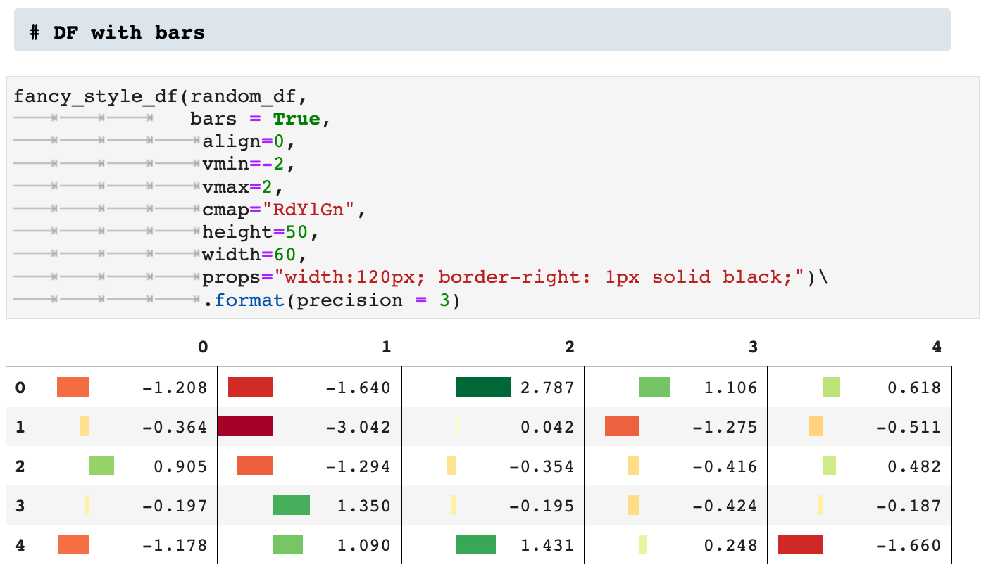
fancy_style_df() is my way of incorporating all the ways Pandas allows users to visualize data within the dataframe display itself. Think of it as matplotlibbing your dataframe in place. While one can call any of the various functions for styling a dataframe individually, I prefer having everything wrapped up in one function so that I can easily switch things around, try out new ideas, and mix and match, as it were.
Listed in the markdown cell below are the various ways this function can be used. Each of these takes its own arguments to specify the data that should be enhanced as well as the properties dictating how the data should be enhanced visually. The markdown cell contains links to each usage with complete descriptions of arguments and how each works.
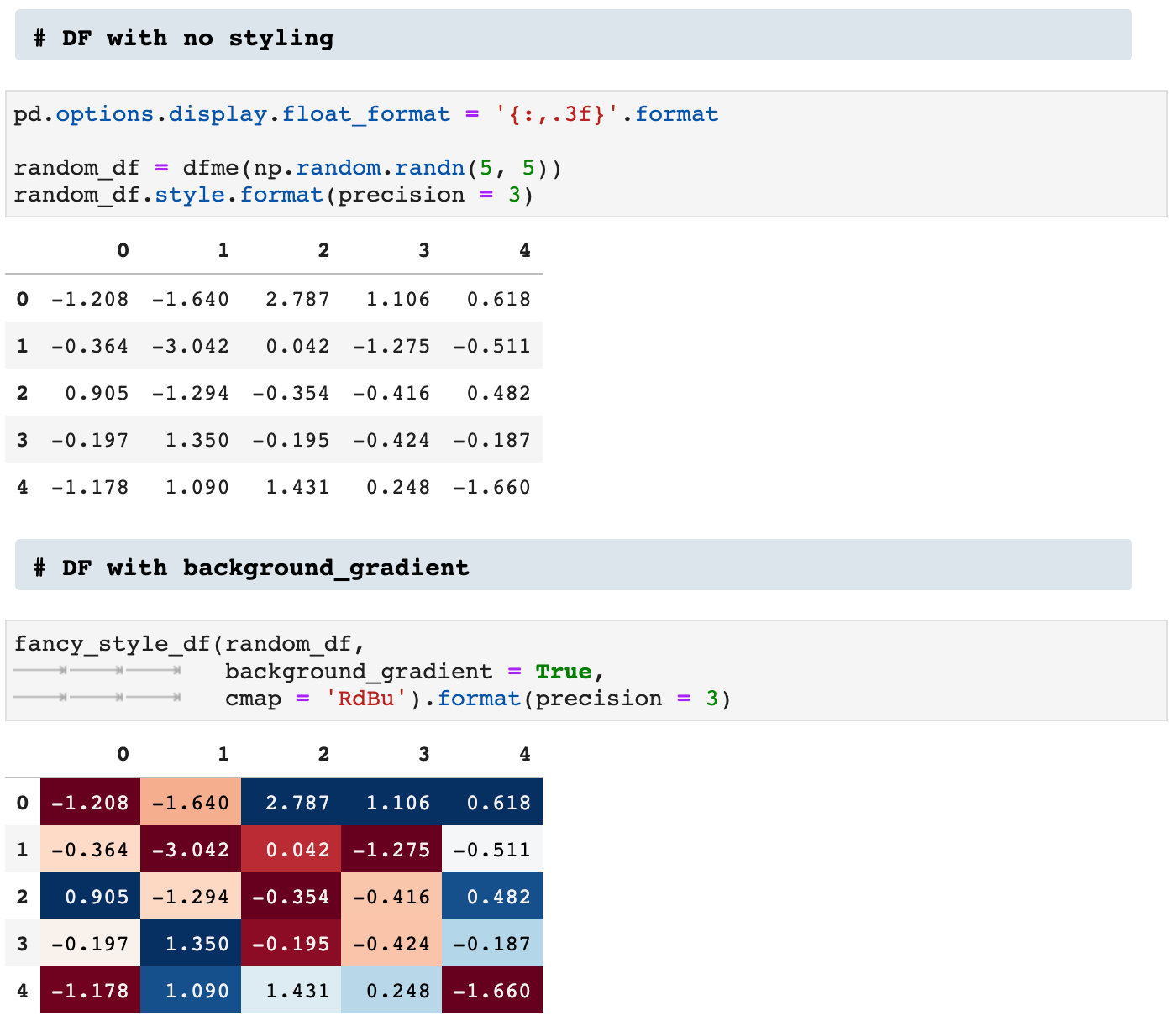
First, we have a dataframe with no styling added. Then look how much more is communicated, for example, by using the background_gradient option.
Then there is the bars option:
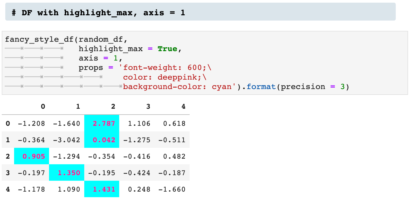
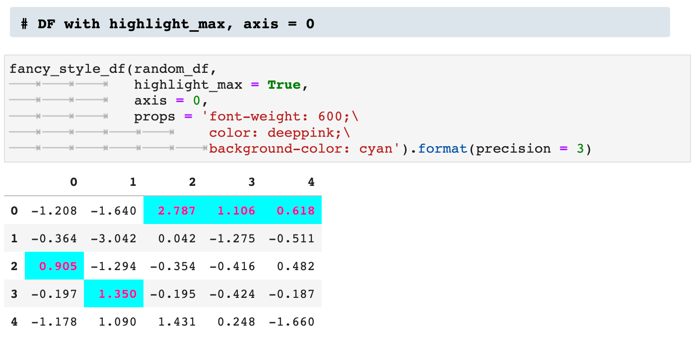
Next we see two versions of utilizing the highlight_max option. The first is across axis 1, and the second across axis 0.
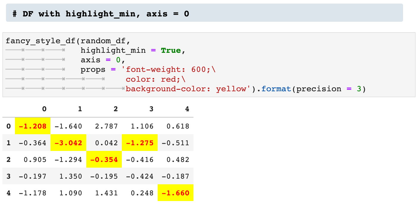
We can do the opposite by highlighting the minimum across the axis.

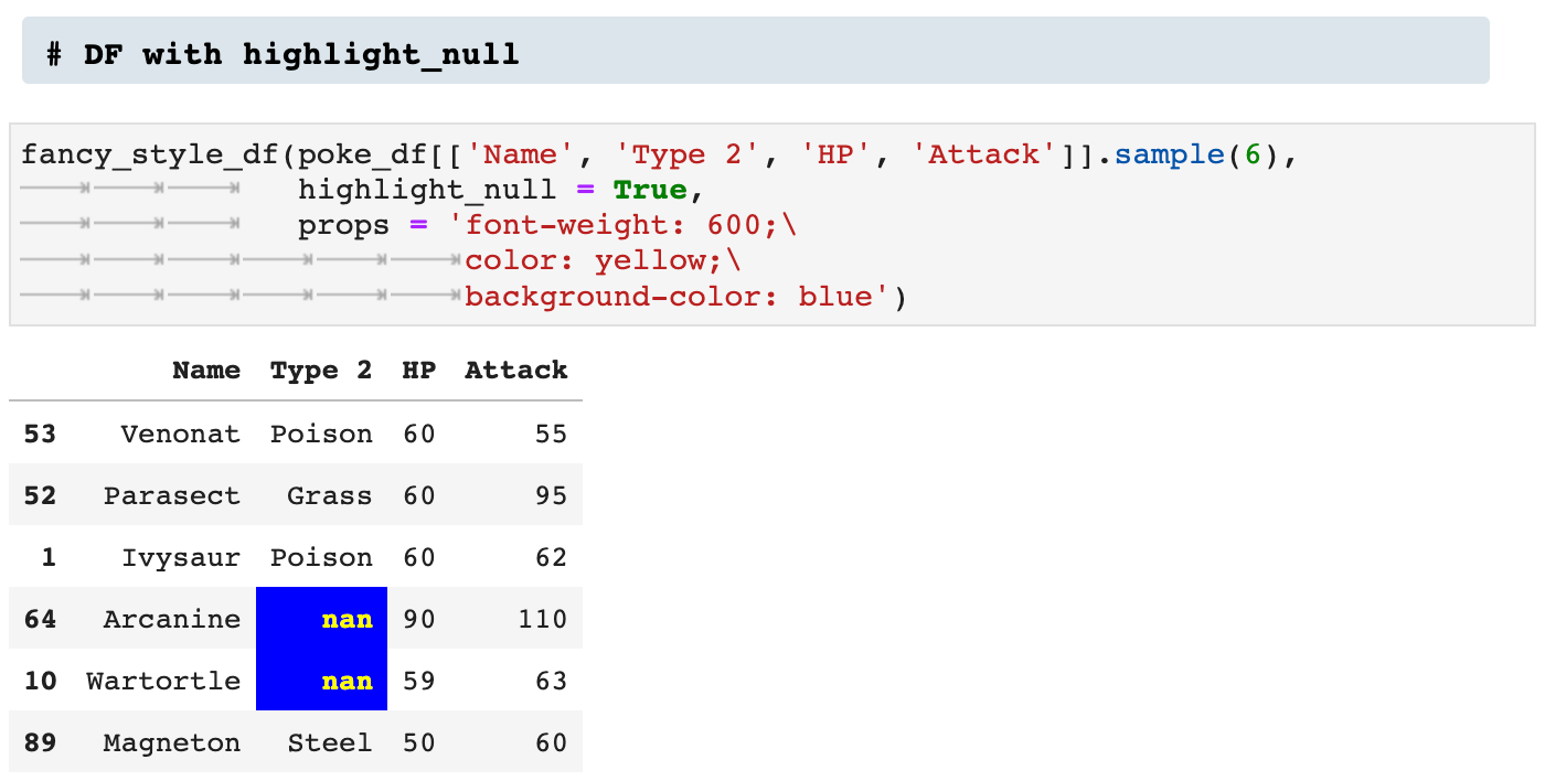
We can also highlight NULL values.
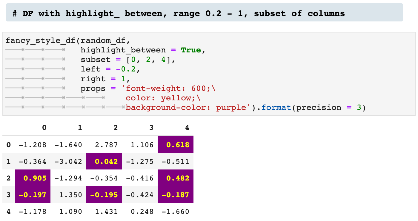
One means of highlighting that I find incredibly useful and communicative is highlight_between, which allows the user to specify a high and low end, left and right, and highlight all values that fall within that range.
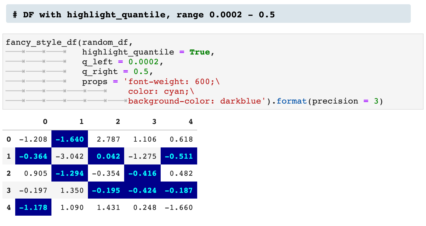
And when you are feeling REALLY fancy, you can highlight the quantile values within a dataframe, as shown below.
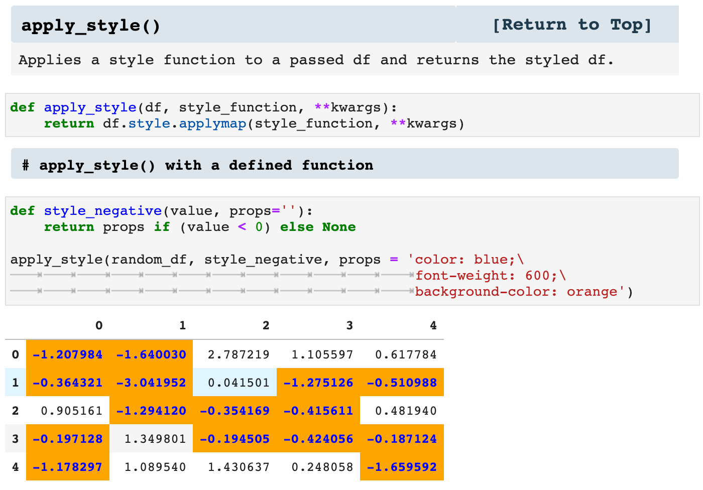
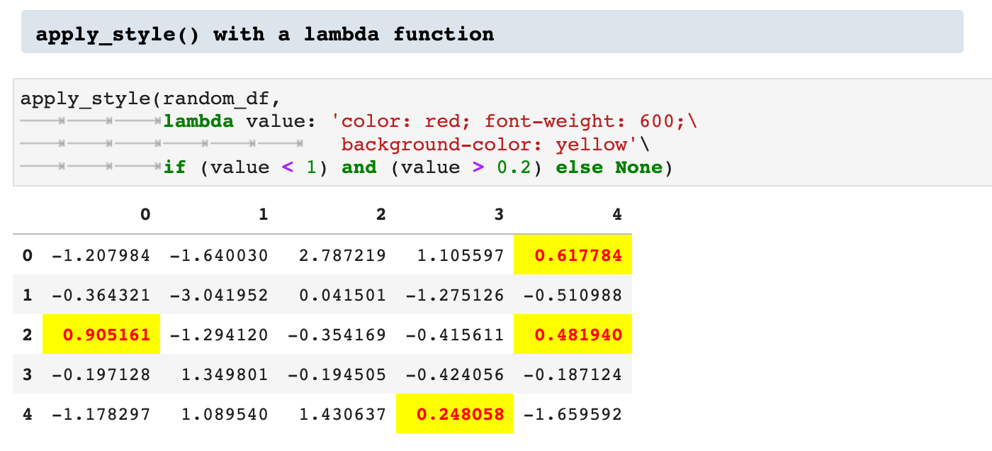
In addition to the previously described ways of highlighting values within a dataframe, we can also specify our own functions for pulling out values visually. For this, I created the apply_style() function, which takes a dataframe and a function to be applied to the data, as well as the properties by which the values should be enhanced.
This can also be done using lambda functions rather than pre-defined functions.
Sections: ● Top ● Importing Helpers ● Utilities Helpers ● Display Helpers ● Styling Helpers ● Time Series Helpers ● Code
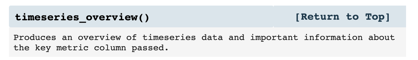
5. Time Series Helpers
I work a great deal with time series data. In many ways, time series data is a data science in and of itself. And so I wrote some functions to deal specifically with this type of data and get more out of it.
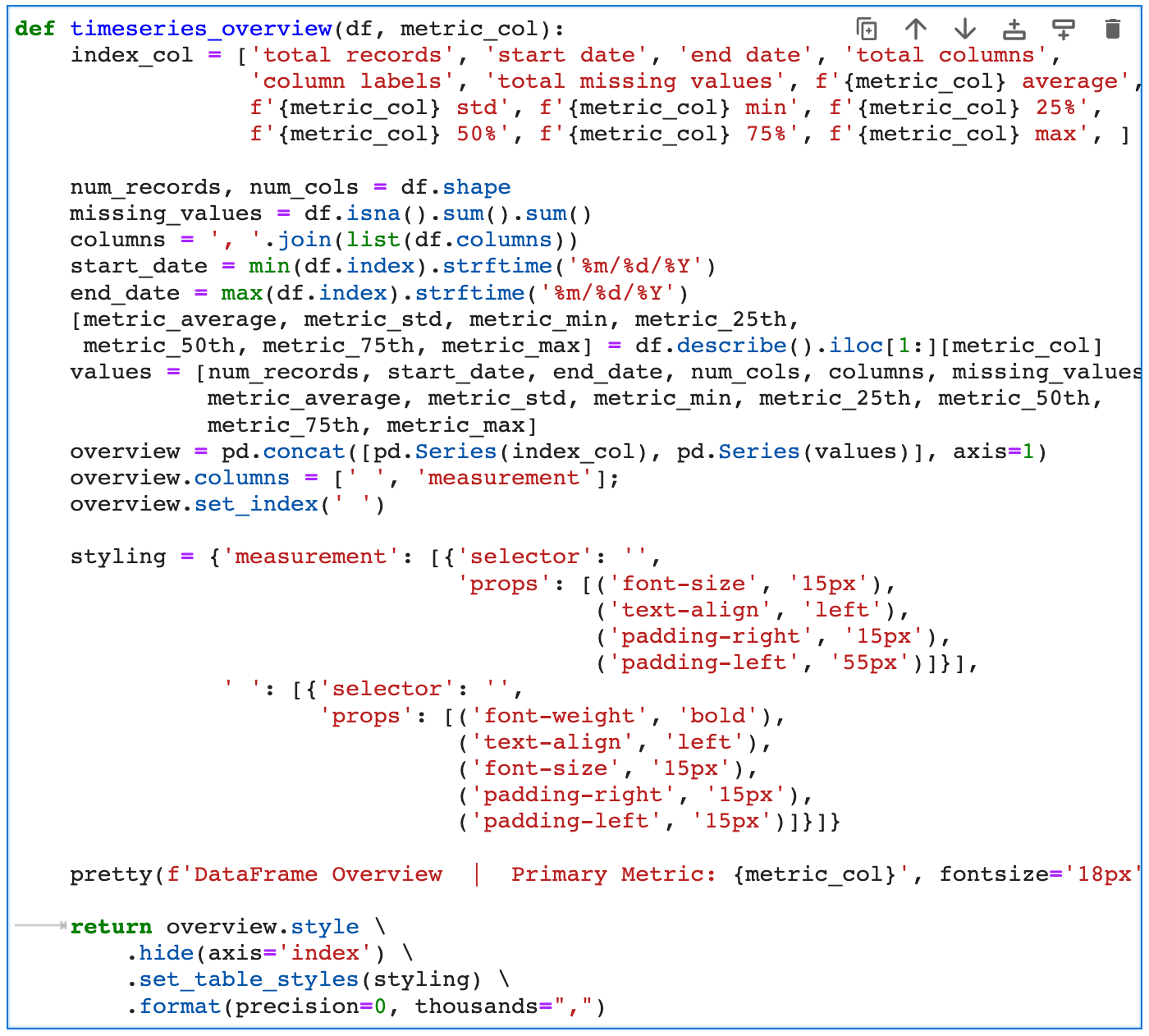
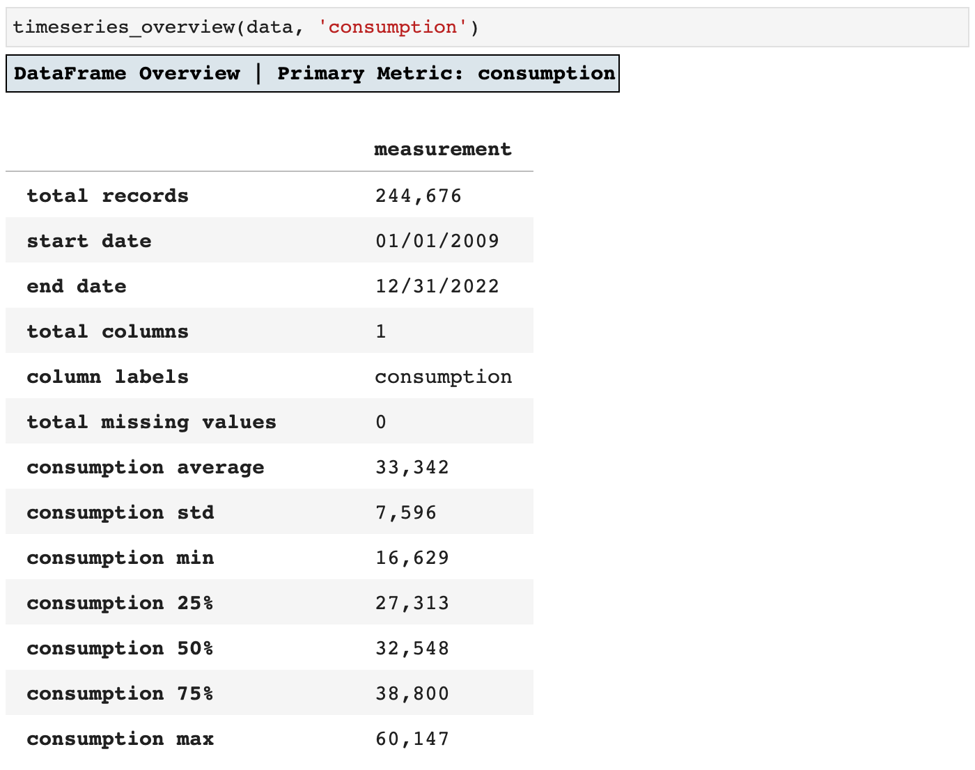
First of all, I want to know as much about my data from the beginning as possible, and I do not like having to call function after function and scroll around to get an idea of the data I am working with. So I wrote timeseries_overview() to do all of the initial wrangling for me. Taking the time to write this function paid off in just the first few uses. I love getting all that data in one frame that I can revisit whenever needed.
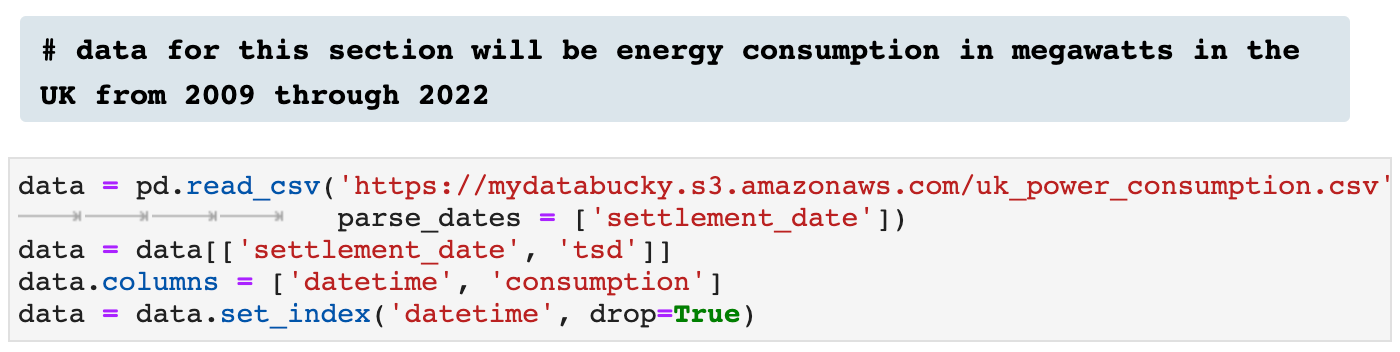
Here I am importing some time series data for the remainder of the article to help exhibit the functionality of all the time series helpers.
And here you see the result of calling timeseries_overview(): everything in one place.
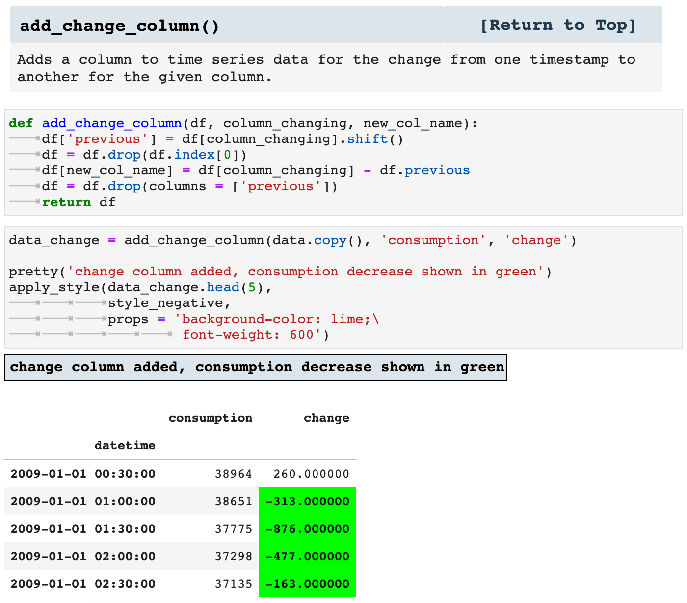
Next we have the add_change() function, which adds a column for the change from the previous timestamp to the current for whichever feature metric column is passed. This way, it is quick and easy to look over data and see the various shifts in values over the course of time. It is also a key means of feature engineering.
You can see below how I was able to use the styling functionality we covered in the last section and the new change column added to highlight the timestamps that signify a drop in energy consumption from one timestamp to the next.
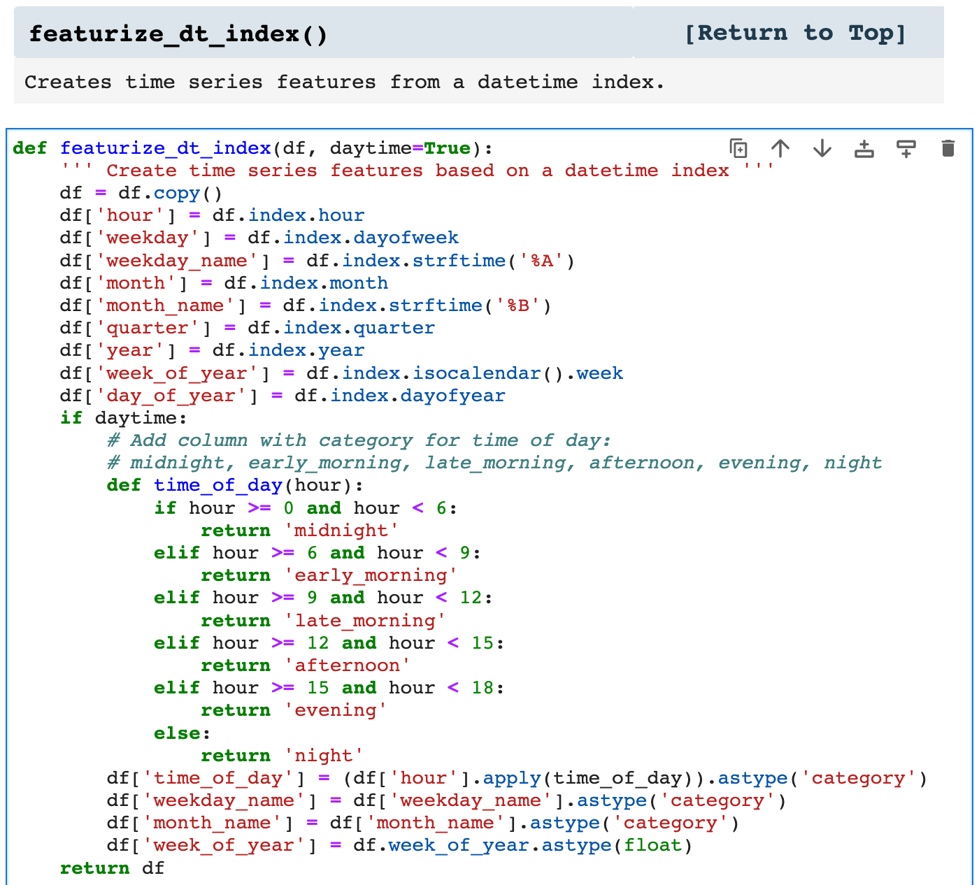
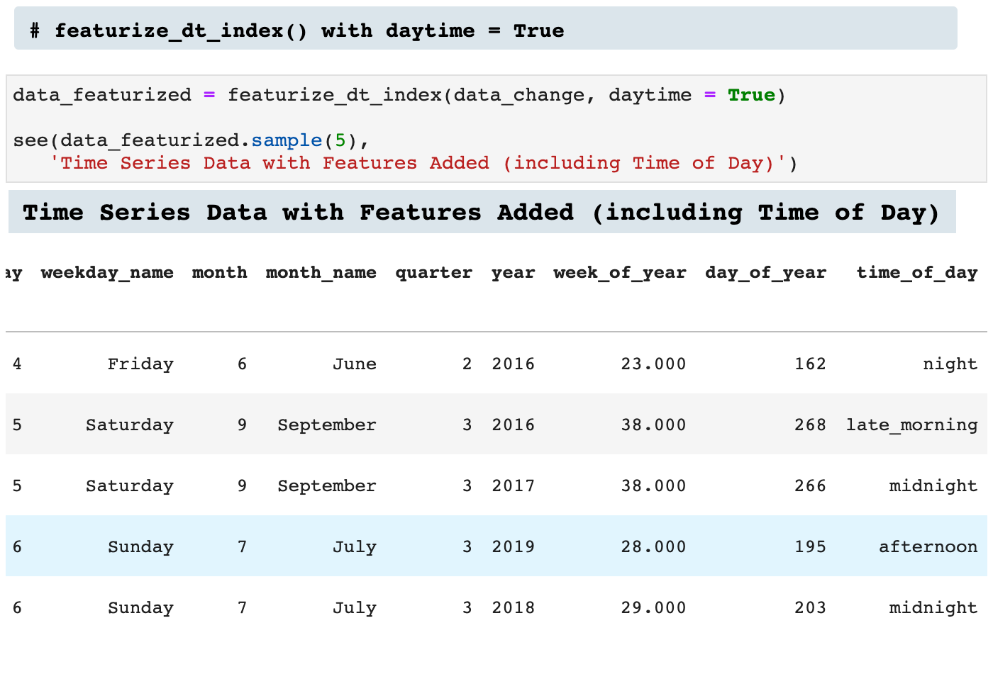
featurize_dt_index() takes the datetime index of a timeseries dataframe and creates 10 new features. Two of these features are essentially good for visualizing correlations in the time series data and must be dropped before feeding the data into a model, weekday_name and month_name. time_of_day is also useful for visualization, but it too must be managed before model fitting and training. You will see below how I use pd.get_dummies() to one-hot encode time_of_day before working with the model.
These features add a great deal of opportunity for our model to discern trends and patterns within the data and enhance accuracy. This is especially useful when working with time series data that comes just as a datetime index and a metric, such as stock prices, or in this case, energy consumption.
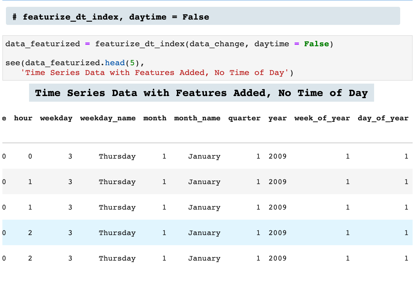
If the time_of_day data is unwanted, daytime = False will make sure that column is not created.
And when left to equal True:
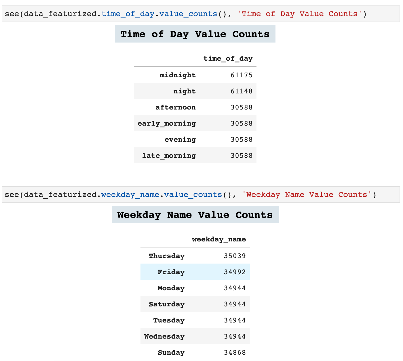
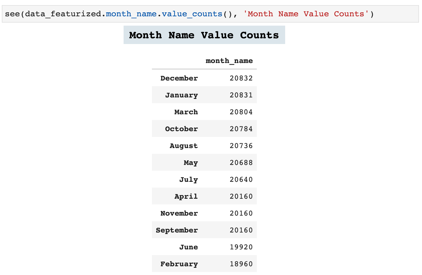
Now we can look at some of the value counts in our new feature columns. This adds a wealth of perspective to time series data.
Lag features are another important feature engineering practice in time series data. The following function is one I created in order to add numerous lag features to any time series dataframe. The user simply passes a list of tuples which contain the length of the lag desired and the label for the column that will be created with that lag feature.
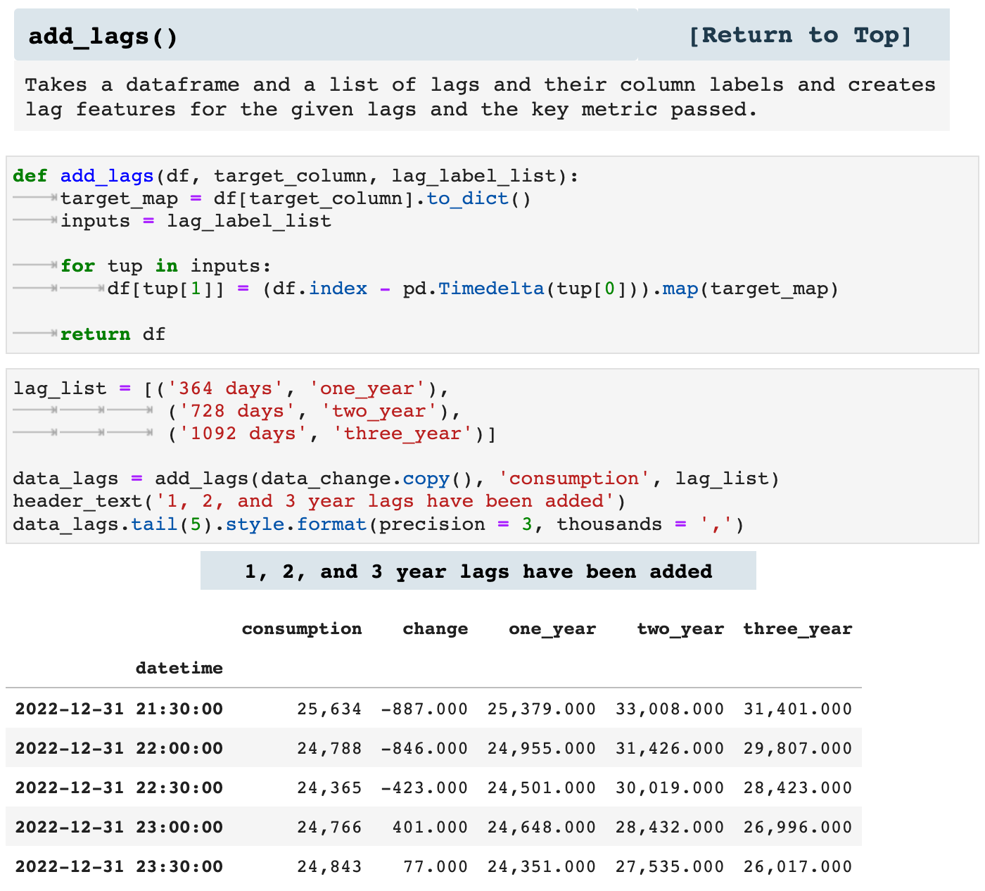
It is important to remember that adding lag features does leave lag feature columns with missing values, simply due to the nature of time lag. But these features are of great use nonetheless.
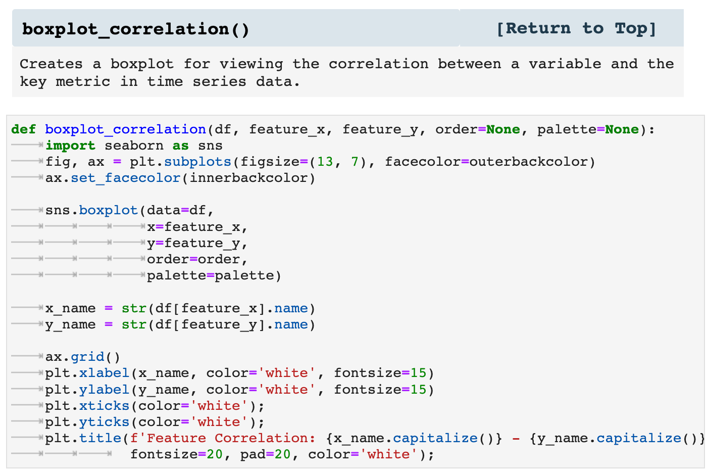
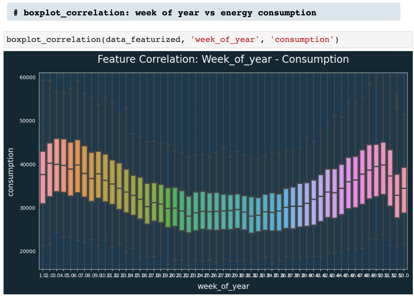
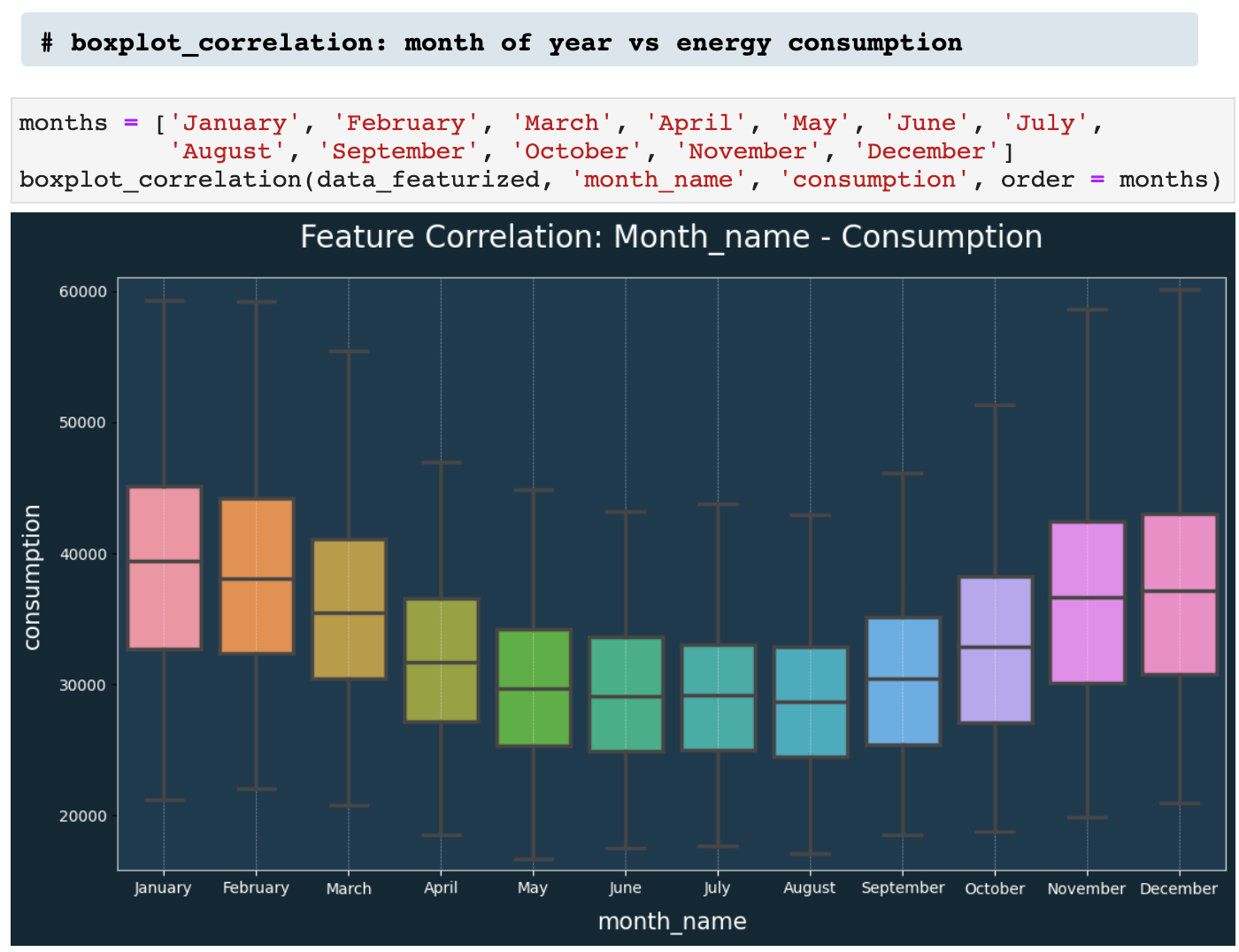
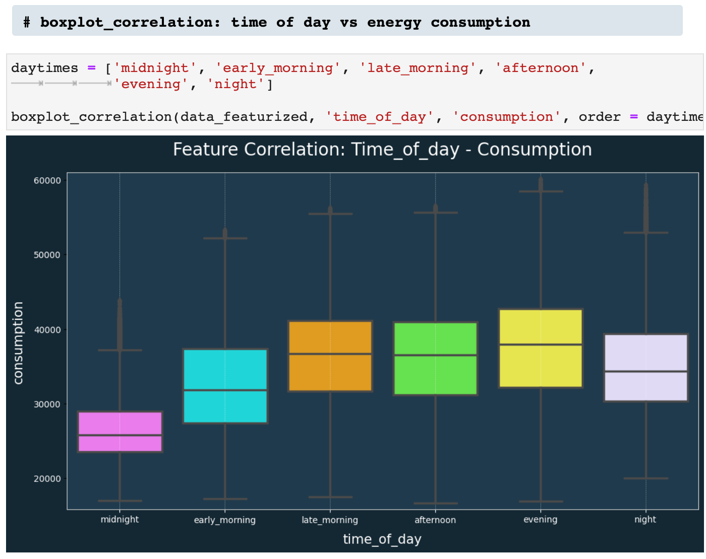
Next, we have boxplot_correlation(), which is the best friend of featurize_dt_index(). Once we have all those new features extracted from the datetime index, boxplot_correlation() allows us to see all sorts of patterns in our data based on the various features such as week of the year, month of the year, and so on.
Here we have a few examples of boxplot_correlation in action!
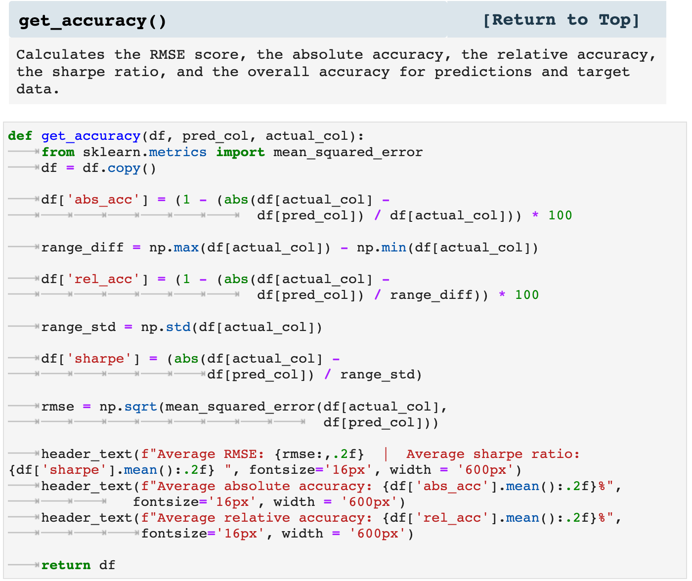
Accuracy is always on my mind when working with machine and deep learning. And I like to have as many different ways of viewing the performance of my models as possible. So I created get_accuracy(), which takes the predictions and targets for the testing data and returns the averaged RMSE score, the averaged absolute accuracy, the averaged relative accuracy, and the sharpe ratio for the performance of the model.
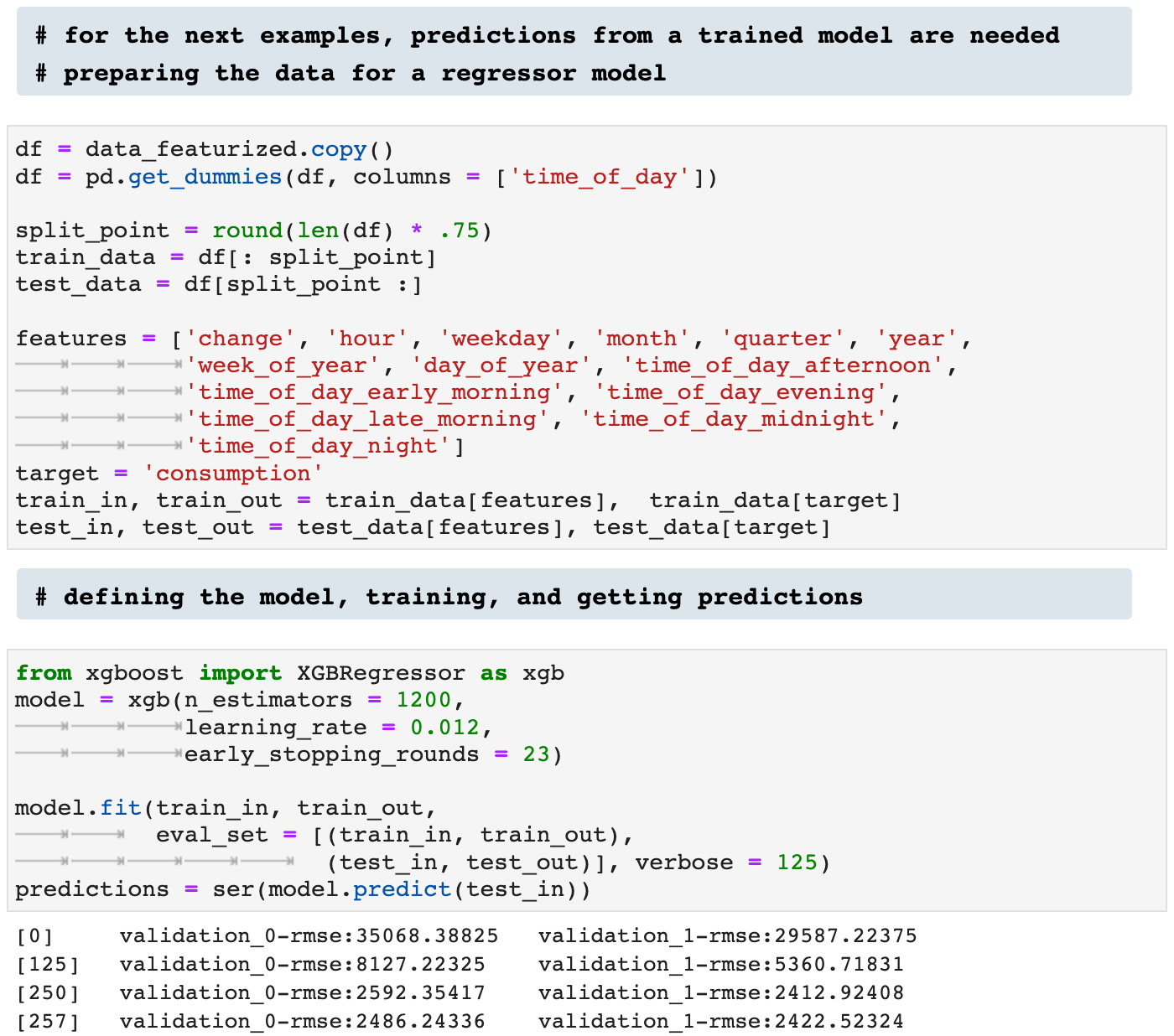
To see this function in action, we will need to quickly prepare the data for training and testing, define and train a model, and get predictions to compare to our test targets.
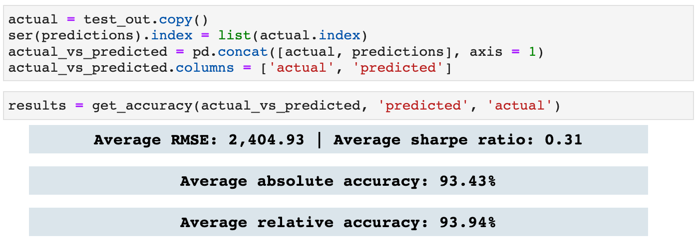
And here we get the accuracy for the predictions compared to the test targets. This function also returns a dataframe with the predictions, targets, and accuracy percentage for each prediction-target pair.
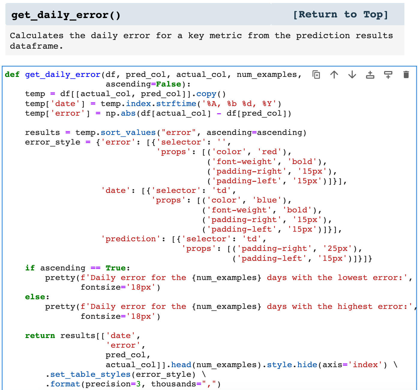
Last in our list of time series helper functions is get_daily_error(), which returns the requested number of highest and lowest error records.
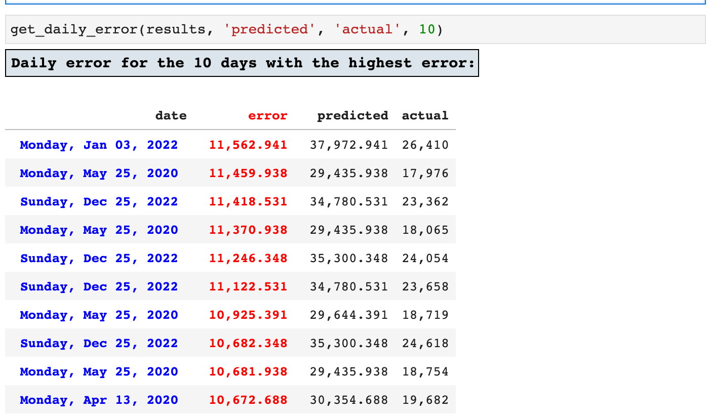
First, we will view the 10 highest error timestamps. This is useful in narrowing down areas where we could possibly improve upon the accuracy of the model by finding any patterns in records that produce the highest errors.
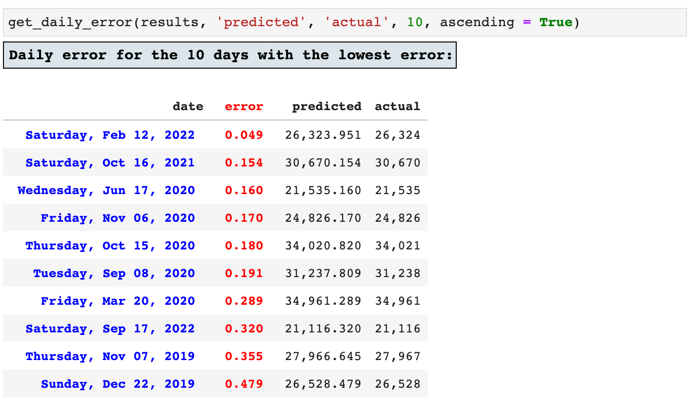
And since it is also helpful to see which records produced the lowest error, achieving the highest accuracy by the model, we can view the top ten lowest error records as well.
That is all of the helpers I have to share with you for now. But I am writing new ones every single day. They do not always make it to my favorites, and many evolve to become better and more robust versions of themselves. But these that I have shared in this article continue to serve me in almost every project I do.
I hope you found these helpful, and I wish you all the best in your data science journey! Happy data wrangling! May your accuracy be high and your RMSE scores close to zero!
The Code: Embedded Jupyter | Interactive Jupyter | HTML
Sections: ● Top ● Importing Helpers ● Utilities Helpers ● Display Helpers ● Styling Helpers ● Time Series Helpers ● Code
Evan Marie online:
EvanMarie@Proton.me | Linked In | GitHub | Hugging Face | Mastadon |
Jovian.ai | TikTok | CodeWars | Discord ⇨ ✨ EvanMarie ✨#6114