💰 Finance, Stocks, & Index Tracking with Python & Pandas

Think of this as a beginner's DEEP dive into finance, stocks, and index tracking by way of Python and Pandas, meaning that it stays fairly surface level, but it still covers a great deal of material in the process. I will be working with the Dow Jones Index and exhibiting how to use various web interfaces to gather real-time data. Then I will show how to use a variety of operations within the Python and Pandas environment with the data gathered. This is a vast territory, which makes it exciting and at the same time daunting. I would put wrangling this data second only to possibly trying to make sense of data coming out of a Las Vegas casino. For the purposes of this project, keeping the context limited to the Dow Jones Index will afford the possibility of getting into some of the finer details of data manipulation and analysis while at the same time getting down to some serious wrangling. Are you ready?
The CODE: IPYNB | Git | PDF | helpers.py
🟣 The Helpers 🟣
stockhelpers.py - custom functions used throughout this project
In an effort to allow for the abstraction away of many repetitive functions and operations, I have compiled this helper file. For the functions that are necessary in understanding what is happening in the code, I include descriptions of each function as well as a link to the GitHub Gist for each individual function, in the following manner:
🔗 stockhelpers.function_name() - GitHub Gist
Other functions are just for the purpose of notebook presentation. The notebook for the project downloads and imports the stockhelpers Python file, but you can investigate the functions on their own as well. All (any function within this notebook preceded by h., my chosen alias for my helpers import) can be found here in one notebook as well.
🟣 The Data Collection 🟣
- Dow Jones Index Data
- Dow Jones Index Constituents
- Constituent Data
Importing the Dow Jones Index Data
I use Yahoo Finance to acquire the Dow Jones Index data in this project. This library is quick and easy to install and use, all of which I cover in the code. I import yfinance as yf, and the following code covers the download, saving as a dataframe, and initial views of the Dow Jones Index data from Yahoo Finance.
Importing the Dow Jones Index Constituents
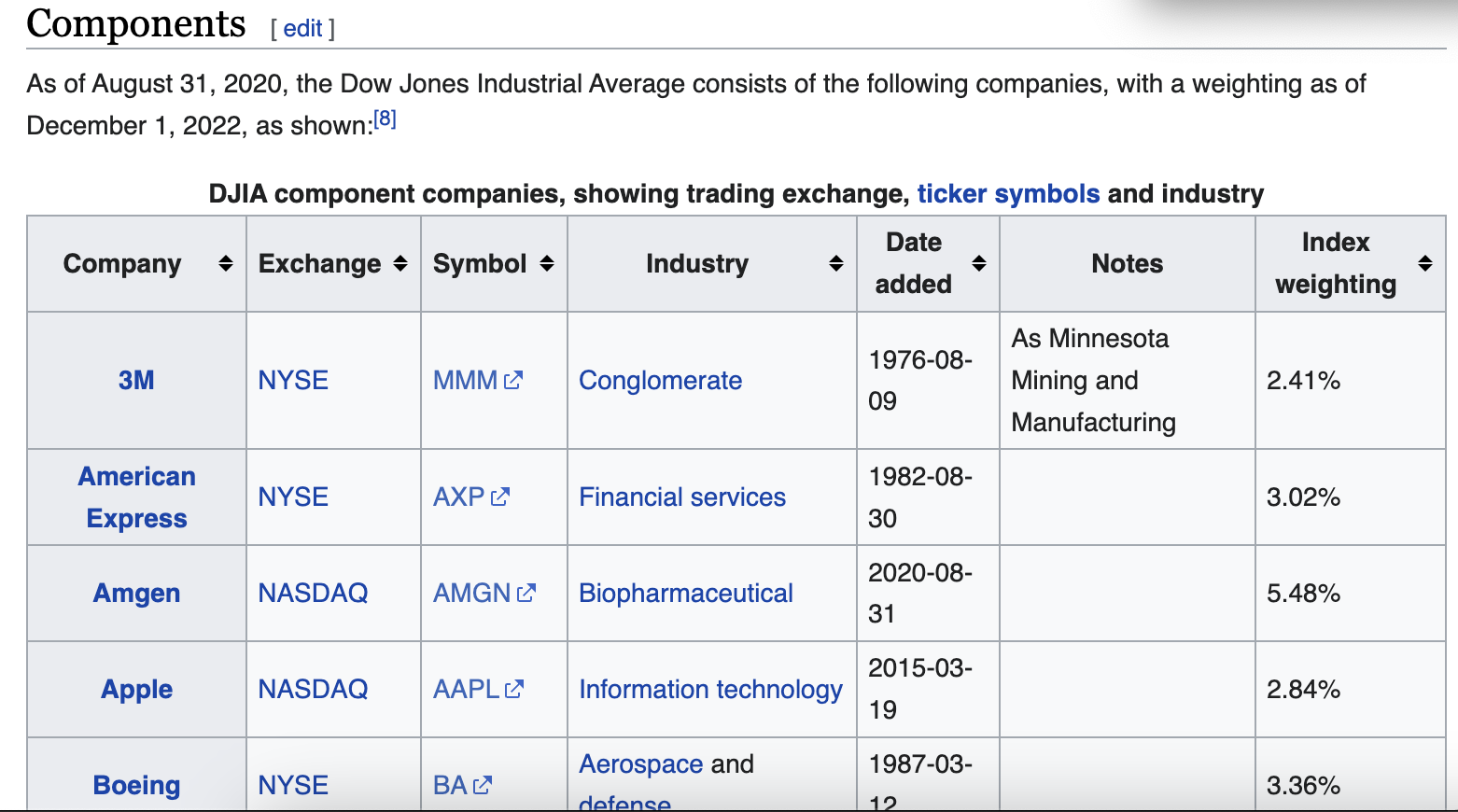
Getting the data for the Dow Jones Index constituents is even simpler and can be done directly from the Wikipedia webpage linked above using the Pandas function pd.read_html(). The only trick is knowing which table on the page you want to import to a dataframe. But that only takes a few seconds of trial and error. And sometimes you can even tell just from looking at the html page which table index it is you are wanting. The following code collects the table referred to on the webpage as components and saves it to a dataframe. I also clean up the column labels upon importing, because I am generally very particular about labels being uniform for more easily readable code.
Importing the Constituents Data
For the constituents data, I again use Yahoo Finance, and this time I give it the list of constituents I made in the code just above, which contains all the symbols for the constituents of the Dow Jones Index.
Combining DJI and Constituents
The next step in data preparation is making a dataframe of all of the constituents that is better organized, i.e. the company name is included in each column label. It is also going to be useful to include the Dow Jones Index data in this dataframe as well. The following code outlines this process.
🟣 The DJI Investigation 🟣
The initial data investigation is a glimpse into the last 30 years of activity of the Dow Jones Index. Upon initial observation of the entire 30 year period visualized, there are clear and marked moments of economic turmoil that stand out.
🔗 stockhelpers.line_graph() - GitHub Gist
Upon zooming in to each of these major downturns, it is clear there is more subtle market activity, and there are trends just around periods of marked downturn. Below are four examples of such time windows in the market activity.
Any one of these four examples I chose to include could be further examined and would provide enough curiosity-satisfying material for numerous economic publications. This aspect only further confirms the depth of possibilities available when working with this data. I personally had to hold myself back from going too far down the housing market crash rabbit hole and even more so the Covid-19 stock market mega rabbit hole. But I am here for data science purposes, not socioeconomic and political discussions. So I will zip it! (But I know you are tempted too!)
The next step in working with the index data was to add a returns column to the data for further investigation, reflecting the amount of change the index experiences for each timestamp, or day. I have chosen to show negative values in red and the max values in any given data column in blue.
🔗 stockhelpers.display_me() - GitHub Gist
Now, it is possible to compare, for example, the fluctuations on a daily basis with the overall index performance.
🟣 The Tracking Strategies 🟣
This section covers three different simple index tracking strategies: momentum, contrarian, and threshold. The momentum strategy will hold on days when returns are up from the previous day and sell when returns are down. The contrarian strategy operates opposite the momentum, selling when returns are up, vice versa when returns are down. And the threshold strategy takes a threshold value, which is the percentage increase in return which will trigger selling.
To see this in code, here is the function try_strategy(). This function will plot the results of each strategy over a given time range. Within the code are the settings for position, which is the value determining the action to be taken for each timestamp, or day.
Along with the plot of the strategy, try_strategy() also returns the annualized data for the returns and the risk for the strategy in the given time range. This is the function for calculating these values , annualized_data()(250 represents the total number of trading days in any given year):
🔗 stockhelpers.annualized_data() - GitHub Gist
def annualized_data(returns):
    annualized = returns.agg(['mean', 'std']).T
    annualized['return'] = annualized["mean"] * 250
    annualized['risk'] = annualized['std'] * np.sqrt(250)
    annualized.drop(columns = ['mean', 'std'], inplace = True)
The following are visualizations of the three strategies. The threshold strategy below dives a little more in depth with the threshold of 1% as the trigger to sell.
The function plot_threshold_strategies() will plot a series of visualizations for a series of threshold values. Below is the code and resulting plots for a threshold strategy at 0, 1, 2, and 3% increase, showing the resulting index tracking.
🟣 The Rolling Averages 🟣
Rolling averages are an interesting and useful way of viewing the intensely fluctuating market activity and can lend insights that more detailed investigations cannot. Think of it as being able to see the forest for the trees. It is a great skill to have.
The following code results in the rolling averages. The function following the rolling average calculations, rolling_average() performs this task, taking a rolling average window and plotting the data over the course of the entire 30 year period accordingly.
Now it is time to put this code to work at have a look at some interesting visualizations of a number of different rolling averages.
And because I love visualizations, I decided we all need a function that will plot multiple moving averages for comparison. And it shall be appropriately named multiple_rolling_averages(). Let's see how she works!
🟣 The Constituents 🟣
If you remember back to the section covering data collection and wrangling, you will recall that after some concatenating and label manipulation, we arrived at a dataframe containing all the data for all of the constituents as well as the Dow Jones Index itself and that it had lovely, concise, yet descriptive column labels for each constituent. Need you visual cues? Sure thing!
Let's investigate this data a little further and get a better idea of what we are working with. Firstly, just as the Dow Jones Index dataframe needed its own returns column, I created a returns dataframe for all constituent, containing the daily returns data for each. Again, negative returns are represented in red, and the max values for a given column in the data are represented in blue.
Likewise, it would be nice to see the annualized data for returns and risks for each constituent.
And I will assume for the sake of...making sense...that you love visualizations as much as I do. So let's look at one such masterpiece which will give you a quick idea of the returns vs risks for each of the constituents as well as an overall comparison.
Another interesting and enlightening perspective we can take is a correlation heatmap between all of the constituents. Let's look at who leans upon whom for economic emotional support, shall we?
You can see in the heatmap how much more closely each constituent correlates to the Dow Jones Index, for obvious reasons as each is a part of the whole. But more interesting are the spots where particular constituents seem to more closely correlate with one another, as if they are off in the corner, away from the crowd, conspiring. I am not pointing fingers, but the heatmap makes me wonder. This is yet another avenue for further investigation and probably a lovely little rabbit hole!
🟣 The Portfolio 🟣
For the portfolio for this project, I chose years for fitting the tracking strategy and years for testing in which there were the very fewest missing values, essentially no missing values aside from the Dow constituent. For the training / fitting period, I chose 2011 to 2019 and for the testing 2020 to 2022.
This could prove tricky, because if you remember the line graphs above that visualize the most volatile moments over the 30 year period, most are before this training period range, aside from the Covid-19 hit to the market, which falls right in the middle of the testing period. So we will be able to see how accurately we can track and how the resulting tracking error looks considering that the testing period contains the largest downturn over the entire 30 year time range, and the training period is mostly comprised of upward, healthy market trends.
The following code covers the creation of the training dataframe, 2011-2019; the normalized version of the same data, which brings all constituents to starting at 100 on the first day of the dataframe for the purposes accurate comparison; the returns dataframe for the same time period; and the return differences dataframe for aggregating and investigating further.
Now that we have the normalized data, let's get wild and plot ALL 30 constituents and their relative performances.
The following is the aggregated data from the return differences dataframe, this data will guide our choices for the top 8 tracking stocks with the lowest tracking error.
The following cells walk through acquiring the annualized tracking errors for all of the constituents. The companies are then ordered according to lowest tracking error, and we are choosing the top 8 of those for the tracking portfolio.
Next we will create a normalized_pf, which is just the normalized data for the list of 8 portfolio stocks extracted from the normalized dataframe that covers the entire training period and all constituents. As we plotted all 30 normalized constituents over this time period above, let's now visualize just the 8 portfolio stocks in the same manner.
🟣 The Tracking 🟣
Now that we have our portfolio of 8 constituents, we will work with two methods of tracking the Dow Jones Index with our 8 stocks. First, we will work with a set of equal weights, meaning that every stock carries the same weight as every other stock in our decision making.
The following code creates the set of 8 equal weights and then applies them to the returns dataframe for our 8 portfolio stocks over the course of the training / fitting time range.
Now, let's have a look at two helper functions which will help us calculate how our portfolio is tracking.
🔗 stockhelpers.portfolio_returns() - GitHub Gist
- calculates the portfolio returns based on weights
def portfolio_returns(weights, portfolio):
    return portfolio.dot(weights)
🔗 stockhelpers.tracking_error() - GitHub Gist
- calculates the tracking error based on the weights array
- first calculates the portfolio returns based on weights with
portfolio_returns() - then it subtracts the Dow Jones Index
- then it calculates the standard deviation, i.e. the tracking error, on a daily basis -
.std() - then it annualizes the tracking error -
* np.sqrt(250)
def tracking_error(weights, portfolio, index_data):
    result =  portfolio_returns(weights, portfolio).sub(index_data).std() * np.sqrt(250)
    colorprint(f'The annualized tracking error for the portfolio is {(result*100):.2f}%', fontsize = 3)
    return result
Now let's find out the annualized tracking error for our portfolio with equal weights across all constituents.
Next, we will calculate the normalized prices based on the equal weights applied.
And finally, we will add this data as a column to our normalized_pf dataframe for later comparison.
And since it has been a hot minute since we had beautiful visualization ASMR to make us feel all warm and cozy, here is the result of our portfolio using equal weights and how it tracked the Dow Jones Index.
Now, you are probably thinking, "What is the purpose of weights if they are all going to be the same?" I agree. It does make sense to investigate into how we can further optimize this process and possibly track the index more effectively and with lower error. For this, we will use the illustrious scipy module and one of its optimization functions.
Optimizing Portfolio Weights for Better Performance
- minimizing tracking error
- using a quadratic optimization algorithm from
scipy scipy.optimize.minimize()[docs]
SciPy optimize provides functions for minimizing (or maximizing) objective functions, possibly subject to constraints. It includes solvers for nonlinear problems (with support for both local and global optimization algorithms), linear programing, constrained and nonlinear least-squares, root finding, and curve fitting.
⚙️ scipy.optimize.minimize()[docs]
- Constraint: weights must sum to 1, and sum of weights minus 1 must equal 0
- Bound: limits all weights to be between 0 and 1, not allowing for short selling (which can be changed)
- Opts: takes constraint and bound, optimizing based on function to be minimized, starting with equal weights
The following code contains two helper functions to make the use of the scipy optimizer more smooth. Then we create the optimizer and the resulting weights for our optimized-weight portfolio investigation.
Here is the view of each portfolio constituent and its respective weight.
And just as we calculated the returns based on the equal-weight portfolio constituents, we will do the same for the optimized weights.
Likewise, we will add this data as a column to normalized_pf and visualize the results.
Now let's compare the performances of the equal-weight portfolio and the optimized-weight portfolio.
🟣 The Testing 🟣
- The portfolio has been fitted to the data for 2011-2019
- The testing period will be 2020-2022
The Plan:
- automate and scale the process of calculating tracking errors
- visualize the tracking portfolios and index
🔗 stockhelpers.tracking_error_general() - GitHub Gist
- takes data
- list of tracking stocks
- array of weights
- index or individual stock to track against
- start date and end date of the range
Returns the annualized tracking error between the tracking stocks, the weights, and the index in the period from start to end.
def tracking_error_general(data, portfolio_list, weights,
                           index, start, end, title = None,
                           printout=True):

    results = data.loc[start:end, portfolio_list].dot(weights).\
                sub(data.loc[start:end, index]).std() * np.sqrt(250)
    if printout is True:
        highlight(title, 'yellow', 'black', 2)
        highlight(f'Period: {start} to {end}', 'yellow', 'black', 2)
        highlight(f'Overall tracking error: {(results *100): .2f}%', 'yellow', 'black', 2)
    else:
        return results
Now let's compare the overall tracking error for the training period for the equal-weight portfolio versus the optimized-weight portfolio.
Next let's look at the same comparison of the overall tracking error for the testing period for the equal-weight portfolio versus the optimized weight portfolio.
Because visualization is always so helpful, let's look at these testing results visualized against the Dow Jones Index, first for the equal-weight portfolio and then for the optimized-weight portfolio.
🟣 The Random 🟣
In this section, we will compare the performance of the optimized weight portfolio with the 8 specifically chosen index constituents to the tracking performance of randomly chosen constituents combined as portfolios and random weights applied to each.
For this, I will create a function that will take the number of random portfolios to test, calculate, average, and then ultimately compare the averaged performance against the optimized portfolio's. For this project, I chose to work with 25,000 random portfolios averaged. Let's take a look at how that works.
The following code cells outline the process that the function will perform.
random_portfolios() will now perform the same operation 25,000 times and average the results for comparison. I will also use the functions compare_random_optimized(), which will compare the averaged random results with the optimized results, and distro_histo(), which will plot the tracking error distributions as they occured in the 25,000 random portfolios.
As you can see above, the optimized portfolio outperforms the average results of the random portfolios almost 84% of the time on the testing data, 2020-2022, and has a tracking error of 8.32% versus the averaged random portfolios' tracking error of 9.76%. So that nice little scipy optimizer definitely resulted in better numbers than the sheer random.
🟣 The Conclusion 🟣
This concludes today's beginner's deep dive voyage into the world of finance, stocks, and index tracking in Python and Pandas. It was quite a journey, but I hope you learned something new and got some interesting ideas about the possibilities of working with data from the financial world. At the very least, I hope you enjoyed all my colorful visualizations!
Happy data wrangling, everyone!
The CODE: IPYNB | Git | PDF | helpers.py