🚕 NYC Taxi Prediction: 1.5 million+ rows of data 🫣
This was the most intense project I have completed thus far. And I guess that would be appropriate! It is my final for my current course, Machine Learning: Zero to GBMs at Jovian.ml.


This project was INTENSE! I did not initially realize that the 1.5 million+ rows in this NYC Taxi Trip Duration Prediction dataset would pose the challenge it did, not until I was well into the project. Numerous runtime crashes and RAM overloads later, here I am! And I must say, I am pleased with the outcome, although I will still be working on boosting my accuracy even more! And while I know you can only do so much with the data provided, I look forward to learning perfecting my use of the intricacies of the parameters for my machine learning models and working in more deep learning models to boost my predictions.
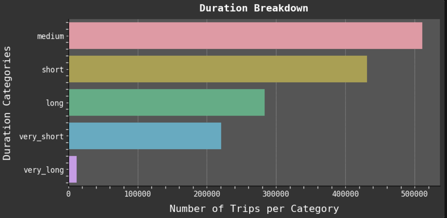
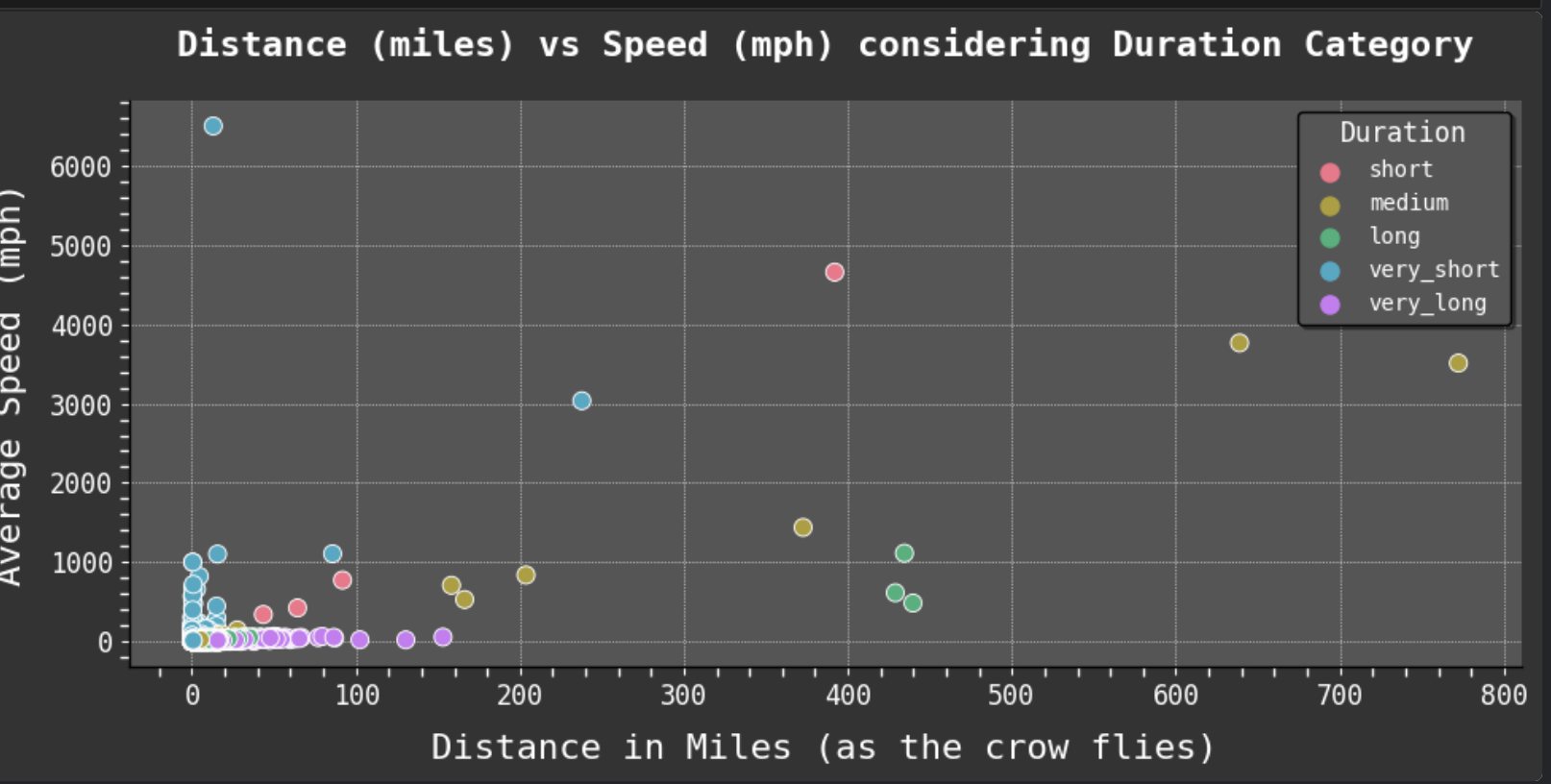
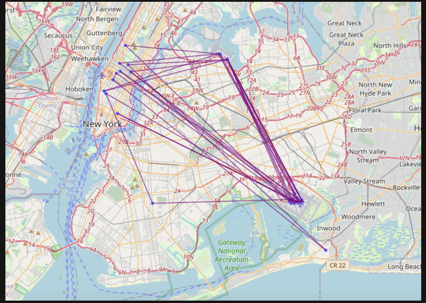
The two models I chose to work with on this project were the SKLearn XGBRegressor and RandomForestRegressor. One of my very favorite aspects of working with this data was how limited it was coming in, well not in number of rows (not by a long shot!), but in features. So I got to do a LOT of feature engineering. And it is always so fun to wrap some python code around the data and see what comes out. I think at one point I had almost tripled the columns/features of the dataset just to get a better look at what all was hidden within in. I learned how to extract street addresses from longitude and latitude points in my code so that I could geoplot the data complete with the store the passenger(s) was picked up from. I created SO MANY categories with which to analyze and visualize the data. I REALLY got to know this data. It was exciting and stressful all at the same time!
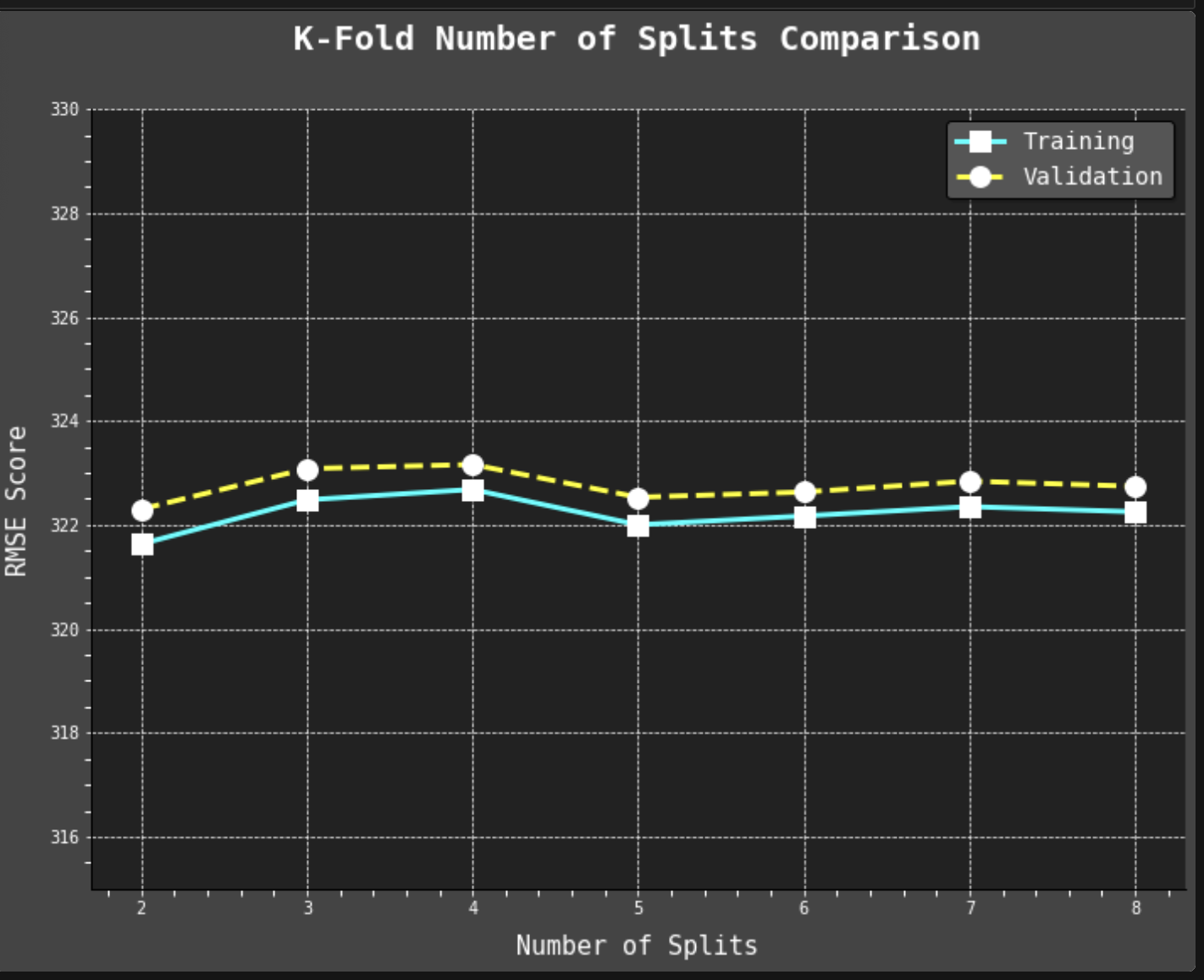
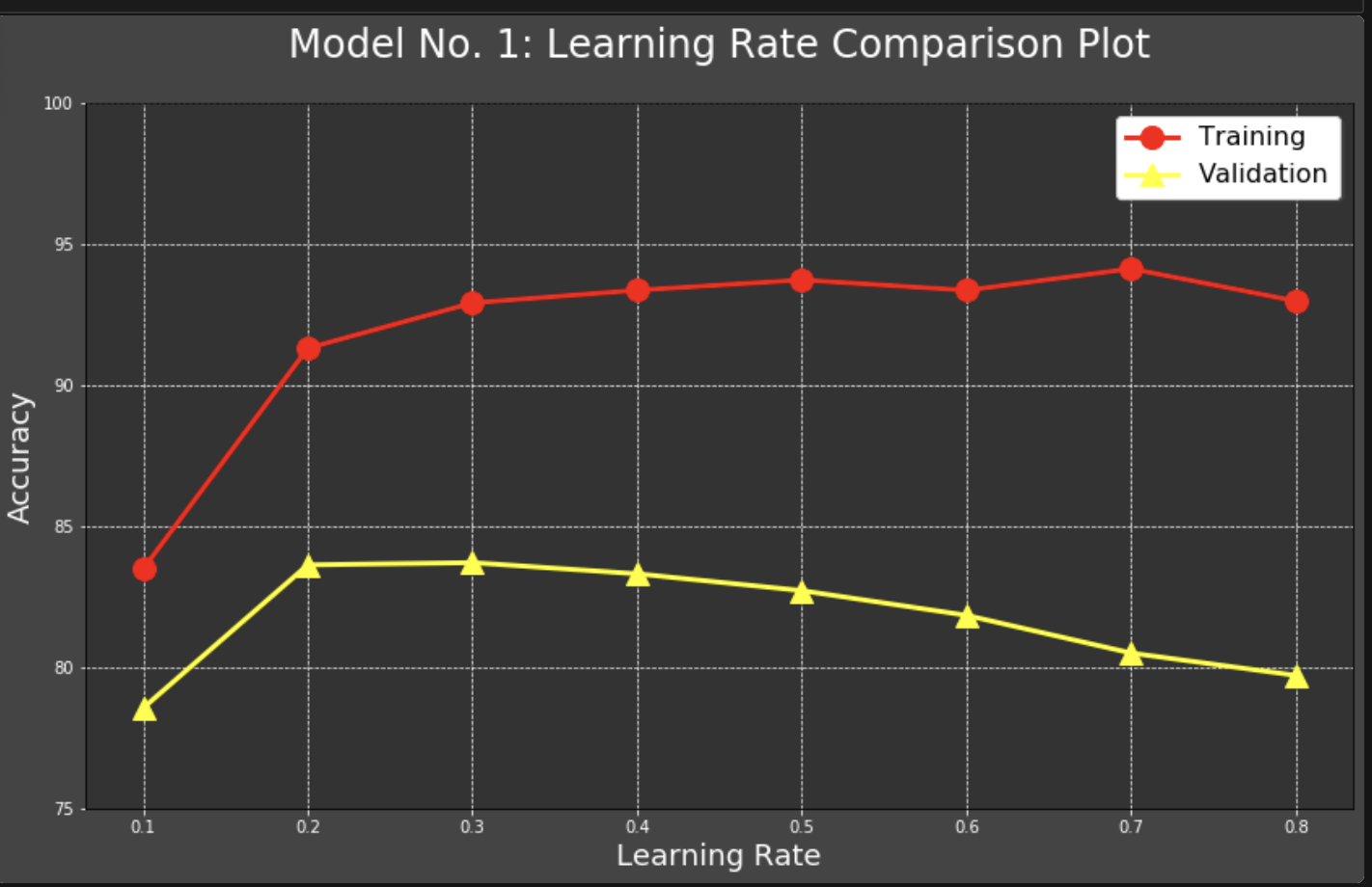
Overall, I am very content with how this project turned out, although I do wish I could have gotten the accuracy numbers higher on my validation sets. This is something I definitely plan to keep learning more about and working on, more hyperparameter tuning, etc.
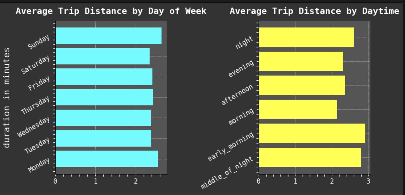
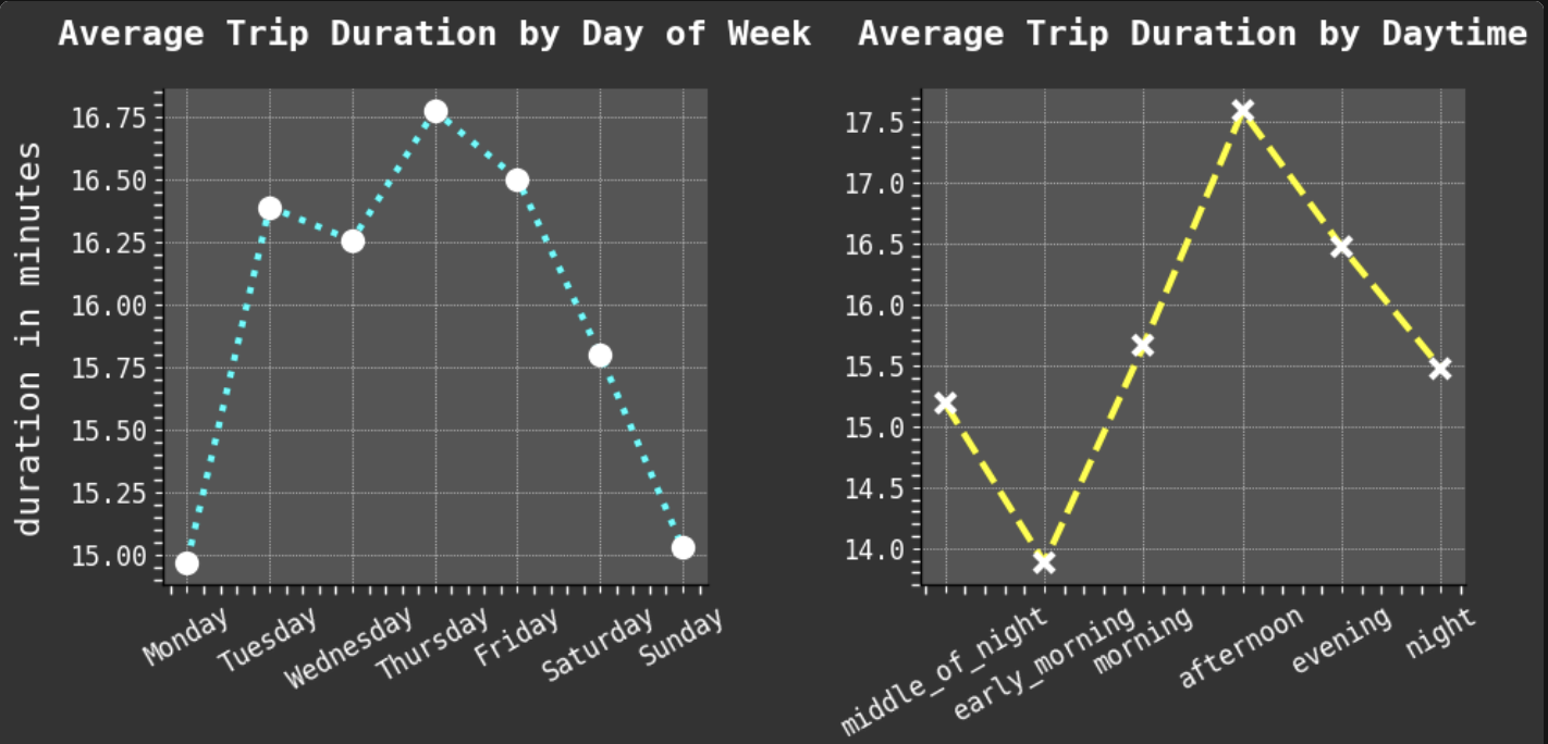
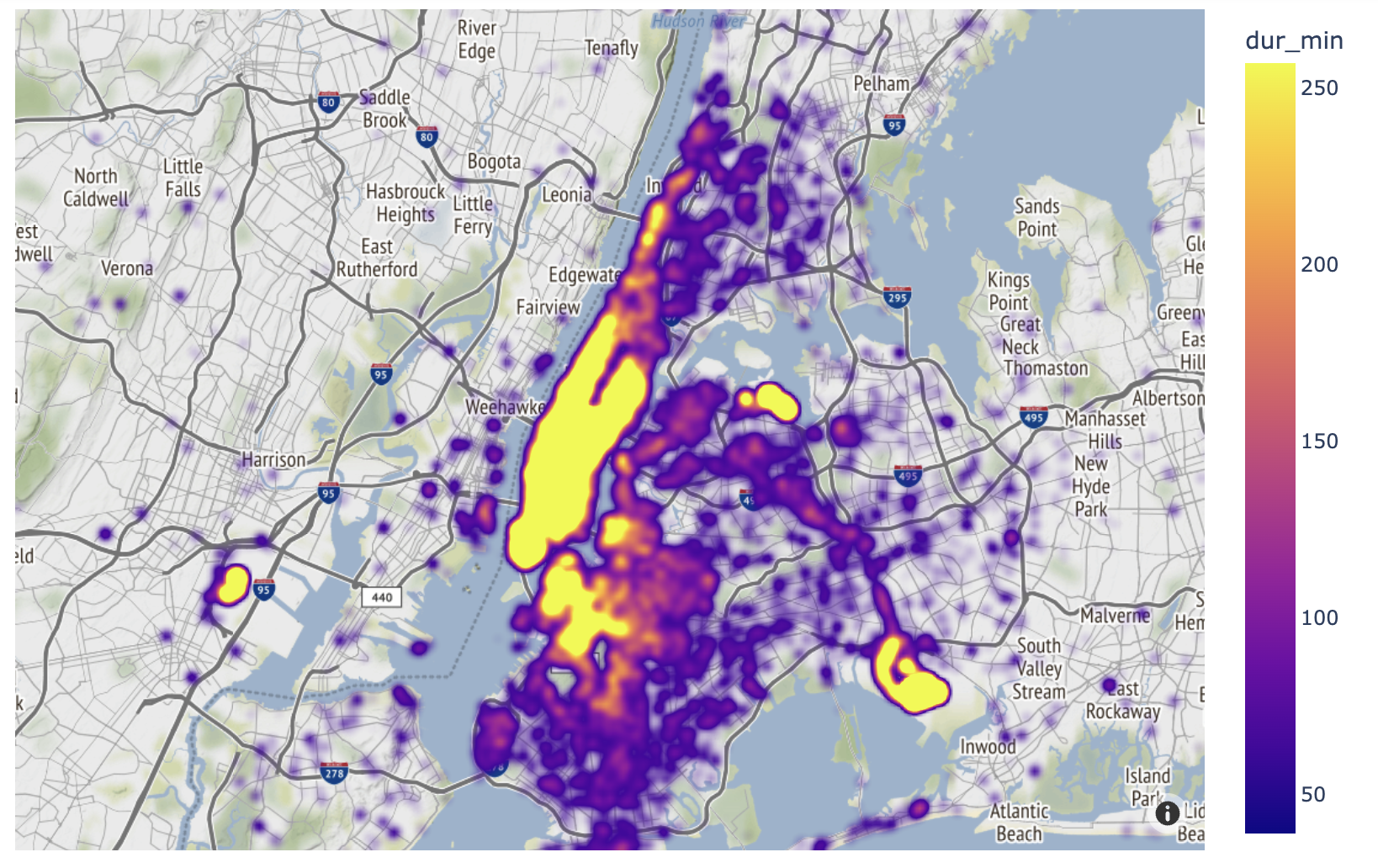
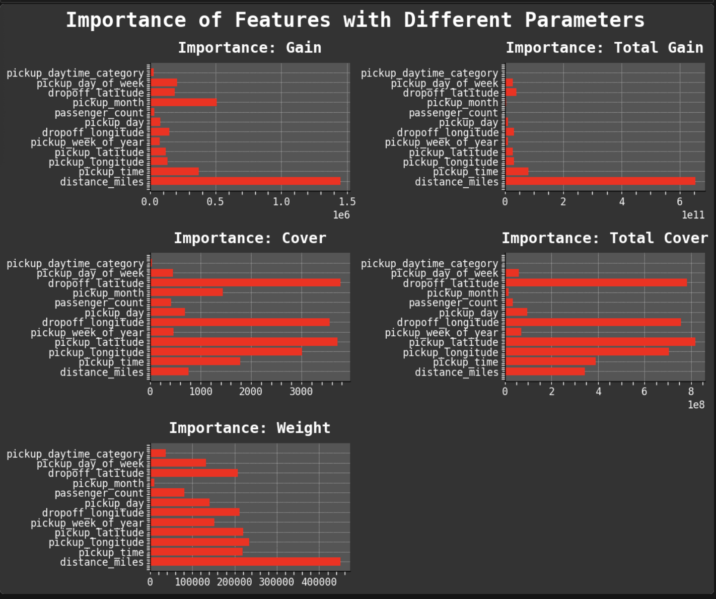
Since one of my favorite parts of this work is data visualization, I will share some of my favorite plots from the project. I especially enjoyed working with GeoPandas and creating the maps of taxi trips. But my absolute favorite was creating the heat maps. One aspect I find most intriguing about data visualization is how good plots can help you find the right questions to ask and inspire new avenues to explore in data science.
My entire notebook can be found at the bottom of this page, complete with documentation and a thorough table of contents which is easily accessible when run on Google Colab. Unfortunately, the embedding does not hide the output where I specified or the looooooong code that in the interactive notebook I have collapsed. So if you are interested, please do follow this link, and choose "Run on Google Colab". There you can see my project in all of its beauty with detailed table of contents and emoji coordinated. Hey! I like to make things graphically pleasing! What can I say?!
Data Visualization: It is a passion!

For full interactive notebook, click here. Or scroll through this embedded version 👇.