🎨 Chakra-UI Component Library

Recently, I decided that in order to multi-task (a favorite pastime of mine), I would create a site as a sort of notebook of my work with Chakra UI and Remix. I found myself wanting to learn so much about both at the same time. So I set off on what I thought was going to be my own little workshop with the library and the framework. What started out as a simple project to help me learn has now become an entire site with far more potential that I ever imagined. And while it is still a wee baby of a project relatively speaking, I have high hopes and plans!
I happily introduce you to IHeartComponents.com. Currently, Chakra UI is the only library I showcase on the site, but I expect this to grow into a wonderful resource for developers. I have had a great time spending every waking moment creating this treasure trove of resources for the past week or so, I do not plan to stop any time soon.

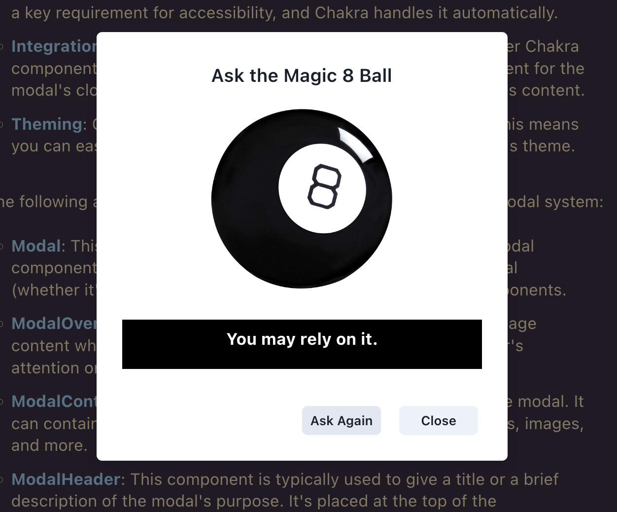
If you visit, be sure to try out the Magic 8 Ball! It is "Useful Tip No. 3" on the Modal page!
Introduction to Chakra.IHeartComponents.com
Chakra-UI is a powerful tool that simplifies the process of building high-quality user interfaces. It is a simple, modular, and accessible component library for building user interfaces with React. Chakra was developed to address common challenges faced by developers when building modern UIs, including reusability, customization, and accessibility.
Chakra-UI provides developers with a set of composable, reusable React components that are styled with Emotion (a CSS-in-JS library) and follow best practices for accessibility (a11y). With Chakra UI, you can leverage a wide range of components like typography, form controls, modals, popovers, and many others, all of which are customizable to match your design requirements.
Chakra was created by Segun Adebayo, a product designer and software engineer, and is maintained by a team of contributors. Segun's vision for Chakra UI was to provide developers with a set of components that are not only easy to use, but also flexible and accessible, thereby enabling them to craft beautiful UI experiences with less effort.
Chakra UI stands out as a popular choice for creating dynamic React applications due to its assortment of impressive features including but certainly not limited to:
- Style Props: Chakra-UI allows you to style components by passing CSS attributes as props to web components, making it easier to edit the layout of different web components while reducing the number of styles you have to write.
- Composition: Chakra-UI dissolves components into smaller elements with limited properties to keep complexity low, then assembles them to ensure that styles and functionality are flexible.
- Accessibility: Chakra-UI strictly follows WAI-ARIA standards for all components, making it easy to create accessible React apps.
- Thematic Design: Chakra-UI is highly customizable, with features such as custom themes and color palettes.
- Color Mode Implementation: Chakra-UI is optimized for multiple color modes, allowing you to use light or dark mode.
- Responsive Design: Chakra-UI provides modern and accessible layout components that are responsive.
The examples showcased here are a mix of references from Chakra's comprehensive documentation and my own explorations. These serve as a testament to my ongoing journey of understanding the nuances of Chakra and Remix, enhancing my HTML and CSS skills, and balancing multiple tasks simultaneously. Each example includes a link to the detailed Chakra Documentation for the respective component or topic. I'm confident that you'll find the library as valuable and impressive as I have.
Some developers might hesitate to utilize a library filled with predefined components, fearing it might stifle their creative instincts. However, my experience has proven quite the contrary. I believe such libraries, in fact, amplify my creative potential, enabling me to dedicate more thought and effort to the app's functionality, rather than getting entangled in the intricate specifics of the user interface. This approach offers a pragmatic balance between design and development. It keeps me from reinventing the wheel and frees me to innovate where it truly matters: the unique value proposition of my applications.
Additionally, Chakra and other component libraries are often designed with customization at their core, allowing developers to tailor each element according to their specific design philisophy. This adaptability ensures that, even while using pre-built components, applications can maintain a unique aesthetic, align with branding, and cater to specific audiences.
Using such a library doesn't mean you're compromising on uniqueness or originality. Rather, it's akin to using a versatile set of building blocks, providing a head start in construction but still leaving plenty of room for the architect's imagination to create a distinctive masterpiece. Thus, these libraries become the launchpad for our creativity, not its cage.
Enjoy the exploration, and remember: the learning journey never ends! ~ Evan Marie Carr